Original research: the content AI answers can't get anywhere else
How a small B2B team can publish original research: five ways to create data compared on cost, credibility and time, a copyable research plan, and how to write findings that get quoted without overstating the sample.
44 min readWritten by Ampere
Short answer
What is original research in content marketing?
Original research in content marketing is content built on evidence a company collected or produced itself, such as a survey, aggregated product data, a new analysis of public records, an expert panel or a benchmark, published with its method. Because the findings exist nowhere else, writers, reporters and AI answers that use them have a reason to cite the company as the source, though no method guarantees citations.
Summary
Original research is the content other writers and AI answers have a reason to cite, because its findings exist nowhere else. A roundup of other people's statistics or an AI summary of published reports can be rebuilt by anyone, so nobody needs to cite it. Original research needs new evidence and a published method; Google's guidance asks whether content provides original information or research, but no method guarantees links, rankings or AI citations.
A small B2B team can create original data in five ways: a survey, aggregated product data, an analysis of public records, an expert panel, or a benchmark. They differ in cost, credibility and time. Surveys measure what people say and depend on who answered, product data shows behavior but only among customers, public-data counts are cheap and checkable, panels explain reasoning without showing prevalence, and benchmarks rest on a published protocol.
A good research question is one buyers already ask, that no current study answers, that the company has special access to, and whose answer is useful whether the number is high or low. A copyable research plan template fixes the analysis, the minimum group size and the known limits before any data arrives, which keeps a team from reporting only the comparisons that look striking.
Findings get quoted when each one is a self-contained sentence naming the number, the group studied and the period, with its base, a chart whose title states the finding, and a method box covering sponsor, population, recruitment, dates, sample size, exclusions and limits. A margin of error applies only to random samples, so opt-in surveys should report counts and recruitment instead.
A fictional worked example follows one software company's first onboarding benchmark, from a blank-number headline to a method box, including the unfinished accounts it kept in the report and a small subgroup finding it cut. Launch with an open findings page, a chart pack and a short pitch, and repeat the study each year with the same core method so the findings become a trend.
Contents
- What counts as original research
- Why original research gets quoted, linked and cited
- Five ways to create original data
- How to choose a research question worth answering
- A research plan template you can copy
- How to collect data on a small budget
- How many survey responses you need
- Analysis that holds up when someone checks it
- How to write findings that get quoted
- Charts that carry the finding on their own
- How to report samples, margins and limits honestly
- Worked example: a first onboarding benchmark (fictional)
- How to launch and distribute a research report
- How to turn a one-off study into an annual report
- How original research works in Ampere
- Sources and further reading
- Frequently Asked Questions
Ask an AI assistant how long onboarding usually takes for B2B software and look at the sources under its answer. The ones worth naming tend to have a number: a survey of customer success leaders, a benchmark from a software vendor, a study with a sample size and a date. The many articles that explain onboarding best practices in general terms are easy to absorb without credit, because an answer can assemble the same points from anywhere.
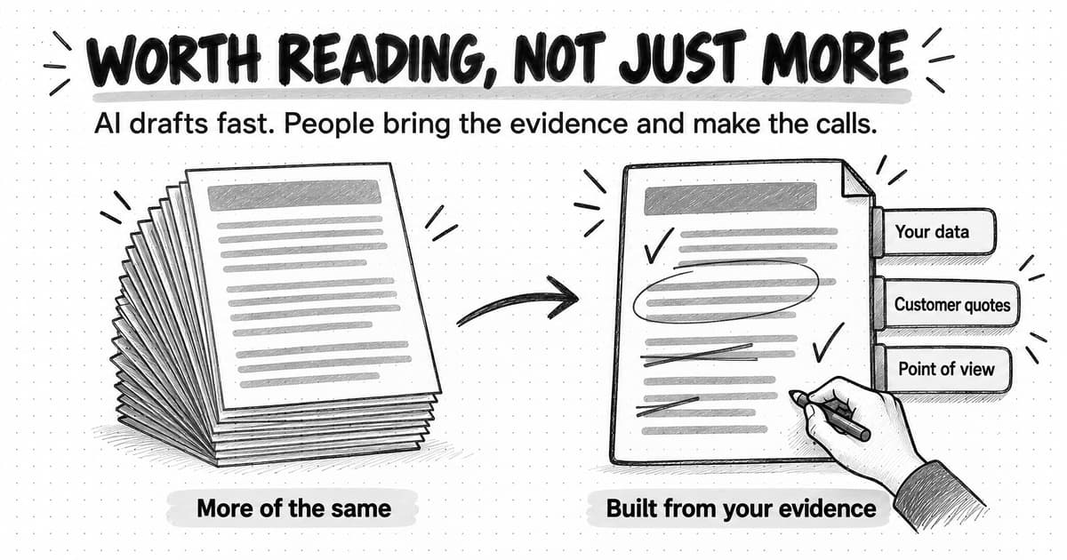
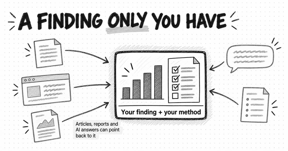
That is the case for original research: content built on evidence your company collected or produced itself, such as a survey it ran, aggregated data from its own product, a new analysis of public records, a panel of experts it convened, or a benchmark it measured, published with enough method for other people to check the findings and reuse them. Anyone can rewrite a summary of other people's statistics. A finding you produced can't be repeated honestly without naming you, which gives journalists, analysts, other writers and AI answers a reason to go back to the original source.
Original research has a reputation for being expensive, and a large commissioned survey is. But a small B2B team usually has something a bigger publisher doesn't: its own product data, its customers, a niche community, or the patience to count records nobody has counted. This guide compares five ways to create original data on cost, credibility and time, gives you a research plan to copy, and shows how to write findings that get quoted, report a sample honestly, and launch the result, with a fictional company's first benchmark report as the worked example. None of it can guarantee links, coverage or AI citations. It can give other people a reason to cite you and what they need to do it accurately.
What counts as original research
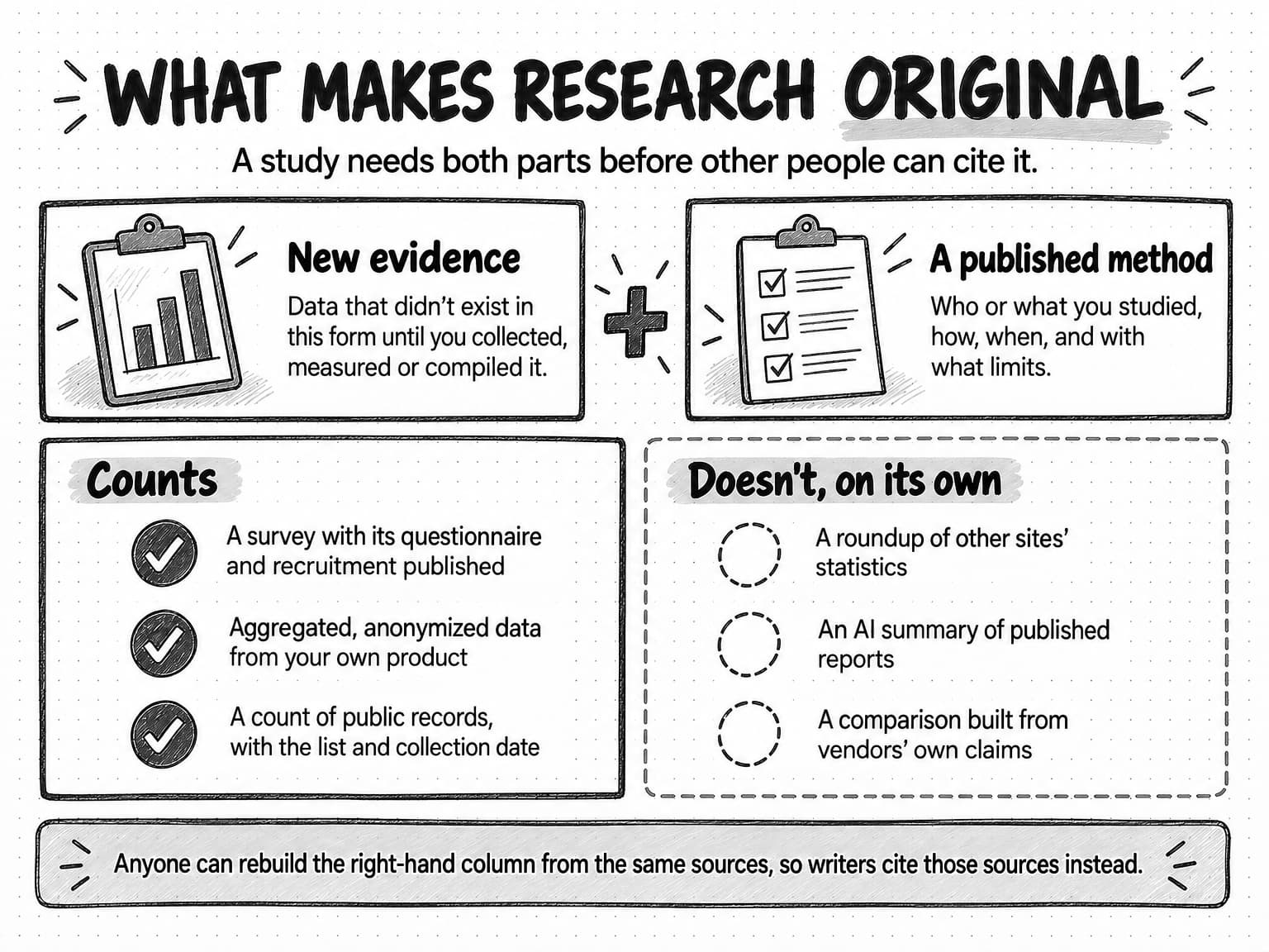
Original research has two parts, and a piece of content needs both. The first is new evidence: data that did not exist in this form until you collected, measured or compiled it. The second is a published method: who or what you studied, how, when, and with what limits. Without the first, you have a summary. Without the second, you have a claim that a careful reader, editor or analyst can't use.
A survey or a benchmark you run yourself is primary research, because it collects new evidence for your question. Product data and public records were created for other purposes, so they are technically secondary sources, but compiling them into findings nobody has published is still original work. Our guide to what market research is explains that distinction and the main methods in depth.
Here is what usually counts, and what usually doesn't:
| Counts as original research | Doesn't, on its own |
|---|---|
| A survey of 200 operations leaders, with the questionnaire and the recruitment method published | A list of "75 statistics about operations teams" gathered from other sites |
| Median time to complete a task across 1,000 customer accounts, aggregated and anonymized | A blog post that says "our customers save hours every week" with no measurement behind it |
| A count of how many of 150 software companies publish their prices, with the list and collection date | An AI-written summary of what published reports say about pricing pages |
| Structured interviews with 15 named security leaders, reported as the views of that panel | An opinion piece that describes what "most CISOs" think |
| A repeatable test of response times across 40 vendors, with the protocol and test dates | A comparison table built from vendors' own claims |
A good roundup or an informed opinion can still help a reader. But anyone can rebuild them from the same public material, so nobody needs to cite them rather than their sources. Desk research is the same: an AI research agent can gather published findings quickly, and our guide to how deep research agents work covers how to check what it brings back, but it reports what has been published. Original research adds to it.
View the what-makes-research-original diagram at full size (opens in a new tab).
Two neighboring formats have their own guides. A white paper argues for an approach to a business problem and can use your findings as evidence. Thought leadership argues for a way of understanding a buyer's problem, and original data is often the evidence behind that argument. A research report leads with what you found; the other two lead with what you think.
Why original research gets quoted, linked and cited
Every number in an article, a news story or an AI answer needs a source. When a writer needs to say how common something is, how long it takes or what it costs, they look for the original measurement. If you published it, every page that repeats the number has a reason to name you.
Google describes a similar preference. Its guidance on creating helpful, reliable, people-first content gives site owners questions to assess their own pages. The first is "Does the content provide original information, reporting, research, or analysis?" Another asks whether content that draws on other sources avoids "simply copying or rewriting those sources." These are self-assessment questions, not a ranking formula, but they show what Google says it is trying to reward. The same page points to Google's E-E-A-T framework, in which first-hand experience is one of the four qualities its raters look for.
You may also see the term information gain in SEO discussions. It comes from a Google patent titled Contextual estimation of link information gain, filed in 2018 and granted in June 2022. The patent describes scoring a document by how much information it adds beyond documents a user has already seen. A patent shows that Google's engineers worked on the idea; it does not show that Google Search uses it, or how. The idea is still a useful test for your own content: if a reader has already seen the top five pages on your topic, what does your page tell them that those didn't?
AI answers raise the same question in a sharper form. A 2023 study, GEO: Generative Engine Optimization by Pranjal Aggarwal and colleagues, later accepted to the KDD 2024 conference, tested edits that make web content more prominent in generated answers. Adding statistics, adding quotations and citing sources were among the most effective, with relative gains of about 30 to 40% on one of the paper's measures, while keyword stuffing did little or nothing. The engine was the researchers' own, built on the top five Google results and a 2023 language model, so read this as evidence that generated answers can favor specific, sourced content, not as a prediction for any commercial assistant. Our guide to generative engine optimization covers what the study measured and which tactics hold up. Google, for its part, says in its documentation on AI features and your website that "There are no additional requirements to appear in AI Overviews or AI Mode, nor other special optimizations necessary." Its usual guidance on useful, original content still applies.
Marketers report that the format works for them. In the Content Marketing Institute's B2B content marketing survey, fielded from June 25 to August 16, 2024, with 980 B2B respondents mostly in North America, 36% said they had used research reports in the previous 12 months, and 45% named research reports among the most effective content types, level with e-books and white papers. The article doesn't say whether that 45% is a share of all respondents or only of users, and it measures marketers' own judgment, so it shows that teams value the format, not that it works for any particular company.
Original research also gives your own team something to say. Sales can open a conversation with a finding, and the founder has material for talks and posts, even if nobody outside cites the report.
Five ways to create original data
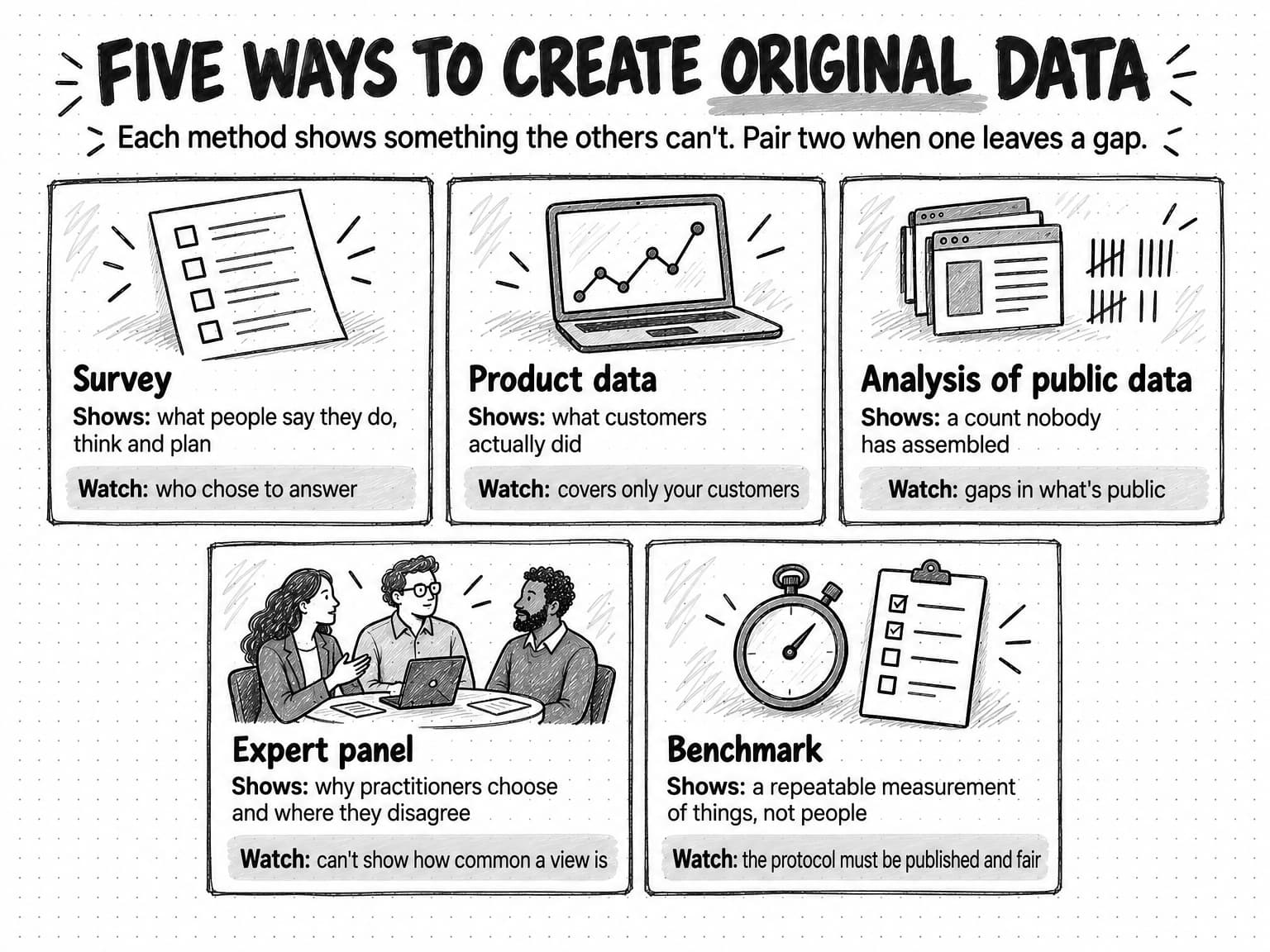
A small team has five practical ways to produce data nobody else has. They differ in the kind of finding they produce, their cost, how far a skeptical reader will trust them, and how long they take. The table uses relative terms because real costs depend on your audience.
| Method | Cash cost | Team time | Time to publish | Credibility when done well | Main risk |
|---|---|---|---|---|---|
| Survey | Low with your own list; medium to high with a paid B2B panel | Medium | 6 to 10 weeks | Medium; depends on who answered and how they were recruited | Unrepresentative respondents and leading questions |
| Product data | Low | Medium; needs an analyst or engineer | 3 to 6 weeks | High for behavior; covers only your customers | Privacy, contracts and a skewed customer base |
| Analysis of public data | Low | High; collection and cleaning take time | 4 to 8 weeks | High when the dataset and collection date are published | Incomplete coverage and changing definitions |
| Expert panel | Low to medium; incentives or donations | Medium | 4 to 8 weeks | High for reasoning and context; can't show how common a view is | Recruiting only friends of the company |
| Benchmark | Low to medium; test accounts or tools | High; protocol design and repeat runs | 4 to 10 weeks | High when the protocol is reproducible | Fairness disputes with the products or companies measured |
The time ranges are planning estimates for a small team's first study, from plan to published findings, not measured averages. Clean product data or an engaged list makes it faster; recruiting an audience you haven't reached before makes it slower.
Surveys
A survey asks many people the same questions so their answers can be counted. It suits attitudes, practices and plans you can't observe directly, such as how teams make a decision or what they plan to change next year.
The main cost is reaching the right people. A survey sent to your newsletter, customers and communities costs little but reaches people who already know you. A paid panel can reach a defined audience, such as finance directors at companies with 50 to 500 staff, but panel respondents describe their own jobs and some answer mainly for the reward, so your own screening matters more than the panel's claims. The market research guide explains how question wording and opt-in samples shape results.
A survey's credibility depends mostly on two things you can publish: who was invited and how, and the exact wording of each question. A survey of 140 people with both disclosed is more useful to a careful reader than one of 2,000 with neither.
Product data
A software product already records how people use it: how long setup takes, which features are used together, what fails. Aggregated across many customers and stripped of anything that identifies them, that data answers questions nobody else can, and it measures what people did rather than what they remember.
It has two limits. It covers only your customers, who may differ from the market, so a finding should name that group ("across 1,200 accounts using our software") rather than speak for an industry. And it is your customers' data. Check your customer agreements and privacy policy with whoever owns them, aggregate so no customer can be identified, and set a minimum group size so a small segment, such as "the three hospitals in our customer base," can't be picked out. Under the EU's General Data Protection Regulation, recital 26 says data protection principles "should therefore not apply to anonymous information," but data is only anonymous if no one can identify a person using "all the means reasonably likely to be used." Aggregated counts usually meet that bar. A table of a few accounts with their industry and size might not.
Cloudflare's 2025 Radar Year in Review, published December 15, 2025, is a large example: it draws on traffic across Cloudflare's own network from January 1 to December 2, 2025, and says plainly that its view comes from that network.
Analysis of public data
Some original research uses no private data at all. It counts public records nobody has assembled for a particular question: the pricing pages of 150 software companies, five years of job postings for a role, every app store review in a product category, or the public ad libraries of a market's main advertisers. Every record was public, but the count is new.
The method is cheap in money and expensive in time, because defining, collecting and cleaning the records take most of the effort. Its credibility comes from reproducibility: publish the list of records, the collection date and your classification rules, and anyone can check your work. Its risks are incomplete coverage, definitions that differ between sources or years, and websites' terms of use, which you should read before collecting at scale. Counting 150 pricing pages yourself produces a finding; summarizing three reports about pricing pages produces a summary of their findings.
Expert panel
An expert panel asks a defined group of practitioners the same structured questions and reports what they said. The best-known structured version is the Delphi method, described by RAND Corporation researchers Norman Dalkey and Olaf Helmer in a 1963 Management Science article: experts answer several rounds of questionnaires, see a summary of the group's answers between rounds, and can revise their views. A marketing team rarely needs several rounds, but structured, repeated questions keep a panel from becoming a set of loosely related interviews.
Fifteen experts are not a sample of anything, so a panel can't show how common a view is. It can explain why practitioners make a choice and where they disagree, often in quotable words. Report it as the panel's views ("9 of the 15 security leaders we interviewed said...") and publish how panelists were chosen. If they are all customers or friends of the founder, say so, or widen the invitations.
Benchmark
A benchmark measures something against a defined, repeatable standard: how fast 40 vendors' support teams answer the same question, how many steps it takes to cancel 30 subscriptions, or how a set of tools perform on the same task. It measures things rather than people, so the question of who chose to answer disappears.
Its credibility rests on the protocol: what you measured, how, under which conditions, on which dates and versions. Publish the protocol with the results so anyone can repeat the test. Companies ranked in a benchmark may dispute the result, so keep screenshots and timestamps and fix errors publicly when someone shows you one.
Combining methods
Strong small studies often pair two methods so each covers the other's weakness: product data shows what customers did and a short survey asks why, or a count of public records shows how common a practice is and an expert panel explains it. Label each finding with the method behind it.
View the five ways to create original data at full size (opens in a new tab).
How to choose a research question worth answering
The question decides whether anyone will care about the answer, so choose it before choosing a method. A useful research question has five qualities.
- People already ask it. Prospects ask it on sales calls, support hears it, and people search for it or ask AI assistants about it.
- No credible, current answer exists. If a reputable study answered it last year with a clear method, you need a different angle, audience or newer data. If the only answers are old, vague or untraceable, there is room for yours.
- You have access others don't. Your product data, customers, community or willingness to count something tedious gives you an edge that a larger publisher can't easily copy.
- The answer is useful whichever way it comes out. If only one result would be worth publishing, you are looking for confirmation, and readers can tell.
- It connects to what you sell without advertising it. A study of how long onboarding takes suits an onboarding software company. A study designed to prove onboarding software is essential reads as a sales piece.
A practical test is to write the headline before you collect any data, leaving the number blank: "___% of finance teams still close the month in spreadsheets," or "The median B2B onboarding takes ___ days." Then ask whether any plausible value would interest your reader. If 20% and 80% would both be worth reporting, the question is strong. If only a dramatic result would get attention, find a better question.
| Weak question | Why it's weak | Stronger question |
|---|---|---|
| What do marketers think about AI? | Already asked by many larger publishers, and too broad to produce a specific finding | Which tasks do B2B content teams of fewer than five people now hand to AI, and which do they still do by hand? |
| Is our category important? | Only one answer helps the sponsor | How many hours a month do finance teams spend on reconciliation, by company size? |
| What are the trends in customer success? | No measurable finding | How many days does it take a new B2B software customer to complete its first onboarding milestone? |
The questions you choose should also fit your content plan. Our guide to building a B2B content marketing strategy explains how to choose subjects your company has earned the right to cover, which is the same judgment applied to research.
A research plan template you can copy
Write the plan before you collect anything. It forces the decisions that are hard to make honestly once the data is in, such as which comparisons you'll report and what you'll do if the result is boring. It also gives reviewers something to check early, while changes are cheap.
Working title:
The headline you expect to write, with the number left blank.

Research question:
One question, in plain words. Which group, which behavior or view, which period?

Who will use the answer:
Which readers, reporters, analysts or customers need this number, and for what?

What already exists:
The best current answers you found, with their dates and methods.
What will ours add?

Method:
Survey, product data, analysis of public data, expert panel, benchmark, or a pair.
Why this method fits the question.

Population:
Exactly who or what the findings will describe.

Sample and recruitment:
Where respondents, records or cases come from, how many you need,
and who that leaves out.

Instrument:
The questionnaire, query, collection rules or test protocol.
Link to the draft.

Analysis plan:
The numbers you will calculate and the comparisons you will report,
decided now. Minimum group size for any percentage.

Expected result and surprise:
What you expect to find, and which result would surprise you.
Will you publish either way?

Known limits:
What this design can't show, written before you see the data.

Privacy, legal and fairness checks:
Customer agreements, consent wording, anonymization, terms of use
for public sources, and how measured companies can raise corrections.

Owner and reviewers:
Who runs the study, who checks the analysis, who approves publication.

Timeline:
Fieldwork dates, analysis, writing, review, launch.

Assets and launch:
Findings page, method page, charts, data table, pitch list, posts,
sales summary.

Update cadence:
One-off, or annual with the same core questions?
Three fields get skipped most often. The analysis plan stops you from searching dozens of comparisons and reporting only the striking ones, which produces findings that don't hold up when someone repeats the study. The expected result and surprise field commits you to publishing an unexciting answer. The known limits field becomes most of your limits section later, and it is easier to write honestly before you know which limits will be inconvenient.
How to collect data on a small budget
Most of the cost of collection is time rather than money. A few habits per method save the most.
Surveys
Recruit where you can tell who people are: customers, your newsletter, a community you take part in, a partner's audience. Record how many people you invited through each channel, because readers will want the response rate. With a paid panel, add screening questions about role and company that a real member of your audience answers easily and an impostor can't.
Keep the questionnaire short and put the questions behind your headline first, because answers get less careful as a survey goes on. Test it with five people from the audience and watch where they hesitate or misread; one confusing question fixed now saves a finding later.
Incentives such as a charity donation per response, early access to the report or a small gift card help, but a large reward attracts people who answer for money. Say what you offered in the method box.
Product data
Define every term in plain words before the query runs. "Time to onboard" needs a start event, an end event, a time window and a rule for accounts that never finished. Write down exclusions such as test and internal accounts, aggregate before anything leaves the analyst's hands, and have whoever owns privacy and customer agreements approve the release.
Public data
Define which records count and when you collect them, and save a copy of each record, because public pages change. AI tools can speed up collection and classification, but check a random sample by hand before trusting the totals, and record the error rate you find.
Expert panels
Invite more people than you need, because experts drop out. Ask everyone the same core questions, record each person's role and how you found them, and get permission and a review before quoting anyone by name.
Benchmarks
Pilot the protocol on two or three cases, fix what breaks, then run every case under the same conditions in as short a period as you can. Log each run, and record a failed measurement rather than quietly rerunning it until it looks normal.
How many survey responses you need
The number of responses you need depends on how precise the findings must be and how you recruited. For a random sample of a defined population, the margin of error describes how far a result could reasonably be from what you'd find if you asked everyone, because of chance in who was selected. Pew Research Center's Andrew Mercer explains it with an example: a simple random sample of 1,067 people has a margin of error of plus or minus 3 percentage points at the usual 95% confidence level, meaning that if the same survey were run 100 times, about 95 of the results would land within 3 points of the true value.
The table applies the standard formula, 1.96 × √(p × (1 − p) ÷ n), given in the NIST/SEMATECH e-Handbook of Statistical Methods, to a percentage near 50%, the widest case. The figures assume a simple random sample from a population much larger than the sample, 95% confidence and no weighting. They cover random sampling error only, not errors from question wording or from who declined to answer, and weighted or clustered samples have wider margins.
| Responses from a random sample | Margin of error at 95% confidence |
|---|---|
| 50 | ±13.9 percentage points |
| 100 | ±9.8 percentage points |
| 200 | ±6.9 percentage points |
| 400 | ±4.9 percentage points |
| 1,000 | ±3.1 percentage points |
Two practical points follow. First, precision improves slowly: to halve the margin of error you need four times as many responses. Second, every subgroup has its own, larger margin. Mercer's example shows that a group making up about 15% of a 1,067-person sample, roughly 160 people, has a margin of about 8 points. If your report compares small and large companies, the size of each group matters more than the total.
When your sample is a large share of everyone you could have asked, as often happens in B2B, the finite population correction, √((N − n) ÷ (N − 1)) for a population of N, narrows the margin. For example, 200 random responses from a population of 2,000 gives about ±6.6 points instead of ±6.9; from a population of 500, about ±5.4. OpenStax's Introductory Business Statistics applies the correction when more than 5% of the population is sampled.
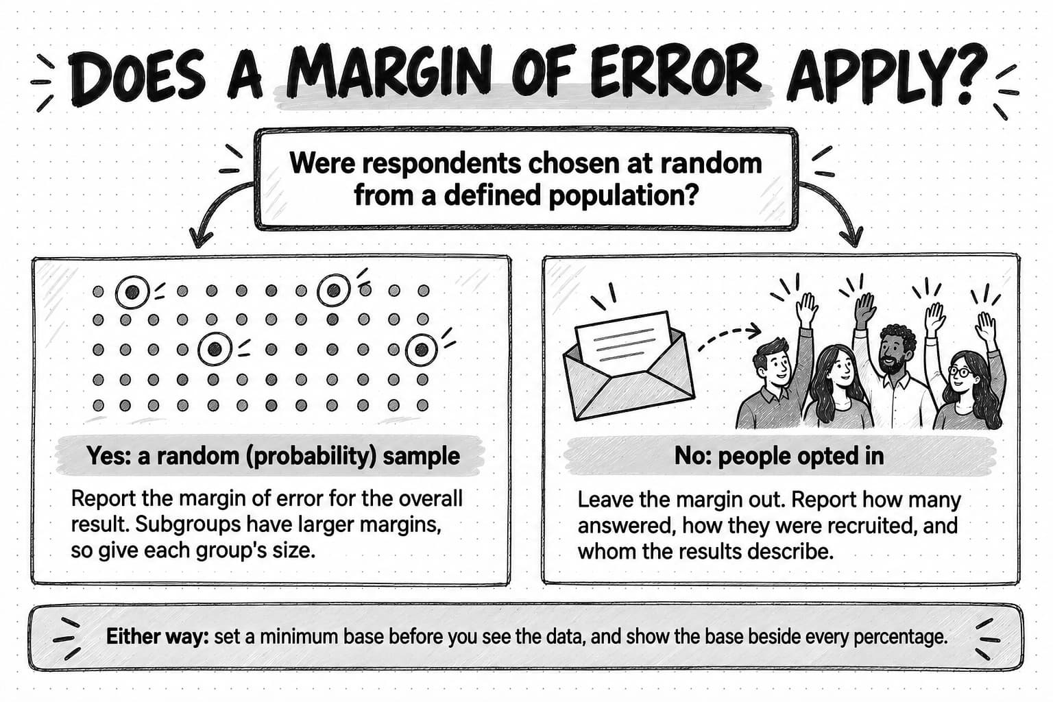
When a margin of error doesn't apply
Most marketing surveys don't use probability samples, in which everyone in the population has a known chance of selection. They go to a newsletter, a community or a paid opt-in panel, and whoever chooses to answer becomes the sample. For those surveys, the margin of error in the table doesn't describe the uncertainty. The American Association for Public Opinion Research said in a 2012 statement that "it is impossible to develop statistically valid margins of sampling error from nonprobability surveys." Printing one anyway makes an opt-in survey look more precise than it is.
For an opt-in survey, report the number of responses, how people were recruited, and what that means for whom the results describe. Then choose a sample size by the comparisons you plan to report rather than by a precision target. As a working rule, set a minimum base before you look at the data, such as 30 or 50 responses, below which you won't report a percentage for any group, and show the base beside every percentage you publish. A survey of 150 well-chosen, clearly described respondents can be worth citing. A survey of 1,500 with a hidden recruitment method usually isn't.
View the margin-of-error decision at full size (opens in a new tab).
Analysis that holds up when someone checks it
Most mistakes that damage a report's credibility happen in analysis, and they are rarely dramatic: small choices that make a number look cleaner or bigger than the data supports.
Clean the data and report what you removed. Remove duplicates, people who failed screening, and respondents who finished impossibly fast or gave the same answer to everything. The counts belong in the method box.
State the denominator of every percentage. "42% said" needs "of whom": all respondents, those who answered that question, or those in a subgroup. For questions where people can choose several answers, the percentages add up to more than 100%, so say "respondents could choose more than one" where it applies.
Use the median for skewed numbers. Times, costs and counts are usually skewed by a few very large values. A mean onboarding time of 58 days can come from a typical 40 days plus a handful of accounts that took a year. Report the median, and the middle range if you can, and say which you used.
Decide your comparisons in advance and report all of them. If you compare twenty subgroups, one or two will probably show a large difference by chance. Report the comparisons in your analysis plan whether or not they turned out interesting. If you find something you didn't plan for, label it as exploratory.
Describe associations as associations. If customers with a dedicated onboarding manager finished faster, the two go together; larger, better-funded customers may simply be more likely to have both. Write "accounts with a named owner finished faster," not "a named owner makes onboarding faster," unless you ran a controlled test.
Check any AI-assisted analysis against the raw data. AI tools can write the analysis script, tabulate results, code open-ended answers and draft findings. They can also miscount, merge categories or overstate certainty. Recalculate every headline number from the raw data and read a sample of coded answers against the originals. Our guide to preventing AI hallucinations in marketing sets out a claim check that works for research drafts too. And never let a model stand in for respondents: answers from synthetic personas are approximations of what someone might say, not data about your market.
Ask someone outside the project to try to break the findings. Give a colleague or advisor the data, the plan and the draft, and ask what a reporter or a competitor would challenge.
How to write findings that get quoted
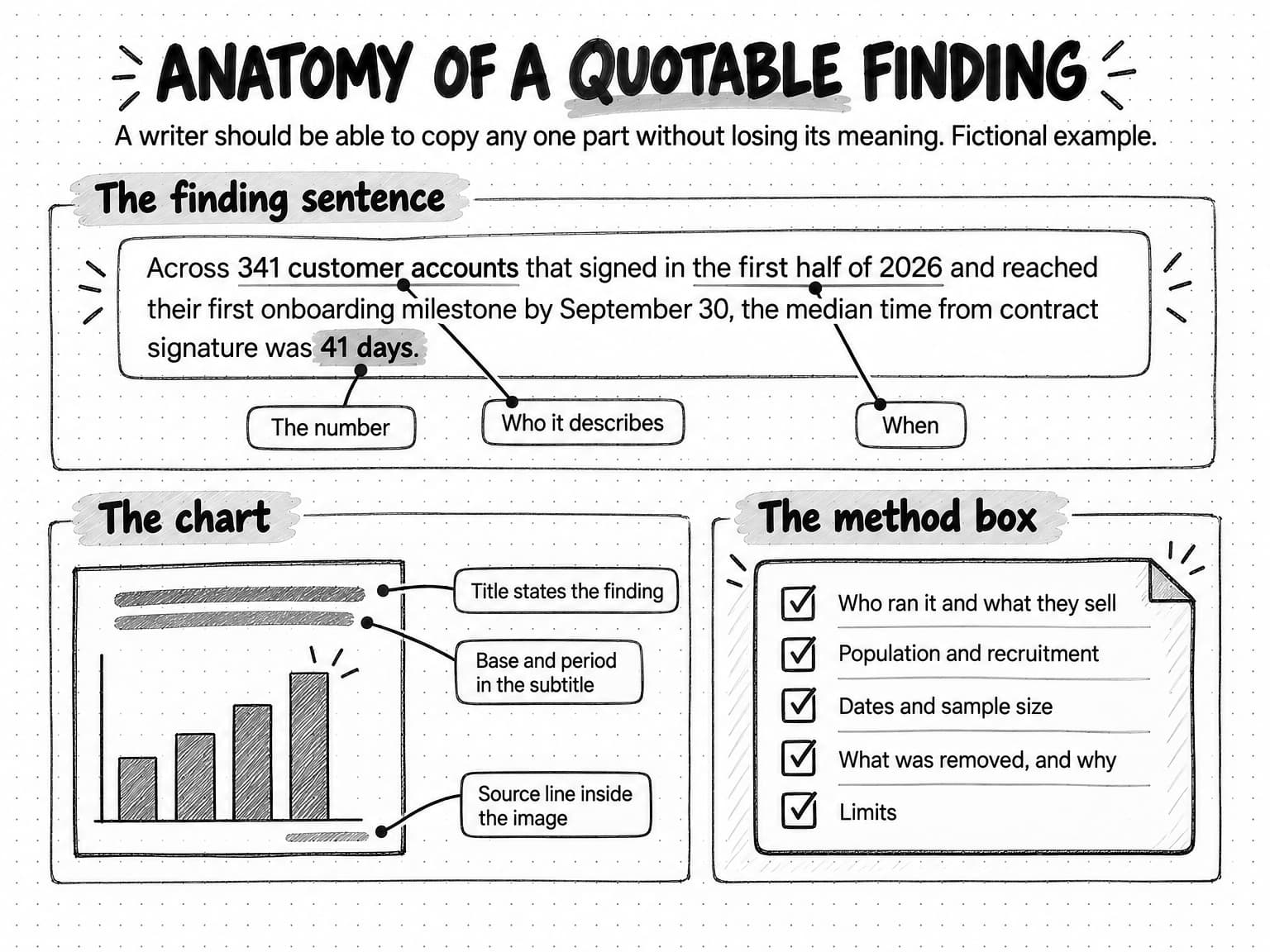
A writer deciding whether to cite your research looks for a sentence they can lift without changing its meaning: specific, self-contained and easy to attribute.
Lead with one headline number
Choose one finding to lead the report: the one that answers your research question most directly. State it as a sentence that names the number, who it describes, and when or where. A useful pattern is [number] of [the group you studied] [did or said something] [in the period], with your brand or report name attached so the attribution travels with it.
| Hard to quote | Easy to quote |
|---|---|
| Onboarding is taking longer than ever. | Across 341 customer accounts that signed in the first half of 2026 and reached their first onboarding milestone by September 30, the median time from contract signature was 41 days. |
| Most teams struggle with month-end close. | 61 of the 140 finance leaders we surveyed in March 2026 said their close took more than eight working days. |
| AI adoption is accelerating in content teams. | 9 of the 15 content leads on our panel said they now draft first versions of product pages with AI, and all 15 said a person edits every page before it goes live. |
The examples on the right are fictional and illustrative. Each can be copied into another article without losing its meaning, and none uses words like "ever," "most" or "accelerating" that the data can't support.
Give every finding its own sentence, chart and base
Structure the report so each finding has its own short section: a heading that states the finding, the finding sentence, a chart, the base it rests on, and a paragraph on what it means and what it doesn't. Start the report with a short list of key findings, each written as a complete sentence, so a reader who only reads the top can still cite you accurately.
Write each finding sentence so it stands alone: "This number rose" means nothing out of context, while "The share of respondents who outsource their close rose from 18% in 2025 to 24% in 2026" can be quoted anywhere. Put your interpretation in a separate sentence.
Publish the findings as a web page, not only as a PDF, so readers can link to a specific finding and the text sits where search engines and AI systems can read it.
Add a method box
A method box is a short, standard summary of how the research was done, placed beside the key findings or at the end of the report, with a link to the full methodology. It answers the questions a careful reader asks before citing a number. The American Association for Public Opinion Research's disclosure standards, from its April 2021 Code of Professional Ethics and Practice, list the items survey researchers must disclose when they release results, including who sponsored and conducted the research, the questionnaire, the population, how the sample was recruited, the mode and dates of data collection, sample sizes, how the data was weighted and processed, and a general statement of the design's limitations. A marketing report can adapt that list.
About this research
Conducted by: [company], which sells [product category]. [Partner], if any.
Method: [online survey / aggregated product data / analysis of public records /
expert panel / benchmark].
Population: [exactly whom or what the findings describe].
Sample: [number] [respondents/accounts/records], recruited from [sources].
[Number] invited; [number] completed; [number] removed because [reasons].
Dates: [fieldwork or data period].
Questionnaire or protocol: [link].
Weighting: [none / how].
Limits: [who is under- or over-represented; what the design can't show].
Contact for questions or corrections: [address].
Disclosing that you sell in the category isn't a weakness. Readers will find out anyway, and saying so shows you expect the work to be judged on its method.
View the anatomy of a quotable finding at full size (opens in a new tab).
Charts that carry the finding on their own
Charts travel without you. A writer copies the image into an article or a slide, and the reader learns only what is inside the frame, so design each chart to survive that.
The UK Government Analysis Function's guidance on data visualisation charts, published May 19, 2022, gives practical rules that work well for marketing research. Its rule on titles is the most useful: "The headline title should communicate the headline message of the chart," paired with a plainer subtitle that states the data, geography and time period. So a chart titled "Onboarding time by project owner" becomes "Accounts with a named project owner reached their first milestone sooner," with a subtitle such as "Median days from signature to first milestone, 341 accounts that signed from January to June 2026."
The same guidance warns against breaking the numerical axis of a bar chart, because readers judge bars by their length and a cut axis exaggerates differences; it recommends a dot plot when a zero-based axis hides the story. It advises avoiding 3D effects, using pie charts only for a few categories that form a meaningful whole, and labeling lines and categories directly rather than relying on a legend matched by color.
| Title | States the finding as a sentence, not the topic |
|---|---|
| Subtitle | Names the measure, the group, the base and the period |
| Axis | Bars start at zero; use a dot plot when small differences matter |
| Labels | Values and categories labeled directly, so color isn't needed to read the chart |
| Base | Number of respondents, accounts or records shown on the chart |
| Source line | Report name, company and date inside the image, so attribution survives copying |
| Data | The numbers behind the chart published as a table on the page |
| Alt text | Describes the finding and the key values for readers who can't see the chart |
Keep one finding per chart; a chart comparing six things across four years in five colors can't be quoted. Offer each chart as a downloadable image and publish the numbers as a table so other writers can make their own chart and still cite you.
How to report samples, margins and limits honestly
Honest reporting makes a study reusable. A writer who can see exactly what your data covers can cite it with confidence; one who suspects you've stretched it will leave it out.
Describe the group you studied, not the one you wish you had. "42% of companies" claims the whole market. "42% of the 214 customer success leaders we surveyed" claims what you measured. If your respondents came from your own newsletter, say they are people who chose to read about your subject, and don't describe them as an industry.
Use margins of error only where they apply. For a random sample, give the margin for the overall result and note that subgroups have larger ones. For an opt-in survey, leave the margin out and describe how people were recruited instead, as the AAPOR statement above advises. Avoid "statistically significant" unless you ran a test and can say which.
Write a limits paragraph, and make it specific. A generic sentence such as "results may not be representative" tells the reader nothing. Name who is over- or under-represented and what the design can't show. Stack Overflow's methodology for its 2025 Developer Survey, which drew 49,009 responses from 177 countries between May 29 and June 23, 2025, is a good model of plain disclosure: it explains that respondents were recruited mainly through Stack Overflow's own channels, notes that "highly-engaged users on Stack Overflow were more likely to notice the prompts," and says about 15,000 responses were excluded by its qualifying questions. A limits paragraph for a small study can follow the same pattern.
Respondents were recruited from [sources], so the results describe
[the group that answered], not [the wider group readers might assume].
[Group] is likely over-represented because [reason], and [group] is
likely under-represented because [reason]. The survey measures what
respondents reported, not what they did. Comparisons between groups
show associations, not causes. Groups with fewer than [minimum base]
responses are not reported separately.
Don't round or crop your way to a better story. Round consistently, keep "don't know" answers in the denominator, and say so if you drop a question or group.
Date everything and correct in public. Put fieldwork dates on the page and every chart. If someone finds an error, fix it and add a dated correction note; a visible correction costs less trust than a silent edit someone notices.
Worked example: a first onboarding benchmark (fictional)
Wrenfield is an invented company. It sells onboarding software to B2B software companies, and its customers use it to run the projects that take a new customer from contract to first use. The company, its data, its respondents and every number in this section are fictional and illustrative. The example follows one small team from question to published findings.
The question
Wrenfield's sales team kept hearing one question from prospects: how long should onboarding take? Search turned up ranges like "30 to 90 days" with no measurement behind them, and the best survey was three years old and covered enterprise software only. Wrenfield had timestamps for the onboarding projects of hundreds of customers. The team wrote the headline before collecting anything: "The median B2B customer took ___ days to reach its first onboarding milestone." A result of 20 days or 90 days would both be worth reporting, so the question passed the test.
The plan
The plan paired two methods. Aggregated product data would measure how long onboarding actually took. A short survey of customer success and onboarding leads, inside and outside Wrenfield's customer base, would ask whether onboarding went as planned and what slowed it down. The analysis plan named four comparisons in advance: by account size, by whether the customer had a named project owner on its side within the first week, by region, and survey answers by respondents' company size. The minimum base for any reported group was 30. The team also committed to publishing the median even if it made onboarding look quick, which would weaken a sales argument for Wrenfield's product.
Collection and cleaning
The product data covered 380 customer accounts that signed contracts between January 1 and June 30, 2026, measured until September 30, 2026. The start event was contract signature and the end event was the customer's first completed onboarding milestone. Test and internal accounts were excluded before analysis, and Wrenfield's privacy lead approved the aggregated output.
Of the 380 accounts, 341 had reached the milestone by September 30 and 39 had not. The team kept the 39 in the report as a separate finding instead of dropping them, because leaving them out would have made onboarding look faster.
The survey went to 2,400 newsletter subscribers and was shared in two customer success communities with about 500 members between them, so roughly 2,900 people were invited. 288 started it and 264 completed it. The team removed 31 respondents who didn't work in customer success or onboarding and 19 who finished in under three minutes, leaving 214.
The findings
| Finding | Base | Method |
|---|---|---|
| Median time from contract signature to first onboarding milestone: 41 days | 341 accounts that reached the milestone | Product data |
| Accounts that had not reached the milestone by September 30: 39 of 380 (10%) | 380 accounts | Product data |
| Median with a named customer-side project owner in week one: 33 days; without one: 52 days | 148 and 193 accounts | Product data |
| Respondents who said their most recent onboarding took longer than planned: 122 of 214 (57%) | 214 qualified respondents | Survey |
The draft headline, and the rewrite
The first draft headline read "B2B onboarding takes six weeks." It was short, but it rounded 41 days up to a convenient unit, dropped the 39 unfinished accounts, and claimed to describe all B2B onboarding. The published version read: "Across 341 Wrenfield customer accounts that signed in the first half of 2026 and reached their first onboarding milestone by September 30, the median time from contract signature was 41 days. Another 39 accounts that signed in the same period hadn't reached it."
The owner finding needed the same care. The draft said "A named owner cuts onboarding time by a third." The data showed an association, and accounts that named an owner early may also have been better organized or better resourced in other ways. The published sentence read: "Accounts that named a project owner on their side in the first week reached the milestone in a median of 33 days, compared with 52 days for accounts that didn't. The data shows the two go together; it doesn't show that naming an owner caused the difference."
What the team cut
One survey question asked whether respondents used AI tools in onboarding. Only 18 said yes, and they reported shorter onboarding projects. The result was tempting, but 18 was below the minimum base of 30, so the team left it out of the findings and mentioned it as a question for next year's survey.
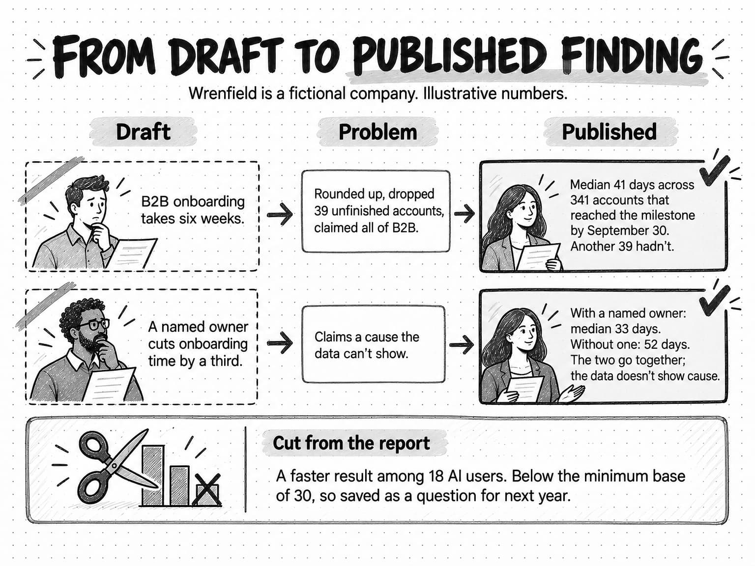
View the draft-to-published rewrite at full size (opens in a new tab).
The method box
About this research (fictional example)
Conducted by: Wrenfield, which sells onboarding software.
Method: Aggregated product data, plus an online survey.
Product data: 380 Wrenfield customer accounts that signed between
January 1 and June 30, 2026, measured to September 30, 2026. Test and
internal accounts excluded. Results describe Wrenfield customers only.
Survey: about 2,900 people invited through Wrenfield's newsletter and
two customer success communities, June 2 to June 27, 2026. 264 completed;
50 removed (31 outside customer success or onboarding roles, 19 completed
in under three minutes); 214 analyzed. Not a random sample, so no margin
of error is reported.
Limits: Survey respondents are people who read about onboarding and
chose to answer. Comparisons show associations, not causes. Groups with
fewer than 30 responses are not reported.
Questionnaire and data tables: [link on the findings page]
Corrections: [address]
In the published report, each finding got its own section and chart. The report was smaller than those the team admired from larger companies, but every number in it could be checked.
How to launch and distribute a research report
Plan the launch with the research plan, because the assets you need shape how you present the findings. A small team can launch with a modest set:
- A findings page on your site with the key findings at the top, a section for each finding, its chart and its base, and the method box.
- A methodology page or section with the full questionnaire or protocol, recruitment details, exclusions and limits.
- A chart pack: each chart as an image with the source line built in, plus the data table behind it.
- A short press note with the three strongest findings as quotable sentences, the method in two lines, and a contact who can answer questions.
- Posts for each finding, one finding per post, written for the channels your audience reads.
- A one-page summary for sales with the findings they can use in conversations and the base behind each one, so nobody overstates them.
Send the report first to respondents, panelists and partners who shared the survey. They were promised it and are the most likely to pass it on.
Decide early whether any part of it sits behind a form. A gated PDF collects contact details but hides the findings from the people who would cite them. Many teams keep the findings and method open and gate only an extra, such as the full dataset or a worksheet. The white paper guide's section on whether a white paper should be gated sets out the trade-offs, and the same reasoning applies to a research report.
Pitch a few reporters and newsletter writers who cover the subject, with the finding most relevant to their readers and the method and data, not only the headline.
Many readers will meet your finding without visiting your site, in an AI answer, someone else's article or a post that quotes your chart, which is why the finding sentence and the chart's source line carry your name. Our guide to zero-click content distribution covers how to reach buyers who never click, and the guide to repurposing content across channels shows how to adapt a long source into posts and short formats without losing the qualifications. Measure the launch by links and mentions from other sites, coverage, citations in AI answers that you sample over time, and use in sales conversations, not by downloads alone.
How to turn a one-off study into an annual report
A single study gives you a finding. The same study repeated each year gives you a trend, which readers often need more, and the second edition costs far less because the questions, queries and templates already exist.
A repeated study only shows a trend if the method stays the same. Keep the core questions, definitions, recruitment sources and timing as close to identical as you can, and when something changes, say so on the page and in the charts, because a difference caused by a new question is not a change in the market. Cloudflare's 2025 Radar Year in Review, which it calls its sixth annual review, says that to ensure consistency it kept its underlying methodologies unchanged from previous years' calculations.
A few habits keep an annual report useful:
- Keep a fixed core and a rotating module. Repeat the same core questions each year and add a small set of new questions on the year's topic, such as the AI question Wrenfield cut for lack of responses.
- Publish at the same time each year, so readers and reporters know when the new figures arrive.
- Keep the old reports online at stable addresses, with a link to the newest edition, so citations to last year's figures still work.
- Show the series. Once you have three or more years, a chart of the core measure over time is often the most quoted image in the report.
- Stop or change the study when it stops answering a live question. A trend nobody needs is not worth maintaining for its own sake.
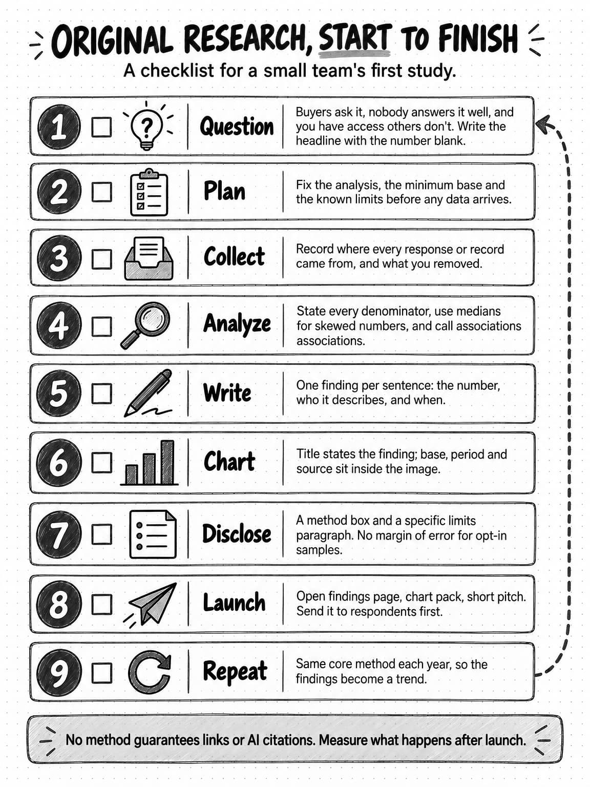
View the original research checklist at full size (opens in a new tab).
How original research works in Ampere
Ampere, the AI marketing agent, can do much of the desk work around an original study, while your team keeps the decisions about the question, the respondents and what gets published.
Before the study, Ampere can search the web and read published sources to show what has already been measured on your question. For an analysis of public data, it can extract content from web pages, crawl websites, and pull public ads, review, social, creator, ecommerce and company data, then organize the records into a spreadsheet or CSV in the session workspace. Public-data coverage is never complete, so check a sample of the records by hand and state the coverage in your method box.
When the data is in, you can share an export from your survey tool or an aggregated product-data file. Ampere can analyze files and spreadsheets in the session workspace, run scripts to tabulate results, and show its working files so you can recalculate the headline numbers yourself. It can then draft a research report or white paper, source-backed infographics, and a self-contained HTML report with static charts and the data behind them. A Project keeps the plan, the questionnaire and the files together, so next year's edition starts from the same method.
Ampere doesn't recruit respondents or run your survey, and it doesn't publish the report. AI output can be inaccurate or incomplete, so a person checks every number against the data before anything goes out.
Sources and further reading
- Google Search Central, Creating helpful, reliable, people-first content. Self-assessment questions, including whether content provides original information, reporting, research or analysis.
- Google Search Central, AI features and your website, last updated December 10, 2025. No additional requirements or special optimizations for AI Overviews or AI Mode.
- Google LLC, Contextual estimation of link information gain, US Patent 11,354,342 B2, filed October 18, 2018, granted June 7, 2022. The source of the "information gain" term.
- Pranjal Aggarwal, Vishvak Murahari, Tanmay Rajpurohit, Ashwin Kalyan, Karthik Narasimhan, and Ameet Deshpande, GEO: Generative Engine Optimization, arXiv, November 2023, revised June 2024; accepted to KDD 2024. Tested on the authors' own generative engine.
- Stephanie Stahl, B2B Content Marketing Benchmarks, Budgets, and Trends: Outlook for 2025, Content Marketing Institute, October 9, 2024. Survey fielded June 25 to August 16, 2024; 980 B2B respondents.
- Andrew Mercer, 5 key things to know about the margin of error in election polls, Pew Research Center, September 8, 2016.
- NIST/SEMATECH, e-Handbook of Statistical Methods, section 7.2.4.1: Confidence intervals, National Institute of Standards and Technology. The normal-approximation interval for a proportion behind the margin-of-error table.
- Alexander Holmes, Barbara Illowsky and Susan Dean, Introductory Business Statistics 2e, section 7.4: Finite population correction factor, OpenStax, December 13, 2023.
- American Association for Public Opinion Research, Understanding a "credibility interval" and how it differs from the "margin of sampling error" in a public opinion poll, October 7, 2012.
- American Association for Public Opinion Research, Disclosure standards, from the Code of Professional Ethics and Practice, April 2021.
- Norman Dalkey and Olaf Helmer, An Experimental Application of the Delphi Method to the Use of Experts, Management Science 9(3), April 1963.
- European Union, Regulation (EU) 2016/679 (General Data Protection Regulation), recital 26 on anonymous information.
- David Belson, The 2025 Cloudflare Radar Year in Review, Cloudflare, December 15, 2025. An example of research from a company's own product data.
- Stack Overflow, 2025 Developer Survey methodology, 2025. An example of plain disclosure of recruitment and sample skew.
- UK Government Analysis Function, Data visualisation: charts, May 19, 2022.
Frequently Asked Questions
How do you conduct original research for content marketing?
To conduct original research for content marketing, start with a question buyers already ask that no credible, current source answers, then choose a method: a survey, aggregated product data, an analysis of public records, an expert panel or a benchmark. Write a research plan with the analysis decided in advance, collect and clean the data, and publish each finding as a quotable sentence with its base, a chart and a method box describing who was studied, how and when.
What is the difference between primary research and original research?
Primary research collects new evidence for your own question, such as a survey, interviews or a benchmark you run. Original research is the wider idea in content marketing: findings nobody has published before, which can come from primary research or from compiling existing records in a new way, such as aggregated product data or a count of public pricing pages. Both need a published method so others can check the findings.
How many survey responses do you need for original research?
The number of survey responses you need depends on how you recruited and which comparisons you plan to report. For a simple random sample from a large population, 100 responses give a margin of error of about plus or minus 10 points at 95% confidence and 400 about plus or minus 5, and each subgroup needs enough responses of its own. Most marketing surveys are opt-in, where a margin of error doesn't apply, so report the count, the recruitment method and a minimum base for any group.
What is a benchmark report?
A benchmark report measures something against a defined, repeatable standard and publishes the results, such as how fast a set of vendors respond to the same support question or how long customers take to reach an onboarding milestone. Its credibility rests on the protocol: what was measured, how, under which conditions and on which dates. Publishing that protocol lets anyone repeat the test and makes the numbers safer for others to cite.
Does a statistics roundup or review article count as original research?
A statistics roundup or review article doesn't count as original research on its own, because it summarizes findings other people produced. It can still help readers, but anyone can rebuild it from the same sources, so writers tend to cite the originals. It becomes original when you add new evidence, such as counting and classifying the records yourself, and publish how you did it.
Can AI tools be used to create original research?
AI tools can help create original research by collecting and classifying public records, writing analysis scripts, tabulating results, coding open-ended answers and drafting the findings. They can't supply the evidence itself: answers from synthetic personas are not data about real people. Check every headline number against the raw data and a sample of AI-classified records by hand, because AI output can miscount or overstate certainty.
Why is original research important for SEO and AI search?
Original research matters for SEO and AI search because other pages and answers that use your number have a reason to cite you as its source. Google's guidance asks whether content provides original information, reporting, research or analysis, and one study of a simulated generative engine found that adding statistics and citations made content more visible in answers. None of this guarantees rankings, links or AI citations, so measure what happens after launch.
What are good original research topics for B2B companies?
Good original research topics for B2B companies are questions prospects already ask, that no credible current study answers, and that the company has special access to answer, such as through its product data or customers. The answer should be useful whether the number turns out high or low. A practical test is to write the headline with the number left blank and check that any plausible value would interest your readers.