LinkedIn carousel posts: how to make a carousel people swipe to the end
A practical guide for founders and B2B marketers: what a LinkedIn carousel is today, when to use one, how to structure, write, and design every slide, how to measure it, and a worked ten-slide example with a copyable brief.
41 min readWritten by Ampere
Short answer
How do you make a LinkedIn carousel post that works?
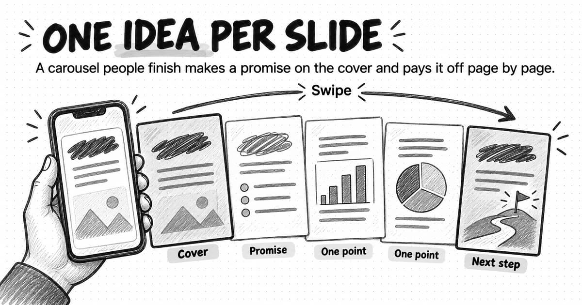
Make a LinkedIn carousel by designing one idea per page, exporting the pages as a single PDF, and uploading it as a document post with a title and post text. It works when the cover names a problem the reader has, the pages pay off that promise in order, the type is readable on a phone, and the last page asks for one thing.
Summary
A carousel people finish is built around one promise. The cover names a problem the reader recognizes and what they will have by the end, and each later page delivers one part of that payoff in an order that builds. Weak carousels are usually a longer piece cut into pages, with no single promise holding them together.
On LinkedIn today, an organic carousel is a document post: a PDF, PowerPoint, or Word file of up to 300 pages and 100 MB that readers swipe through, and that cannot be changed after posting. Multi-photo posts and paid carousel ads are different formats, and LinkedIn removed its old native carousel posts in December 2023.
The structure is cover, promise, body pages with one point each, recap, and one next step. Eight types suit B2B subjects, from frameworks and checklists to data stories and case studies. To test a draft, read only the headlines in order; they should tell the whole story.
Design for a phone: one page size throughout, usually portrait 4:5 or square, large type checked on a real phone, contrast of at least 4.5:1 for normal text, and one template. Because slide text is hard for many screen readers to reach, the post text should carry the key points too.
Judge a carousel with LinkedIn's own measures, such as impressions, saves, reposts, and comments, against the account's other posts rather than a benchmark. A worked example follows a fictional software company through a ten-slide carousel, and a copyable brief and slide outline help you plan the next one.
Contents
- What a LinkedIn carousel is today
- When a carousel is the right format, and when it isn't
- The anatomy of a carousel people finish
- Eight types of LinkedIn carousel for B2B
- How to write slide copy people read
- How to write the post text that goes with a carousel
- Design rules for LinkedIn carousels
- How to build and post the carousel file
- How to make a LinkedIn carousel accessible
- How to turn an article, webinar, or report into a carousel
- How to measure a LinkedIn carousel
- How to test and improve your carousels
- Common LinkedIn carousel mistakes
- Worked example: a ten-slide carousel, page by page (fictional)
- A copyable LinkedIn carousel brief and slide outline
- How Ampere helps you make LinkedIn carousels
- Sources and further reading
- Frequently Asked Questions
A founder finishes a 2,000-word article on why month-end close slips, and someone suggests turning it into a LinkedIn carousel. The obvious approach is to open a slide template, paste one paragraph per page, and export fourteen pages. The cover says the article's title. Page two starts the argument halfway through a thought. By page four the text is small enough that a reader on a phone has to zoom, and by page six many readers have scrolled away. The few who reach the end find a page that says "Thanks for reading."
Nothing in that carousel is wrong, exactly. The article was good. The problem is that a carousel is read differently from an article. Each page has to earn the next swipe, the reader decides from the cover whether the pages are worth their time, and the whole thing has to make sense on a small screen, one page at a time. A carousel that works is a new piece built around one promise, not a long piece cut into slides.
A LinkedIn carousel is a post that shows a multi-page document, usually a PDF, as pages a reader swipes through in the feed, so each page works like a slide. LinkedIn calls these document posts. Marketers kept the word carousel from LinkedIn's older carousel format and from carousel ads, and now use it for any swipeable document post. For a B2B company, the format suits ideas with parts or steps: a framework, a checklist, a process, a short report.
This guide is for founders and B2B marketers who want carousels that teach something and get saved. It covers what the format is today, using LinkedIn's own help pages, when to choose it, and how to structure, write, design, build, and measure one, with a worked fictional ten-slide example and a copyable brief.
What a LinkedIn carousel is today
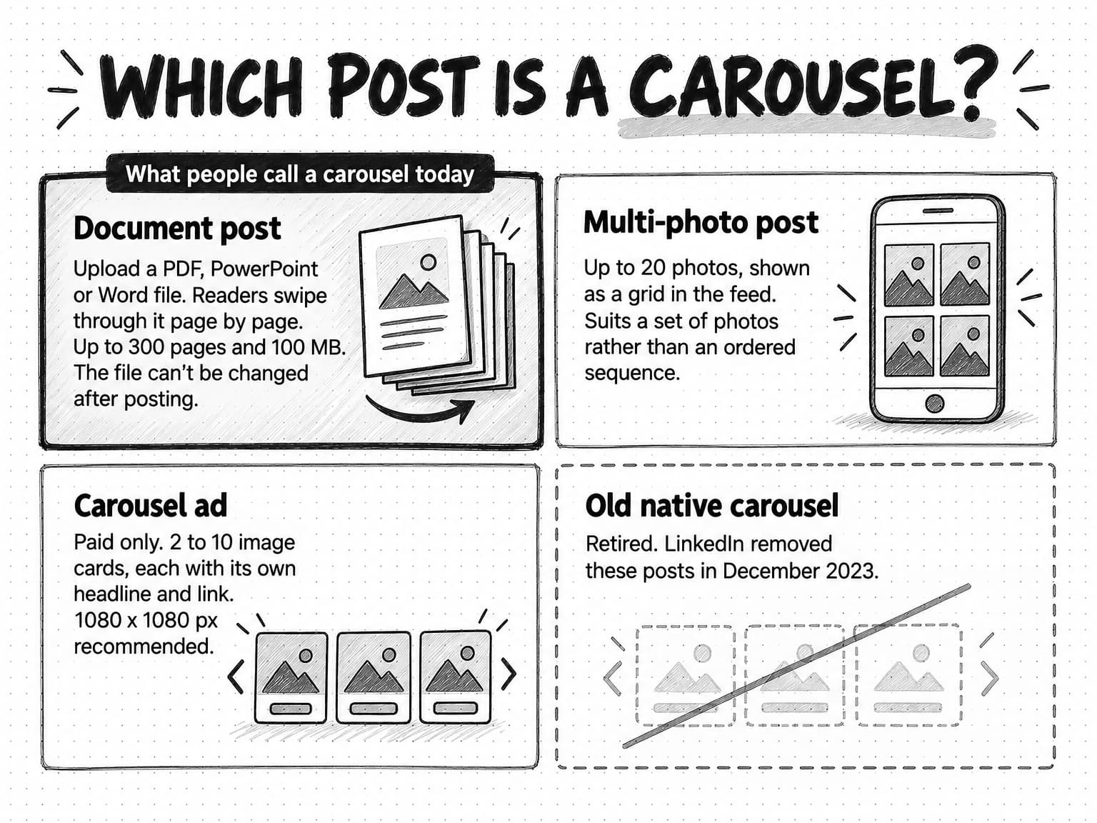
Three LinkedIn formats get called carousels, and a fourth one used to. They have different rules and uses.
Document posts are what people usually mean. You upload a file, LinkedIn shows it in the feed as pages, and readers swipe or tap through them. LinkedIn's help page on uploading and sharing documents lists the supported file types as PPT, PPTX, DOC, DOCX, and PDF, and says the file "cannot exceed 100MB and 300 pages." You can post a document from your own profile, a Group, or a LinkedIn Page. During upload LinkedIn asks for a document title, which readers see with the document. After posting you can edit the post's text or remove the post, but you cannot change the document itself. That last rule matters more than it sounds: a typo on page seven stays on page seven unless you delete the post and start again, losing whatever reactions and comments it had.
Multi-photo posts let you attach several images to one post. LinkedIn's help page on sharing photos says you can upload a maximum of 20 photos. The feed shows them as a grid whose layout depends on the first image's shape. That suits event photos or product shots, where order matters less, but not a sequence: the grid shows several images at once and can crop them to fit.
Carousel ads are a paid format with their own specifications. LinkedIn's carousel ad specifications call for a minimum of two cards and a maximum of ten, with each card an image file of up to 10 MB, and recommend 1080 x 1080 pixels at a 1:1 ratio. Each card can carry its own headline and link, which makes carousel ads better for a set of separate offers than for a teaching sequence. To promote a teaching document with paid budget, LinkedIn offers document ads instead.
The old native carousel is gone. LinkedIn once let members build a swipeable post from images and video directly in the composer. It stopped allowing new ones in 2023 and, according to a notice reported by Social Media Today, began removing existing carousels from December 14, 2023. Advice written before then sometimes describes that format; it no longer applies.
| Format | What it is | Organic or paid | Key limits from LinkedIn | Best for |
|---|---|---|---|---|
| Document post | A PDF, PowerPoint, or Word file shown as swipeable pages | Organic | Up to 300 pages and 100 MB; the file can't be changed after posting | Teaching sequences: frameworks, checklists, how-tos, short reports |
| Multi-photo post | Several images shown as a grid | Organic | Up to 20 photos | Sets of photos where order matters less |
| Carousel ad | Two to ten image cards, each with a headline and link | Paid | 1080 x 1080 px recommended, 10 MB per card | Several offers, products, or links in one ad |
| Document ad | A sponsored document | Paid | Under 10 pages recommended, 300 maximum | Promoting a teaching document to a targeted audience |
| Native carousel | A swipeable image and video post built in the composer | Retired | Removed from December 14, 2023 | Nothing; use a document post |
The rest of this guide is about document posts. Most of the craft also applies to document ads, which are the same kind of file shown to a paid audience.
When a carousel is the right format, and when it isn't
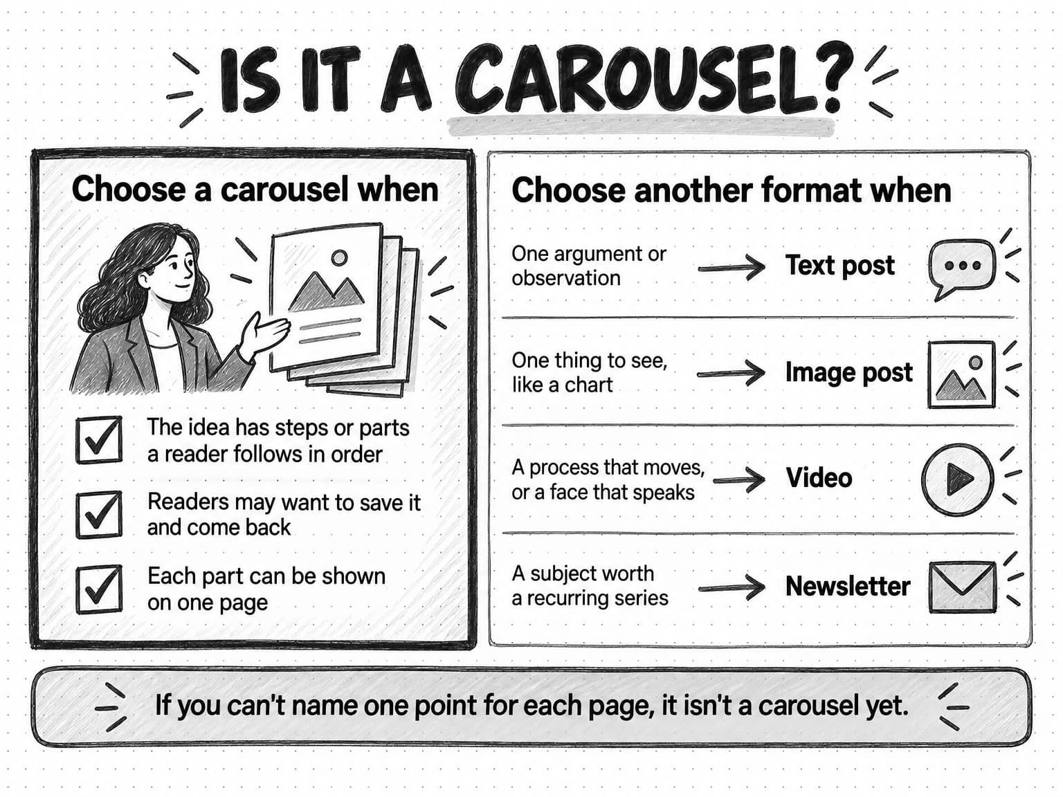
A carousel is the right format when the idea has parts a reader follows in order, the reader may want to keep it, and each part can be shown on one page. If any of those is missing, another LinkedIn format usually does the job with less effort.
The first condition matters most. Swiping is a sequence, so ideas with a natural order fit: a five-step process, a four-part framework, a checklist, a short report on one finding. An argument that is really one thought, such as "most onboarding emails are too long," needs a well-written text post, not eight pages that make the reader work harder for the same point.
The second condition is about value after the first read. A reader who saves a checklist opens it again when they do the work, and LinkedIn counts saves as an engagement in its post analytics. If no one would come back to the content, a carousel's main advantage is gone.
The third condition is practical. A page has room for a headline, a line or two, and perhaps a simple visual. A point that needs a paragraph of nuance to be true belongs in a text post or article; squeezing it onto a page can make a careful claim misleading.
Benchmark data suggests the format performs well for company pages when it fits. Socialinsider, a social media analytics company, analyzed 1.3 million posts from 16,645 LinkedIn business pages published from January 2024 to December 2025 for its 2026 LinkedIn benchmarks. Native documents had the highest average engagement rate of any format in 2025, at 7.00%, up from 6.10% in 2024, ahead of multi-image posts at 6.45% and text posts at 4.50%. Socialinsider calculates engagement rate as engagements divided by impressions. For pages with 1,000 to 5,000 followers, documents also had the most average impressions per post, about 525. These are averages across many pages, and pages choose formats for their own reasons, so the figures show an association, not that switching a post to a carousel will raise its engagement.
| If the idea is... | Use | Why |
|---|---|---|
| A process, framework, checklist, or short report with parts | Carousel | The reader follows the parts in order and may save it |
| One argument, observation, or lesson | Text post | One idea does not need pages; the opening lines carry it |
| One thing the reader needs to see, such as a chart or screenshot | Image post | A single image shows it faster than a sequence |
| A process that moves, a demonstration, or a person speaking | Video | Motion and voice carry what a static page cannot |
| A subject you will return to again and again | Newsletter | Subscribers are notified about each edition |
| A full method with nuance and sources | Article on your site, plus a carousel that teaches one part of it | The article holds the detail; the carousel brings readers to the idea |
Our guide to LinkedIn content strategy for B2B covers how carousels fit with text posts, polls, newsletters, and video across a company page, the founder, and the team, and founder-led marketing covers the founder's own posts. If the subject is a recurring series, our guide to B2B newsletter strategy covers LinkedIn newsletters, and for subjects that need motion, the guide to B2B video marketing covers which videos to make.
The anatomy of a carousel people finish
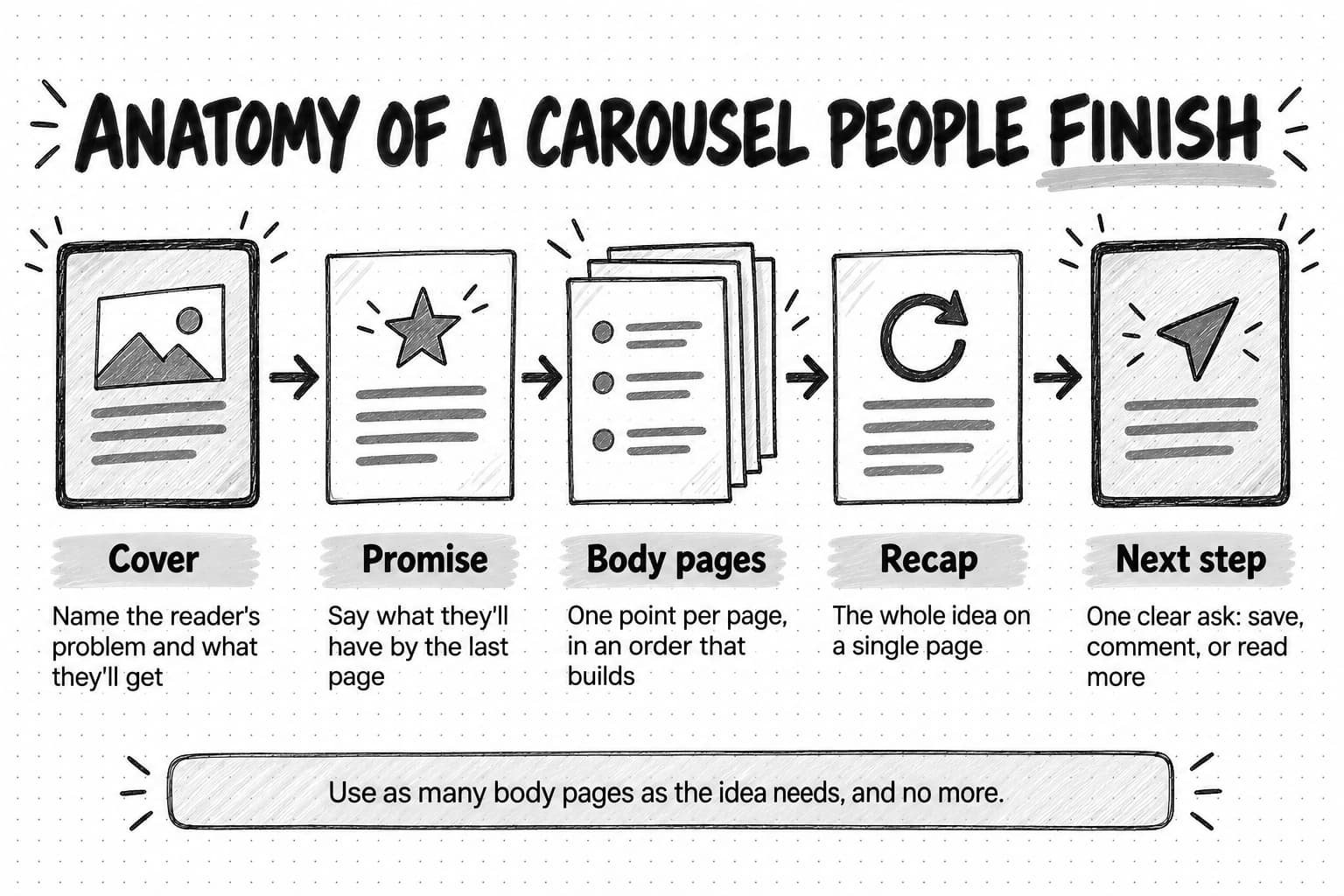
A carousel people finish has five parts: a cover that names the reader's problem and what they will get, a promise that sets expectations, body pages that each make one point in an order that builds, a recap that puts the whole idea on one page, and a final page that asks for one thing. Each part has a different job, and leaving one out shows.
The cover: name the problem and the payoff
For many readers, the cover is the only page they see. It appears in the feed below your post text, and a reader decides in a moment whether to swipe. A good cover does two things: it names a problem or goal the reader recognizes, and it tells them what they will have if they keep going.
Compare two covers for the same carousel. "Month-end close best practices" names a topic but gives no reason to swipe; the reader can't tell whether the pages hold anything new. "5 invoice exceptions that delay your close, and who should fix each one" names a specific problem, a number that tells the reader how much there is, and a payoff they can use. The second cover is longer, but every word helps the reader decide.
A number tells the reader the size of the commitment. Naming the reader ("for finance leads at growing companies") helps the right people stop. A concrete outcome beats an abstract one like "improve your process." And large type matters most here, since the cover is often seen at its smallest.
Avoid a cover that only teases. "You're doing this wrong" may earn a swipe, but if page two doesn't immediately say what and why, the reader feels tricked and leaves. LinkedIn's March 2026 announcement on improving the feed says it wants "less generic content and engagement bait" and more "posts that offer genuine insight, actionable ideas, and thoughtful perspectives." A cover that states its payoff plainly fits what LinkedIn says it is trying to show.
The promise page: set expectations
The second page tells the reader what the carousel will do for them and, often, why it matters: what a checklist is for and when to use it, or the problem a framework solves. One or two sentences are enough.
This page is also where you earn trust. Say what the carousel is based on, such as your own data, a customer project, or a published source. If it is opinion, say that too; a clearly framed point of view is more credible than an opinion dressed up as a rule.
Body pages: one point each, in an order that builds
The body pays off the promise, one point per page. That rule is what makes the format readable: when a page holds two ideas, the reader has to work out which is the main one, and on a small screen many won't.
Order matters as much as content. A step-by-step carousel follows the order people do the work; a framework often runs from the most basic part to the most advanced; a myth-and-fact carousel can end with the most surprising belief so interest rises. If you could shuffle the body pages without anyone noticing, the carousel is a list that needs a stronger organizing idea.
Number the points when they are a set. "3 of 5" tells the reader how far they have come and how much is left, which makes the end feel reachable.
How many body pages? As many as the idea needs. A checklist of five items needs five body pages, or fewer if items group naturally. LinkedIn's document ads specifications recommend keeping sponsored documents under 10 pages, and while that is advertising guidance, six to twelve pages in total is a sensible range for most organic teaching carousels. If you find yourself at twenty, the carousel probably holds two ideas, and it may be two carousels.
The recap page: the whole idea on one page
Near the end, put the whole idea on a single page: the five steps in one list, the framework in one diagram, the checklist in one table. This is the page people screenshot and save, and the one they return to when they do the work. The cover promised; the recap delivers in compressed form, like a reference card.
The last page: ask for one thing
The final page tells the reader what to do next, and it should ask for one thing. Good asks for a teaching carousel include saving the post for later, answering a specific question in the comments, following the author for the rest of a series, or reading the full article or report the carousel came from. Each is honest and connected to the content.
Avoid stacking asks ("like, comment, repost, follow, and visit our site"), which dilutes each one, and avoid bait such as "comment YES for the template," the kind of post LinkedIn says it is reducing. A question that invites a real answer produces comments worth replying to. If you link to something, put the link in the post text too, since links inside a PDF are easy to miss on a phone, and make sure the carousel is useful to people who never click.
Eight types of LinkedIn carousel for B2B
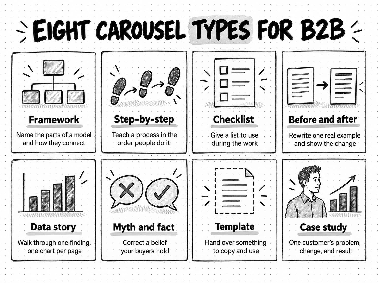
Most good B2B carousels follow one of eight patterns. Choosing the type first makes the rest of the work easier, because each type has a natural structure and suits a different kind of material.
| Type | What it gives the reader | Natural structure | Fits when you have |
|---|---|---|---|
| Framework | A model with named parts and how they connect | Problem, then one part per page, then the whole model | A way of thinking your team uses and can explain |
| Step-by-step | A process in the order people do it | Goal, then one step per page, then a summary list | A task your audience does repeatedly |
| Checklist | A list to use during the work | Purpose, then items grouped by stage, then the full list | A review or launch your audience runs |
| Before and after | A real example improved, with the change explained | The original, then one change per page, then the result | A piece of copy, a page, or a process you can show |
| Data story | One finding walked through, one chart per page | The question, the method, the finding, what it means | Your own data, or a careful reading of a published study |
| Myth and fact | Corrections to beliefs buyers hold | One belief and its correction per page | Evidence that a common belief is wrong |
| Template | Something to copy and use | What it's for, then each section explained, then the blank template | A document, brief, or worksheet your team relies on |
| Case study | One customer's problem, change, and result | Situation, problem, what changed, result, lesson | A customer who has agreed to be named, and real results |
A few of these types need extra care. Frameworks work when your team really uses the model and can explain why its parts are ordered the way they are; a framework invented for the post usually shows. Checklists invite saves, because people use them during the work; when there are more than six items, group them by stage so each page holds one stage. Data stories are strongest with your own data, which no one else has, and our guide to original research covers how to produce it; if you use someone else's study, cite it on the page and keep its limits. Myth and fact carousels need evidence for each correction, or they are only disagreements. Case studies need a customer who has agreed to be named and results you can state accurately; our guide to writing a B2B case study covers both.
View the eight carousel types at full size (opens in a new tab).
How to write slide copy people read
Slide copy is closer to headline writing than to article writing. Each page has seconds of attention, on a small screen, and the reader can't scroll back up the page to find context. Four habits make slide copy work.
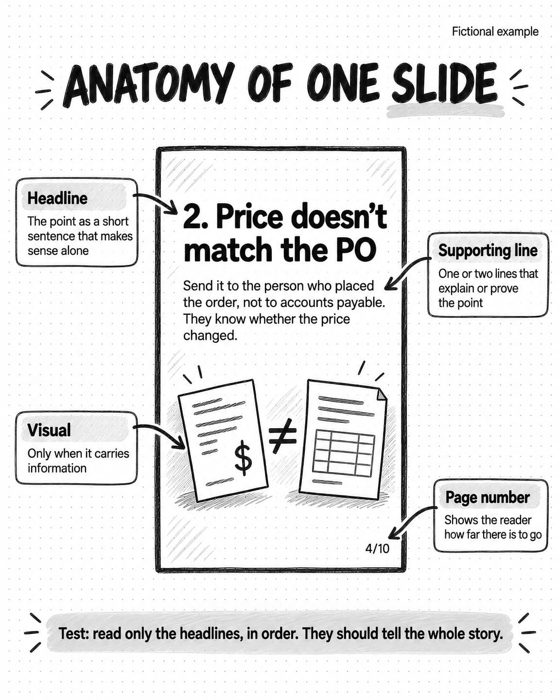
Make each headline a complete point. The headline on a body page should state the point as a short sentence, not name a topic. "Missing purchase order" names a topic; "Missing purchase orders stall an invoice until someone decides who approves it" makes a point. Some slides need only the topic as a label, such as a numbered exception, with the point in the line beneath. Either way, the reader should understand the page's point from its largest text.
Keep the word count low. There is no LinkedIn rule on words per page, but phone screens set a practical limit. As a working rule, keep a headline to about 12 words and the whole page to about 40, with the cover and last page shorter still. If a page needs more, it holds two ideas, or it needs an example rather than more explanation. These are editorial rules of thumb, not measured thresholds; check your own pages on a phone.
Use a clear hierarchy. Each page should have one largest element, usually the headline, and at most one or two supporting lines. A small page number and an optional visual complete it. When everything is the same size, the reader doesn't know where to start.
Write plainly. Short words and sentences read faster on a small screen. Use acronyms only when every intended reader knows them, and cut filler such as "it's important to note."
A quick test catches many problems: read only the headlines, in order. If the headlines alone tell the story, the carousel is structured well, and a reader who swipes quickly still gets the point. If the headlines read like a list of topics, rewrite them as points. If one headline doesn't follow from the one before, the order needs work.
Visuals earn their place when they carry information: a diagram of how a framework's parts connect, a before-and-after screenshot, one simple chart with the key point labeled. A decorative stock photo takes space from the text and slows the reader down.
How to write the post text that goes with a carousel
The post text is the words above the document in the feed. It does three jobs: it gives a reason to open the document, it carries the key points for readers who won't swipe or can't easily read the slides, and it gives context the slides don't have room for.
LinkedIn's help page on posting says posts can contain up to 3,000 characters, but the feed shows only the opening lines before readers tap to see more. So the first two lines matter most. Like the cover, they should name the problem and the payoff, but add something the cover doesn't say, such as why you wrote it or who it's for.
Below the opening, summarize the carousel's points in plain text, a sentence or a list item for each. That helps readers who don't open the document and readers using screen readers, covered in the accessibility section below. It may feel like giving the carousel away, but a reader who finds the points useful is more likely to open the document and save it. End with the same single ask as the last page. Tag people or companies only when they are part of the content, such as a customer in a case study who has agreed to it.
The document title, which LinkedIn asks for during upload, is a separate field. Use a plain description of what the document is, such as "5 invoice exceptions that delay month-end close." Readers see it with the document, and a clear title helps people who download the PDF find it again later.
Design rules for LinkedIn carousels
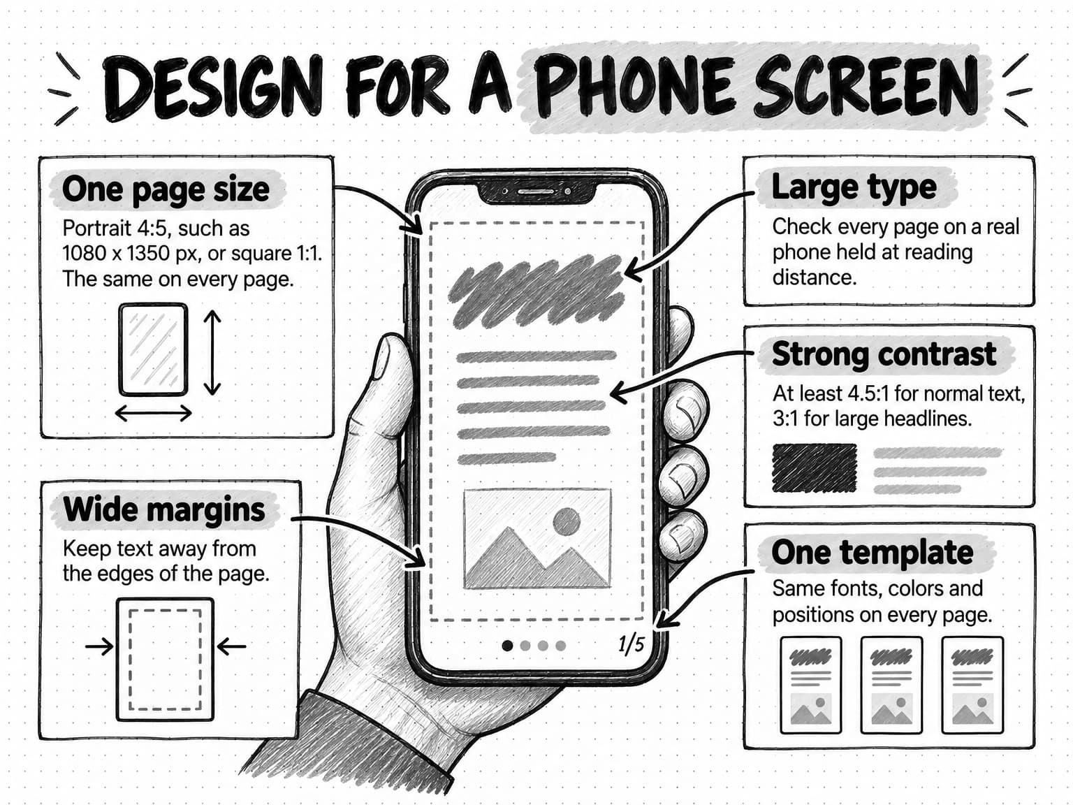
Design for a phone screen, because many of your readers will see the carousel on one, and a page that works on a phone will also work on a desktop. Five rules cover most of the design decisions.
Choose one page size and keep it. LinkedIn's help pages don't set a required page size for organic document posts. Its document ads specifications accept vertical, horizontal, and square documents, list standard page sizes such as Letter and A4, and say that PDFs with pages of different sizes "must be fit to the same page size." For organic carousels, the common choices are a portrait 4:5 page, such as 1080 x 1350 pixels, or a square page, such as 1080 x 1080 pixels. A portrait page takes up more of a phone screen than a square or landscape one. Landscape pages, like the default slide size in presentation software, appear small in a phone feed, so if you build in presentation software, change the slide size before you start rather than at the end. Whatever you choose, use it on every page.
Make the type large and check it on a phone. Text that looks fine on a laptop can be unreadable on a phone, and LinkedIn sets no minimum. Send the exported PDF to your phone and read every page at normal distance. If you have to zoom, the type is too small.
Use strong contrast. Light grey text on white, or brand-colored text on a brand-colored background, often fails on small screens and in bright light. The Web Content Accessibility Guidelines set a minimum contrast ratio of 4.5:1 for normal text and 3:1 for large text, which WCAG defines as at least 18 point, or 14 point bold. Those standards are written for web content, but they are a sound target for carousel pages, and free contrast checkers will tell you whether your color pairs pass.
Leave wide margins. Text close to the edge looks cramped. Keep it well inside the page, with the same margins on every page.
Use one template. Put the headline, supporting text, page number, and any author line in the same positions on every page, in the same fonts and colors. Consistency lets the reader focus on the content and makes your carousels recognizable over time. A template built from your brand's colors, typefaces, and visual style turns every new carousel into a fill-in exercise rather than a design project. Our guide to brand identity covers the elements a brand kit should define.
Two smaller rules follow. Use one or two typefaces at most. And don't rely on color alone to carry meaning, such as red for bad and green for good; add a label or symbol, because some readers can't tell the colors apart.
How to build and post the carousel file
Any tool that exports a multi-page PDF can make a carousel: presentation software, a design tool with carousel templates, or a word processor. The export matters more than the tool, and a short checklist prevents most problems that only appear after posting, when the file can no longer be changed.
- Set the page size before you design. Changing it at the end usually breaks the layout.
- Export a single PDF. LinkedIn accepts PowerPoint and Word files too, but a PDF gives you the most control over how pages look, because fonts and layout are fixed. LinkedIn's document ads specifications say that "PDFs with multiple layers must be flattened or merged," which is worth doing for organic posts as well if your design tool exports layers.
- Keep the text as text where your tool allows. Exporting text as real text, rather than flattening whole pages into images, keeps the PDF readable by screen readers and searchable for people who download it. Some design tools flatten pages by default; check the export settings.
- Check the file size. LinkedIn's limit is 100 MB, but a smaller file uploads faster and is easier to download.
- Proofread the exported PDF, not the design file. Open the PDF on your phone and read every page. Check spelling, numbers, names, and page numbers. Remember that after posting, the document cannot be edited.
- Upload as a document post. On desktop, start a post, choose the option to add a document, select the file, add a title, write the post text, and post. LinkedIn's help page describes the same steps on mobile.
- Check the live post. Open it on a phone and on a desktop. Swipe through every page. If something is wrong, it's better to delete and repost quickly, before the post gathers comments.
If you schedule posts with a social media management tool, check that it supports document posts. Our guide to social media automation covers what to automate and what to keep human, including the review step before anything is published.
How to make a LinkedIn carousel accessible
A carousel's text is mostly locked inside page images, and that creates real barriers for some readers. Accessibility consultants at Intopia tested LinkedIn carousels in July 2024 and found that screen readers handled them reliably only for very simple content, that the reading order didn't always follow the PDF's, and that text on pages didn't respond to user settings such as high contrast mode. Their advice was to reconsider carousels when inclusivity matters and to design both the images and the PDF for accessibility when you do use them.
LinkedIn's document help page says that "for accessibility purposes, members who can view your post will be able to download your document as a PDF." That download is useful only if the PDF itself is readable by assistive technology, which is another reason to export text as text.
Five practices make a carousel usable by more people:
- Put the key points in the post text, a sentence for each body page, so a screen reader user gets the content even when the document is hard to navigate.
- Export a PDF with real text, in reading order. Use your tool's tagged or accessible PDF option where it has one, and keep one column of text per page.
- Meet contrast minimums and keep type large, which also helps readers with low vision.
- Don't carry meaning by color alone. Pair colors with labels or symbols.
- Offer a text version of a checklist or template as a web page or document linked in the post text.
How to turn an article, webinar, or report into a carousel
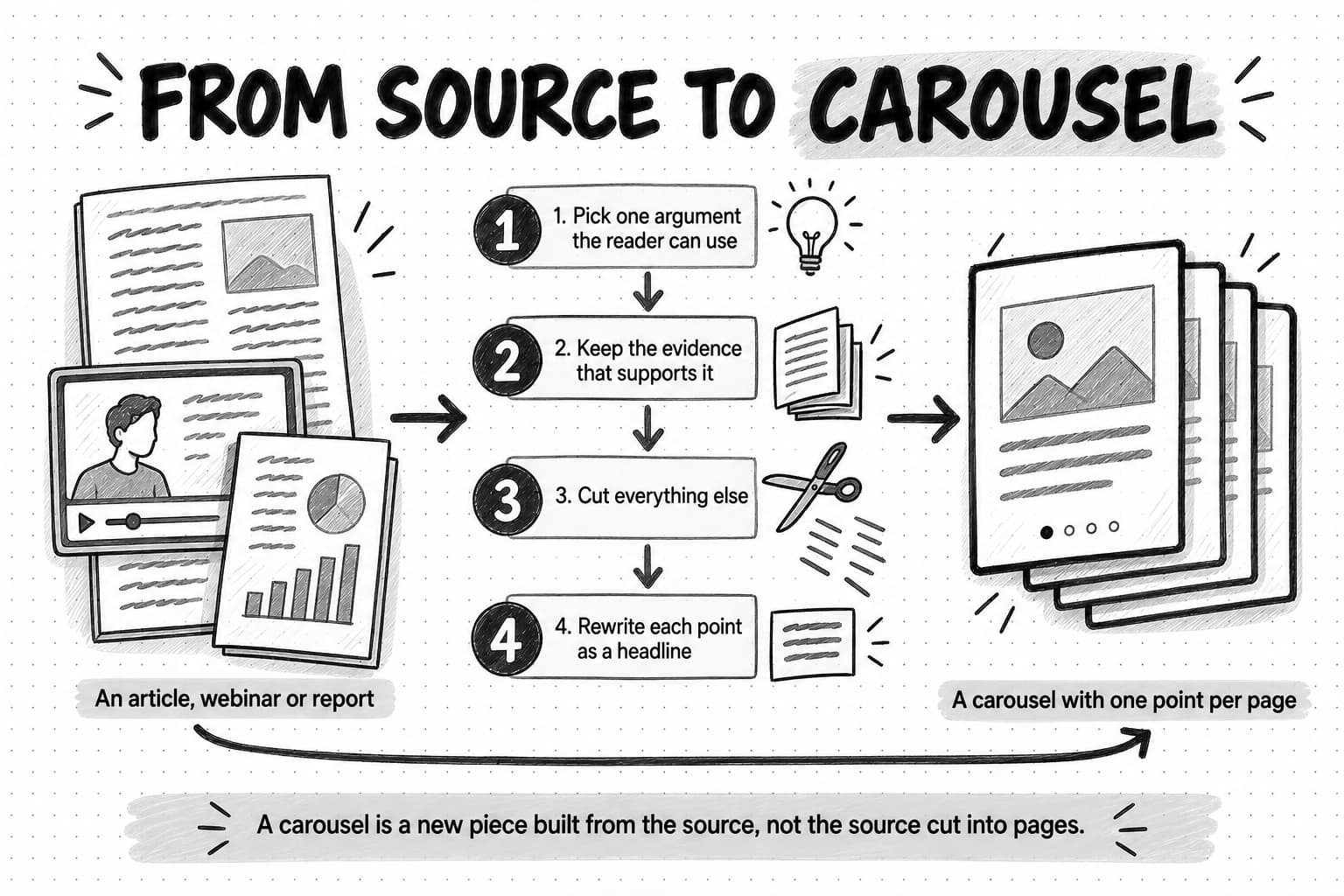
Many of the best carousels come from material you already have: a blog article, a webinar recording, a research report, a customer interview. The trap is to cut the source into pages, which is what happened in the example at the start of this guide. A carousel is a new piece built from the source, and building it takes four decisions.
Pick one argument the reader can use. A 2,000-word article usually holds several ideas. A carousel should carry one. Choose the one a reader can act on, or the one that is most surprising, and leave the rest for other posts. A webinar might yield a framework carousel from one segment and a myth-and-fact carousel from the Q&A.
Keep the evidence that supports it. The source's credibility comes from its evidence: the data, the customer example, the specific result. Keep enough of it on the pages that the argument stands, and keep its limits. If the source said "in our sample of twelve customers," the carousel should not turn that into a general rule.
Cut everything else. Background, caveats that don't change the reader's action, related ideas, the history of how you got there: these all have a home in the source, and the post text can link to it. The carousel has room for the argument and its proof.
Rewrite each point as a headline. Paragraphs from the source rarely work as slide copy. Rewrite each point as a short sentence a reader can understand alone, then check the headline test.
Then choose the type that fits: a how-to article becomes a step-by-step carousel, a research report a data story. Our guide to repurposing content across channels works through a full example, from a fictional webinar to an article, a LinkedIn post, a carousel, and a short video, including how to check what the source really supports before adapting it.
How to measure a LinkedIn carousel
Measure a carousel with the questions it was meant to answer: did the right people see it, did they find it useful enough to save, repost, or comment, and did it lead to anything such as profile visits, follows, or conversations? LinkedIn's analytics answer the first two well and the third partly.
LinkedIn's combined post analytics define the basic measures for posts on a member's profile. Impressions are "the number of times your post was displayed on screen," and LinkedIn notes that the number "is an estimate and may not be precise." Members reached counts the distinct members and pages who viewed the post, without repeat views. Engagements include "reactions, comments, saves, sends, and reposts," and impressions are split into in-network and out-of-network shares. LinkedIn's help page on post analytics lists further sections for individual posts, including discovery, profile activity, social engagement, and post viewer demographics. Page admins see content performance in Page analytics.
For a teaching carousel, these measures matter most:
| Question | Measure | Why it matters for a carousel |
|---|---|---|
| Did people see it? | Impressions and members reached | The baseline; compare with your other posts, not with someone else's |
| Did it reach beyond your network? | Out-of-network share of impressions | Shows whether the subject traveled to new readers |
| Was it useful? | Saves and sends | Saves are a strong sign of reference value; sends mean someone thought a colleague needed it |
| Did it start a conversation? | Comments, read for quality | A comment from a peer with a real question is worth more than several from colleagues |
| Did it travel? | Reposts | Someone put their name next to it |
| Did it lead anywhere? | Profile activity, follows, and messages or meetings that mention it | The link from content to relationships, partly visible in analytics |
Two cautions apply. First, LinkedIn's help pages for post analytics don't document a measure of how far readers swiped, so saves and comments that refer to later pages are your best signs that people reached the end. Second, compare a carousel with the same account's other posts over time. Socialinsider's 7.00% average for documents is context, but an account's own trend tells you more.
Read the comments as well as counting them, to see whether the carousel reached the people you want as customers. Our guide to measuring content marketing ROI covers how to connect content like this to pipeline when attribution can't see much of its influence.
How to test and improve your carousels
A single carousel's numbers say little, because so much varies from post to post. Improvement comes from posting carousels regularly, changing one thing at a time, and keeping a log with one row per carousel: date, type, subject, cover headline, page count, and the measures above after a fixed period such as seven days. After eight or ten carousels, patterns start to show; you might find, for example, that checklists draw more saves than frameworks.
When you test, change one variable and keep the rest the same. Useful variables to test include:
- The subject. Two subjects in the same type and template show which problems your audience cares about.
- The cover. Try a different promise for a similar subject: a number versus a question, a named reader versus a general one.
- The type. The same subject as a checklist and as a framework.
- The length. Fewer pages with denser points, or more pages with one small point each.
- The post text. A different opening line, or a summary of the points versus a teaser.
Treat results as directional: with small numbers, a difference between two posts may be noise, so act on patterns that hold across several carousels. Reposting a strong carousel months later, with a refreshed cover and post text, is also a fair test, since many followers will not have seen it. Our guide to content pillars covers how to plan subjects you can return to.
Common LinkedIn carousel mistakes
Cutting a long piece into pages. The mistake from the opening of this guide. Build the carousel around one promise instead.
A cover that names a topic but not a payoff. "Pricing strategy" gives no reason to swipe. Name the problem and what the reader will get.
Two ideas on one page. The reader has to work out which is the point. Split the page, or cut one idea.
Type too small, or landscape pages. Both make pages hard to read in a phone feed. Use portrait or square pages and check every one on a phone.
No recap. Without a page that holds the whole idea, readers have nothing to save and come back to.
Stacked or baiting calls to action. Ask for one thing, and make it honest.
Post text that says nothing. "New carousel! Swipe to see more" wastes the most-read words in the post. Use the opening lines to name the payoff and summarize the points below.
Claims the source doesn't support. Shortening a careful finding into a slide headline can turn it into a rule it never was. Keep the source's limits, and cite it on the page.
Judging a format by one post. A carousel that underperforms may have had a weak subject or cover. Test several before deciding carousels don't work for your account.
Worked example: a ten-slide carousel, page by page (fictional)
This example follows Pellwick, a fictional company that makes accounts payable software for finance teams at mid-size companies. Its marketing lead wants a carousel for the company page and the head of customer success's profile, based on what the customer success team sees during month-end close. Everything about Pellwick, its customers, and its observations is invented for illustration.
The brief. The reader is a finance lead or accounts payable manager at a growing company whose month-end close regularly runs late. The problem is that invoices with exceptions sit in a queue because no one has decided who resolves each kind of exception. The promise is a list of five common invoice exceptions with the person who should decide each one. The type is a checklist, chosen because readers will use it during their own close. The evidence is the customer success team's experience, stated as such rather than as data. The ask is to save the post for the next close and to answer a question in the comments.
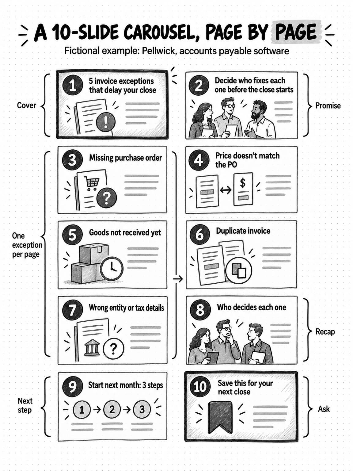
The slides. Here is the copy for each page, as it would appear.
- Cover. Headline: "5 invoice exceptions that delay your close." Supporting line: "And who should fix each one. For finance and accounts payable leads." Small author line: the head of customer success's name and role.
- Promise. Headline: "Decide who fixes each one before the close starts." Supporting line: "An invoice with an exception waits until someone decides what to do. These are the five our customer success team sees most often during close."
- Exception 1. Headline: "1. Missing purchase order." Supporting line: "Send it to the budget owner for the cost center. They can approve it or explain why there's no PO."
- Exception 2. Headline: "2. Price doesn't match the PO." Supporting line: "Send it to the person who placed the order, not to accounts payable. They know whether the price changed."
- Exception 3. Headline: "3. Goods not received yet." Supporting line: "Ask the receiving team to confirm delivery. If it arrived, the receipt is the fix; if not, hold the invoice."
- Exception 4. Headline: "4. Duplicate invoice." Supporting line: "Accounts payable can resolve this alone. Compare invoice number, amount, and date, then reject the copy."
- Exception 5. Headline: "5. Wrong entity or tax details." Supporting line: "Send it back to the supplier with the correct details. Don't fix it internally; the record should match what the supplier issued."
- Recap. Headline: "Who decides each one." A simple two-column table: missing PO, budget owner; price mismatch, the person who ordered; goods not received, receiving team; duplicate, accounts payable; wrong entity or tax details, the supplier.
- Next step. Headline: "Start next month: 3 steps." Supporting lines: "Agree the owners in this table with each team. Add them to your close checklist. Review the exception queue on day one of the close, not day four."
- Ask. Headline: "Save this for your next close." Supporting line: "Which of these exceptions costs your team the most time?"
Why it is built this way. The cover names the reader, the problem, and a numbered payoff. The promise page says where the list comes from without inventing data. Each body page holds one exception and one decision, the recap is the page readers will save, and the last page asks for a save and a question with a real answer. Read only the headlines and they tell the whole story.
The post text. The first lines say what the cover doesn't: "Most late closes we see aren't caused by the close itself. They're caused by invoices that sat in a queue for a week because no one owned the decision." Then a plain list of the five exceptions and their owners, so the content is available to anyone who doesn't open the document. It ends with the same question as page 10. The document title is "5 invoice exceptions that delay month-end close."
What Pellwick would check. After seven days, the marketing lead compares impressions, saves, and comments with the page's previous ten posts and reads whether the commenters are finance leads. Strong saves would suggest repeating the checklist type with another subject, such as approval delays.
View the ten-slide example at full size (opens in a new tab).
A copyable LinkedIn carousel brief and slide outline
Fill in the brief before you open a design tool. It prevents many of the mistakes above, because it forces the decisions about reader, promise, type, and evidence before any page exists. The slide outline then gives every page a job. For a longer briefing process, our guide to writing a content brief covers the same thinking for any format.
LINKEDIN CAROUSEL BRIEF

Reader:            Who is this for? (role, company type, situation)
Problem:           What are they stuck on or trying to do?
Promise:           What will they have by the last page? (one sentence)
Type:              Framework / Step-by-step / Checklist / Before and after /
                   Data story / Myth and fact / Template / Case study
Evidence:          What is this based on? (own data, customer example,
                   cited source, team experience, opinion)
Limits:            What should the carousel not claim?
Account:           Company page, founder, team member, or several
Ask:               The one thing the last page asks for
Source to link:    Article, report, or page (if any)
Review:            Who checks the facts and approves it before posting?

SLIDE OUTLINE (one point per page; read the headlines alone as a test)

1  Cover        Headline:                Support line:
2  Promise      Headline:                Support line:
3  Point 1      Headline:                Support line:
4  Point 2      Headline:                Support line:
5  Point 3      Headline:                Support line:
6  Point 4      Headline:                Support line:
7  Point 5      Headline:                Support line:
8  Recap        The whole idea on one page:
9  Next step    What the reader does now:
10 Ask          The single request:

POST TEXT

Opening lines (what the cover doesn't say):
Points in plain text (one line per body page):
Closing ask:
Document title:

BEFORE POSTING

[ ] Same page size on every page (portrait 4:5 or square)
[ ] Every page read on a phone at normal distance
[ ] Contrast checked (4.5:1 normal text, 3:1 large text)
[ ] Exported PDF proofread: spelling, numbers, names, page numbers
[ ] Text exported as text where the tool allows
[ ] Key points in the post text
[ ] Source cited on the page where a claim depends on it
Adjust the outline to the type; a case study, for example, replaces the points with situation, problem, change, and result. The cover, promise, recap, and ask stay in every version.
How Ampere helps you make LinkedIn carousels
Ampere is an AI marketing agent that can take on much of the research, writing, and design work in this guide, while your team chooses the subject, checks the facts, and decides what to post.
For a carousel, Ampere can start from a named topic, from recommendations it researches for your brand, or from source material you share as a link, an attachment, or pasted text, such as an article, a page, a deck, or a recording when it is readable. When it works from a source, you can choose how the carousel uses it: as a summary, as a teaser for the full piece, as inspiration, or in a way you describe. On paid plans, Ampere first shows content-style and visual-style choices as example decks to set the direction, then produces a carousel of 3 to 20 slides as a PDF, with a caption, built for your brand, topic, objective, and audience.
The brand side of the work draws on Brand memory, Ampere's saved and reviewable knowledge about your brand, including its colors, visual identity, voice, products, audience, and competitors. That is what keeps a carousel's fonts, colors, and tone consistent from one deck to the next without rebuilding a template each time. You can watch a replay of a real Ampere session building a LinkedIn carousel, in which Ampere reads a set of release notes, asks about the objective and style, produces eight slides, reviews the whole deck and regenerates slides that drifted from the brand's style, and packages the PDF with a suggested caption and posting steps.
Ampere can also audit one LinkedIn company page from up to about 70 of its recent public posts and recommend topics to focus on; its engagement figures are public counts and can be partial. On paid plans, a scheduled task can prepare recurring drafts, such as a weekly list of carousel ideas, and return each result to a Project for review.
Ampere drafts and designs; it does not post to LinkedIn for you. Someone on your team reads every page, checks every claim, and uploads the PDF. AI output can be inaccurate or incomplete, which is why the review step in the brief above matters.
Owners who have never had a paid plan can start on the Free Plan with no card required. Ampere sets up the Organization's Brand memory, then completes up to four Free tasks for the brand, one of which is a LinkedIn carousel: an eight-slide carousel for the company page, researched from Brand memory, the company's LinkedIn page, Reddit, and the web, or built from a link or text you share.
Sources and further reading
- LinkedIn Help, Upload and share documents on LinkedIn, accessed October 17, 2026. File types, 100 MB and 300-page limits, title, editing after posting, and PDF download for accessibility.
- LinkedIn Help, Share photos on LinkedIn, accessed October 17, 2026. Multi-photo posts of up to 20 photos and their layout.
- LinkedIn Help, Carousel Ads advertising specifications, accessed October 17, 2026. Card count, image size, and text limits.
- LinkedIn Marketing Solutions, Document Ads specs, accessed October 17, 2026. Page count recommendation, aspect ratios, standard page sizes, and PDF requirements.
- LinkedIn Help, Post and share updates, accessed October 17, 2026. The 3,000-character post limit.
- LinkedIn Help, Combined post analytics, View post analytics for your content, and LinkedIn Page analytics, accessed October 17, 2026.
- LinkedIn Corporate Communications Team, How LinkedIn is improving the Feed to show more relevant, authentic professional content, LinkedIn Pressroom, March 12, 2026.
- Andrew Hutchinson, LinkedIn says that previously posted carousel posts will be deleted from the app, Social Media Today, November 9, 2023.
- Elena Cucu, LinkedIn organic benchmarks 2026, Socialinsider, March 16, 2026. 1.3 million posts from 16,645 business pages, January 2024 to December 2025; engagement rate is engagements divided by impressions.
- Naomi Saines and Tess Hutley, Navigating the accessibility challenges of LinkedIn carousels, Intopia, July 16, 2024.
- W3C, Understanding Success Criterion 1.4.3: Contrast (Minimum), Web Content Accessibility Guidelines 2.2.
Frequently Asked Questions
What is a carousel post on LinkedIn?
A carousel post on LinkedIn is a document post: a PDF, PowerPoint, or Word file that LinkedIn shows in the feed as pages a reader swipes through, so each page works like a slide. LinkedIn removed its older native carousel format in December 2023, so today the word usually means a document post, although carousel ads are a separate paid format.
What size should a LinkedIn carousel be?
LinkedIn doesn't set a required page size for organic document posts, so use a portrait 4:5 page, such as 1080 x 1350 pixels, or a square page, such as 1080 x 1080 pixels. Portrait takes up more of a phone screen. Use the same size on every page. Carousel ads are different: LinkedIn recommends 1080 x 1080 pixel image cards.
What format should a LinkedIn carousel be?
A LinkedIn carousel should usually be a single PDF. LinkedIn also accepts PowerPoint and Word files, up to 100 MB and 300 pages, but a PDF fixes the fonts and layout so every page looks the way you designed it. Export text as real text where your tool allows, so the file stays readable by screen readers when people download it.
Do carousel posts perform well on LinkedIn?
Carousel posts tend to perform well on LinkedIn when the content suits the format. In Socialinsider's analysis of 16,645 business pages, native documents had the highest average engagement rate of any format in 2025, at 7.00%. That is an average across many pages, not a promise for any one post; a carousel works when each page makes one clear point and readers want to save it.
How many slides should a LinkedIn carousel have?
A LinkedIn carousel should have as many slides as its idea needs; for a teaching subject, aim for six to twelve. LinkedIn allows up to 300 pages, but it recommends keeping sponsored documents under 10 pages. A cover, a promise page, one body page per point, a recap, and a final ask is a reliable structure; at twenty pages, the carousel probably holds two ideas.
What is the difference between a LinkedIn carousel and a multi-image post?
A LinkedIn carousel is a document whose pages readers swipe through in a fixed order, while a multi-image post attaches up to 20 photos that the feed shows as a grid. Carousels suit sequences such as frameworks, checklists, and step-by-step guides. Multi-image posts suit sets of photos, such as an event, where the order matters less.
How do you make a LinkedIn carousel in Canva or PowerPoint?
To make a LinkedIn carousel in Canva, PowerPoint, or a similar tool, set a portrait or square page size first, design one point per page in a consistent template, and export a single PDF. Proofread the PDF on a phone, then start a LinkedIn post, add it as a document, give it a title, and write post text that summarizes the points.
Can you edit a LinkedIn carousel after posting?
You cannot edit the document in a LinkedIn carousel after posting. LinkedIn lets you edit the post's text or delete the post, but the pages stay as uploaded. To fix an error on a page, you have to delete the post and upload a corrected file, which loses the original post's reactions and comments, so proofread the exported PDF before posting.
Are LinkedIn carousels accessible?
LinkedIn carousels are only partly accessible. Accessibility testers have found that screen readers handle them reliably only for very simple content and that slide text doesn't respond to settings such as high contrast mode. LinkedIn lets viewers download the document as a PDF. Put the key points in the post text, export real text, and keep contrast high.