What is brand identity? The elements that make a brand recognizable
The recurring visual and verbal choices that let people recognize a company in any format, and how to keep them consistent without making every asset look the same.
45 min readWritten by Ampere
Short answer
What is brand identity?
Brand identity is the set of deliberate, recurring choices a company uses to present itself: its name, logo, color, typography, imagery, composition, and voice, plus the rules for using them. It expresses the company's positioning in forms people can see and hear, while brand image is what people actually conclude. A useful identity stays recognizable across formats and lets each format adapt.
Summary
Brand identity is the part of a brand the company controls. The brand as a whole also includes the product, the buying experience, and what other people say, and each buyer's image of the company forms from all of those sources. Comparing what buyers actually say with what the company intends shows whether the identity is getting through; reputation is the judgment that builds up over time.
The visual elements are the logo, color, typography, imagery, and composition; the verbal ones are the name, product and feature naming, and voice. Each has a specific job, such as a logo that stays legible as a small icon or a color with one defined role. Color meanings depend on context, culture, category, execution, and prior exposure, so published color codes are not universal rules.
A logo alone is not an identity. People often see it small or not at all, and it gains meaning only through repeated association with the company's work. Research on distinctive brand assets finds that other elements, such as characters and fonts, can become cues with consistent use, while color is the hardest for one brand to own. Recognition helps people remember a company, but it does not by itself create preference, trust, or sales.
Consistency means repeating decisions, not layouts. In the guide's fictional worked example, the name, logo, color roles, type pairing, imagery, and voice stay fixed across a website section, a webinar slide, a LinkedIn image, and an email, while proportion, density, type size, crop, and tone adapt. Product interfaces and marketing share core elements while doing different jobs, as GitHub, Atlassian, and IBM document.
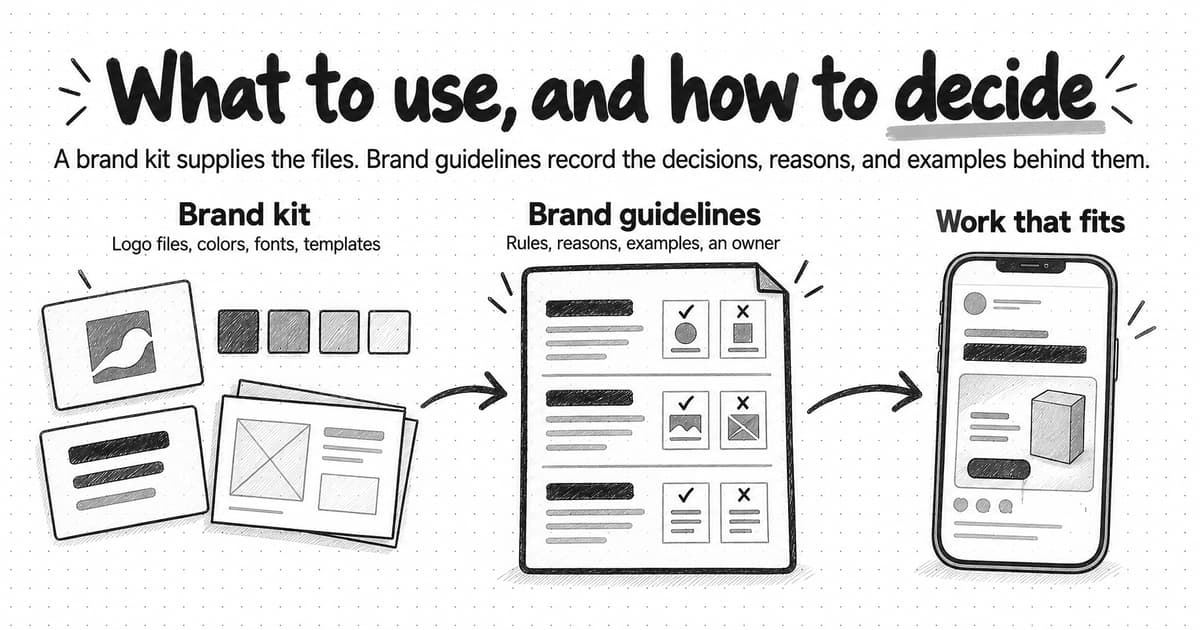
Brand guidelines document the identity well enough for others to apply it, and a brand kit packages its files. A kit without the reasons behind each choice leaves writers, designers, and AI tools guessing in new situations.
Refine an identity when the position changes, when it fails in formats the company depends on, when people confuse it with competitors, or when it has drifted, and keep the cues people already recognize. A short touchpoint audit sorts each recurring choice into keep, clarify, or question.
Contents
- What brand identity is
- How brand identity relates to positioning, brand image, and reputation
- The elements of brand identity
- Why a logo alone is not an identity
- What makes a brand identity recognizable
- Three B2B software identities in public view
- Consistent without being identical
- Before and after: four assets that looked like four companies
- How product interfaces and marketing relate
- A useful identity versus a collection of fashionable choices
- Brand identity, brand guidelines, and a brand kit
- When a brand identity needs refinement
- Audit a few touchpoints
- Give everyone who makes your marketing the same brand context
- Sources and further reading
- Frequently Asked Questions
A controller at a growing software company might come across the same vendor four times before visiting its website: a LinkedIn post in March, a slide in a webinar a colleague recommended in April, a newsletter in May, and an email after a conference in June. None of those encounters lasts long, and the controller is not studying logos. By the third or fourth, one of two things has happened. Either the controller recognizes the company, perhaps as the one with the plain annotated screenshots and the careful explanations, and the new piece adds to what they already know. Or the company arrives as a stranger again and has to start over.
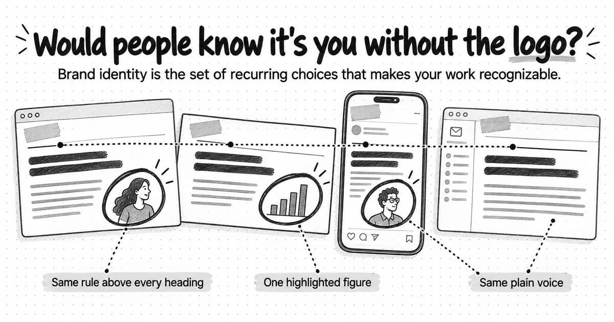
Brand identity is what makes the first outcome possible. When the same few choices, such as a type pairing, a way of annotating screenshots, a single accent color, and a plain voice, recur across a homepage, a slide, a social post, and an email, each piece teaches people a little more about the same company. When they change from piece to piece, each asset arrives without that history.
Recognition is not the whole goal, and the controller's impression will not come from marketing alone. By the time they evaluate the vendor, they will also have heard from colleagues, read reviews, sat through a demo, and perhaps tried the product. An identity that expresses something true about the company, such as who it serves and what it does better, helps the controller connect all of that to one company and understand what it stands for. It does not, on its own, make them prefer the product.
By the end of this guide, you should be able to name the elements of your own identity, decide which ones must stay fixed and which can change by format, and audit a few recent pieces of your marketing. The guide uses Slack, Mailchimp, and Notion as real examples, and Clearwick, a fictional company, for two worked examples.
What brand identity is
David Aaker's 1996 book Building Strong Brands gave one of the best-known definitions. Aaker described brand identity as the set of brand associations that a company's strategists aspire to create or maintain. The important word is aspire. Identity is the company's side of the brand: what it intends people to recognize and remember, expressed through choices the company controls.
In practice, those intentions become concrete through the visual and verbal elements described later in this guide. The identity is those elements plus the decisions about how they are used, such as which color marks what, when a small symbol replaces the full logo, and how formal the writing becomes in a contract renewal notice. Two companies can choose the same typeface and still have different identities, because they give it different jobs.
Some related terms are narrower. Visual identity covers only the visual elements. Corporate identity is an older term, often used for the visual system of a large organization. Many designers use brand identity to mean visual identity, and the confusion is old: Aaker later renamed his concept "brand vision," because people kept taking identity to mean the logo. This guide includes the verbal elements because people recognize companies by how they sound as well as how they look, and because much of a B2B company's marketing, such as emails, sales follow-ups, and product messages, is mostly words.
The brand itself is larger than its identity. It includes everything people associate with the company: the product, its price, the experience of buying and using it, the people they have dealt with, and what others say about it. The identity's part is narrower: it decides whether people can connect what they experience to the right company.
How brand identity relates to positioning, brand image, and reputation
These terms describe overlapping parts of one subject. The clearest way to separate them is to ask who controls each one.
| Term | What it is | Who controls it | The question it answers |
|---|---|---|---|
| Brand | Everything people associate with the company and its products | The company shapes it; people form it | What comes to mind when someone hears the name? |
| Positioning | The choice of audience, category, alternative, and the difference that matters | The company | Who is this for, and why is it better for them than the alternative? |
| Brand identity | The recurring visual and verbal choices that express the brand | The company | How does the company look and sound wherever it appears? |
| Brand image | The associations a person or a market currently holds | Each person who encounters the brand | What do buyers believe the company is? |
| Reputation | The judgment that builds up over time about how the company behaves and performs | The market, over time | Do people trust the company to deliver and to behave well? |
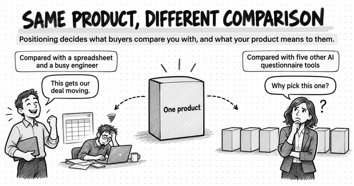
Positioning comes first. It is the decision about who the company serves, which alternative it competes with, and what it does better, and our guide to brand positioning covers how to make that decision. Identity expresses the decision in forms people can see and hear. A company positioned as the careful option for finance teams should not look like a consumer game, and a company positioned as playful should not sound like a bank. When a team changes its identity without a clear position, it tends to change style for the sake of change.
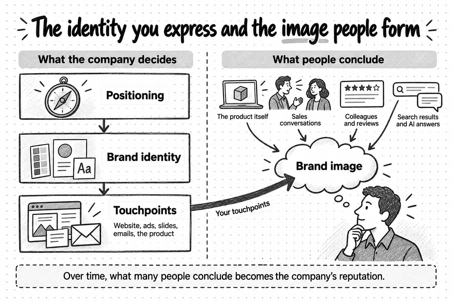
View the identity and image diagram at full size (opens in a new tab).
The identity you intend and the impression people form
Jean-Noël Kapferer, a scholar of brand management, puts the difference simply: identity is on the sender's side, and image is on the receiver's side. Kevin Lane Keller defined brand image as people's perceptions of a brand, reflected in the associations they hold in memory. A company sends its identity. Each buyer builds an image from it, and also from the product, sales conversations, colleagues' opinions, reviews, search results, and, increasingly, answers from AI assistants. The image may be richer than the identity, less flattering, or simply different.
Some gap between the two is normal, especially for a young company that few buyers have met. The useful work is finding out which way it runs. Several sources show the image directly:
- Sales and demo calls. The words prospects use to describe the company, and the companies they compare it with.
- Win and loss interviews. Why buyers chose you or someone else, in their own words.
- Reviews and community threads. How customers describe the company to people who have not used it.
- Unprompted descriptions. Ask a few people in the category to describe the company from memory before you show them anything.
- AI assistants. Ask several assistants to describe the company and its competitors, and note which sources they cite. Answers vary from one request to the next, so look for patterns across several replies.
Then compare what you hear with what you intend. If people describe the company accurately but do not recognize its marketing, the identity's cues are too weak or too inconsistent. If they recognize the marketing but describe the company wrongly, the identity may be expressing the wrong things, or the position itself may be unclear. If they describe a problem with the product, no change to the identity will fix it. The positioning guide's section on the position you intend and the position buyers hold covers the same gap from the strategy side.
The elements of brand identity
Descriptions of brand identity list similar elements and group them in different ways. This guide uses seven: five visual and two verbal. Some companies add others, such as a character (Mailchimp has its chimp, Freddie), motion, or sound, but most B2B software companies can do a great deal with these seven.
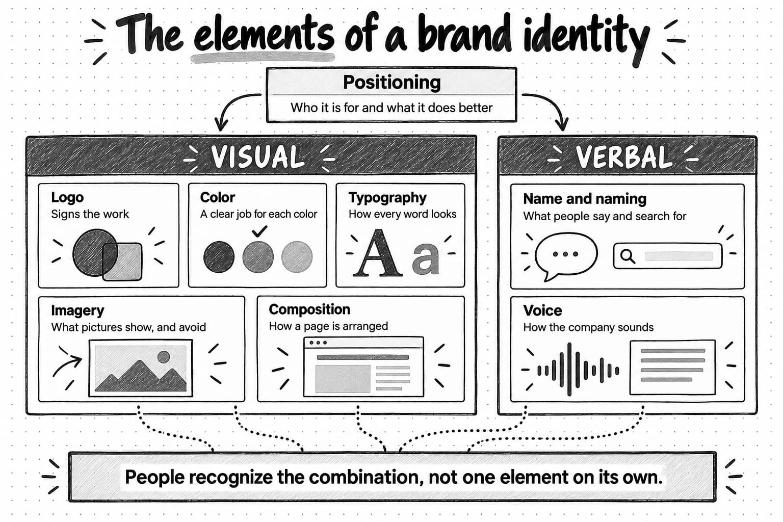
View the elements of a brand identity at full size (opens in a new tab).
Name and naming
The name is the element people meet most often, and the one that travels furthest without any design around it. It is said in meetings, typed into search engines, written on procurement forms, and repeated by AI assistants. A name works well when people can say it, spell it after hearing it, find it in search, and tell it apart from competitors' names.
Naming continues inside the company. Product, plan, and feature names either follow a system or accumulate one at a time. Descriptive feature names, such as Variance notes in the Clearwick example below, explain themselves. Invented names can become distinctive, but they need more repetition before people remember them. Small details count too. When Mailchimp updated its identity in 2018, it changed "MailChimp" to "Mailchimp" and explained that the business now did far more than deliver email.
Logo
A logo signs the work, and its functional requirements matter more than most discussions of its shape suggest. It needs a full version and a compact one. It has to stay legible as a small browser-tab icon and as a social media avatar, and it has to work on light and dark backgrounds and in a single color. Slack's 2019 redesign, described in the examples below, responded largely to these requirements, because the earlier logo was hard to use anywhere except on a white background. A logo also carries less of the identity than teams tend to expect, which is the subject of the next section.
Color
Color can identify a company before anyone reads a word, which makes it valuable when a company manages to own one, and it is one of the most misunderstood elements. The valuable part is recognition: a color used consistently, in a consistent role, becomes linked to the company that uses it. The misunderstood part is meaning. Many articles present color as a fixed code, in which blue signals trust, red urgency, and green growth. The research is more qualified than that.
People do share some broad associations. Jonauskaite and colleagues asked 4,598 people in 30 countries to match emotion words with color terms and found that the patterns were broadly similar across countries. They also found that a participant's country predicted associations beyond the shared pattern, and that countries closer in language or geography were more alike. The study used color words rather than logos or products. In marketing research, Labrecque and Milne found in controlled tests that hues were linked on average with different brand-personality traits, such as red with excitement and blue with competence, and that saturation and lightness changed the effect. Average associations measured in a study are not rules a brand can rely on.
What a color means in practice depends on several things a color chart leaves out:
- Context. Andrew Elliot's review of color research gives a simple example: a blue ribbon means first place, while blue on meat means it has gone bad. Elliot and Markus Maier describe the field as still at an early stage of development.
- Culture and language. The same color can carry different associations in different countries, which matters once a company sells internationally.
- Category. Bottomley and Doyle found that people judged a logo color more appropriate when it suited the type of product, and when it matched how the brand was trying to position itself. In a separate study of 281 leading brands, Labrecque and Milne found that standing out by color helped in some categories and hurt in others.
- Execution. A saturated orange and a muted rust are both called orange and read very differently. How much of a page the color covers, and what sits next to it, matter as much as the hue.
- Prior exposure. Much of what a brand color means is learned from the brand itself. Yellow suggests Mailchimp to people who have seen Mailchimp's yellow many times, not because yellow means email.
Color is also hard for one company to own. A 2020 study of 1,281 brand elements from consumer-goods categories, by Ehrenberg-Bass Institute researchers, found colors the hardest kind of element for a single brand to own, while characters, logos, and logotypes had the most potential.
For a B2B software company, this suggests choosing color for what it can do rather than for a promised emotion: to be distinguishable from the companies a buyer will compare you with, to fit the position you have chosen, and to have one clear role in the system, such as marking the one thing that needs attention. Then check that it works. The Web Content Accessibility Guidelines require a contrast ratio of at least 4.5:1 for normal-size text and 3:1 for large text, and they ask that color is never the only way information is conveyed. A brand color that cannot carry text legibly needs a darker partner for text, not a lower standard.
Typography
Typography carries much of an identity's tone, because most B2B marketing is text. Large companies often commission their own typefaces: Mailchimp uses Means, GitHub uses Mona Sans, IBM uses Plex, and Atlassian uses Charlie Sans. IBM's design language calls Plex "just as important as our name or our logo." A smaller company rarely needs a custom typeface. It needs a pairing with clear roles, sizes that work on a phone and on a projected slide, and an agreed fallback for places where its fonts cannot load, such as many email programs and slides built by colleagues who do not have the fonts installed. Product screens and marketing pages can also need different type, as a later section shows.
Imagery
Imagery covers photography, illustration, icons, diagrams, and, for software companies, product screenshots. A company has to decide what its images are for as well as how they look. Notion's first illustrations were drawn in black and white by the artist Roman Muradov when the company had only a few employees, and Muradov has said his loose, gestural drawings stood out against the vector illustrations most companies used. Hand-drawn line illustration still appears on Notion's homepage.
For many B2B companies, the most persuasive image is the product itself. That makes the treatment of screenshots an identity decision: how they are cropped, whether they are annotated, and whether the sample data looks believable. Rules about what to avoid, such as stock photos of people pointing at laptops, are often as useful as rules about what to use.
Composition and layout
Composition is how the elements are arranged: the grid, the margins, the alignment, the amount of empty space, how much fits in one frame, and recurring devices such as a rule above each heading or a frame around each screenshot. Composition carries over to formats where little else does. Dropbox's brand guidelines, for example, describe a version of the logo called the Tab, set inside a panel from which the page layout starts, and say these panels give layouts hierarchy, recognition, and cohesion across platforms and devices. Composition is also the element most easily broken by accident, because every new template arrives with its own.
Voice
Voice is how the company sounds in writing and speech: its word choice, sentence length, directness, humor, and the things it never says. It is the element that appears where nothing visual does, in email, product messages, support replies, sales follow-ups, and the passages an AI assistant quotes from the company's website. Mailchimp's content style guide states the core rule compactly: the voice stays the same while the tone changes with the situation. Slack's 2020 brand guidelines pair each voice trait with its limit, such as "Confident (never cocky)."
Our guide on how to define your brand voice covers how to write a voice down. For identity, the point is that people recognize voice together with the visual elements, and an inconsistent voice can undo a consistent look, as the before-and-after example later in this guide shows.
Why a logo alone is not an identity
People see a company's logo less often, and at a smaller size, than most teams assume. It sits in a page corner, in a small avatar beside a post, in a slide footer, or nowhere at all: in a forwarded paragraph, a screenshot shared in a chat, a podcast mention, or an AI assistant's answer. In most of those encounters, what people actually take in is the rest of the identity.
A logo also has little meaning on its own. Paul Rand, who designed logos for IBM, ABC, and UPS, wrote in 1991 that a logo takes its meaning from the quality of the thing it stands for, and not the reverse. A new company's logo means nothing to buyers yet. It gains meaning by appearing again and again beside work that people recognize as that company's.
Research on distinctive brand assets makes the point more precise. Jenni Romaniuk of the Ehrenberg-Bass Institute for Marketing Science describes distinctive assets as elements other than the brand name, such as colors, logos, characters, and fonts, that signal one brand. She tests them on two criteria: uniqueness, whether the element brings only that brand to mind, and fame, whether most people who see it think of that brand. She treats uniqueness as the more important of the two. Logos tend to do well on both, but other elements can become assets too with consistent use, and a set of strong assets gives a company more ways to be recognized than a logo alone. In a 2025 report on B2B buying, Magda Nenycz-Thiel and Romaniuk observed that every B2B brand has a logo but often little else that helps buyers notice and identify it.
Romaniuk also warns against choosing assets by asking customers which ones they like. People identify brands by their assets largely without conscious thought, so they tend to undervalue cues they already know. A more useful test is to cover the logo. If people who know your work can still tell it is yours, the identity is doing its job.
What makes a brand identity recognizable
Recognition builds slowly, through repeated exposure to the same distinctive cues. The identities people recognize tend to share four qualities:
- Distinctive within the category. The cues are not shared with the companies a buyer is comparing. A blue logo and a gradient hero image signal a software company, not a particular one.
- Repeated over time. The same choices appear in the same roles across formats and across years. Romaniuk's shorthand for assets is "use or lose": memory of an asset fades when a brand stops using it.
- Legible in small and partial views. A cue that only works full-screen on the homepage will rarely be seen. A cue that survives as an avatar, in a slide footer, or in a cropped screenshot will be seen often.
- Connected to something true about the company. Cues that express the company's position stay relevant as campaigns change, which makes them easier to keep using.
How recognition differs from preference
Recognition means people can tell a piece of work is yours. It does not mean they prefer the company, trust it, or will buy from it. Byron Sharp of the Ehrenberg-Bass Institute distinguishes the likelihood that a buyer notices or thinks of a brand in a buying situation from the buyer's attitude toward it, and Keller treated awareness as necessary for brand equity but not sufficient. Sharp also notes that familiarity tends to improve how people feel about a brand, so the two are related. Recognition still leaves most of the buying decision open. A buyer who recognizes a company also has to believe the product suits them and trust the company to deliver, and nothing in an identity establishes either.
What a recognizable identity does is make each encounter count toward the same memory, so that the next ad, email, or conversation builds on the last one instead of starting over. Treat claims that consistent branding raises revenue by a fixed percentage with caution. The most widely repeated figure, an increase of up to 23%, comes from a 2016 survey by Lucidpress and Demand Metric in which companies estimated the effect themselves; it is not a controlled study, and this guide does not rely on it.
Three B2B software identities in public view
The three companies below have published enough about their identities to show the decisions behind them. Each description draws on the company's own announcements, guidelines, and website as they appeared on October 6, 2026, and on agency or type-foundry case studies where noted. None of these sources shows what the identity contributed to the company's commercial results, and this guide does not claim that it did.
Slack: a logo rebuilt to work everywhere it appears
Slack's announcement of its 2019 logo explains why the old one stopped working. Slack wrote that the previous logo used 11 colors, looked wrong on any background other than white, and broke if it was rotated away from its prescribed 18-degree angle. To compensate, the company had made extra versions, and its app buttons ended up looking different from one another. Pentagram, the design firm behind the redesign, describes what changed in its case study: the hash shape, the octothorpe that also appears before channel names in the product, was kept and rebuilt on a grid from two simple shapes; the palette was reduced to four primary colors; and Slack's aubergine, a deep purple, stayed as an accent that makes Slack easy to recognize against other desktop windows.
Slack's September 2020 brand guidelines show how much of an identity consists of rules, not drawings. The full-color logo appears only on white, black, or aubergine. A separate small-use logo covers widths from 50 to 90 pixels. The voice is defined as pairs of traits and limits. Today, after Salesforce's 2021 acquisition of Slack, the website's headlines are set in Salesforce typefaces rather than those named in the 2020 guidelines, but the octothorpe and the aubergine remain.
Mailchimp: one system across product, website, and support
In 2018, Mailchimp updated its logo, wordmark, typeface, colors, photography, and illustration, working with the agency Collins. Mailchimp's announcement described the problem as consistency: different parts of the customer experience had grown in different directions, and the new system was meant to cover the product, the website, marketing, and support together while keeping the brand's odd, likable character. Inside the product, only the colors and illustrations changed at first.
Today Mailchimp's brand assets page names Cavendish Yellow as its hero color, and its logo always pairs the name with Freddie, the winking chimp. The identity kept changing after the launch. The 2018 typeface, a light weight of Cooper, was later replaced by Means, a typeface that Commercial Type developed with Mailchimp's brand, interface, and marketing teams and announced in December 2020. Commercial Type wrote that the earlier typeface had a limited range of weights and was poorly suited to interface design. Intuit acquired Mailchimp in 2021, and the website header now shows an Intuit Mailchimp wordmark beside Freddie.
Notion: black-and-white drawings, with color saved for billboards
As the imagery section describes, illustration has been central to Notion's identity since its early days. In a 2024 post about a brand campaign, Notion wrote that its original branding and illustrations were all black and white. For the campaign, made with the studio BUCK, it added bold yellows, blues, and reds for the first time, because without color the work would struggle to stand out on billboards in busy cities. In the same post, Notion said it refrains from using bright colors inside the app.
The homepage sits between the two. It is mostly white and near-black, with bold sans-serif headlines and a hand-drawn face peering over a product screenshot, and it uses a single blue for its buttons.
What the three examples have in common
Each company owns a small number of elements and has written rules for them. Each changed what had become hard to use, whether Slack's logo construction, Mailchimp's typeface, or Notion's palette for one format, and kept the cues people already linked to it: Slack's hash shape and aubergine survived a redesign and a change of ownership, and Mailchimp's yellow, chimp, and voice survived a new typeface and a new parent company. Each also treats its product differently from its advertising, which is the subject of a later section.
Consistent without being identical
Consistency is often mistaken for sameness: every asset with the same layout, the same hero image, and the same gradient. That approach breaks quickly, because formats differ in ways an identity cannot ignore. A feed image may get a second's attention on a phone, a slide is read across a room, and an email has to work in programs that ignore custom fonts. Audiences and situations differ too. A security page for an enterprise buyer, a recruiting post, and a notice about a service outage need different levels of formality, and each should still sound like the same company.
Atlassian's design system puts the balance in one line: "We avoid consistency for the sake of consistency and reject infinite flexibility." The practical answer is to decide which elements stay fixed and which ones each format may change. Our article on brand consistency in AI marketing makes the same argument for teams that produce work with AI tools.
Worked example: one identity in four formats
Clearwick is a fictional company. It sells an AI agent that prepares month-end close work for finance teams at software companies of roughly 50 to 500 employees: it drafts account reconciliations, accrual entries, and explanations of month-over-month changes, then sends each item to a controller for approval. Its position is the careful choice for controllers who must be able to explain every number to an auditor, so its identity has to look and sound exact, calm, and reviewable.
Clearwick's identity is small enough to write on one page:
| Name and naming | Features are named for the task they do: Close checklist, Variance notes, Accrual drafts. No invented feature names. |
|---|---|
| Logo | A wordmark set in the headline serif, plus a small symbol, a tick resting on two ruled lines, that stays legible as a browser-tab icon |
| Color | Near-black ink for text, white paper, two grays for structure, and one accent, marigold, which has a single job: it marks the figure or item that needs a person's decision |
| Typography | A serif for headlines and the wordmark, a plain sans-serif for body text and the product, and figures that line up in columns |
| Imagery | Cropped, annotated product screenshots with labeled sample data, and simple line diagrams of the close. No stock photos or 3D renders. |
| Composition | Left-aligned text, wide margins, one point per frame, and a thin horizontal rule above each heading |
| Voice | Plain, exact, and calm. Numbers come with their period and source, and copy says what the agent drafted and what the controller approves. |
In October, Clearwick launches Variance notes, a feature that drafts an explanation for each significant change in an account and cites the transactions behind it. The launch needs a section on the website, a slide for a customer webinar, a LinkedIn image, and an email to existing customers.
| Format | What the reader is doing | How the identity appears |
|---|---|---|
| Website section | Scanning a product page to decide whether the feature fits their close | A thin rule and a small label, “Variance notes,” above a serif headline: “Every change in the trial balance arrives with its explanation.” A short sans-serif paragraph explains how notes cite transactions. An annotated screenshot shows a variance table in which one row, software subscriptions up 18%, is marked in marigold as needing review. |
| Webinar slide | Listening to a presenter and glancing at the screen | The same rule and serif headline: “Explanations drafted. Approval stays with the controller.” A line diagram shows four steps, from transactions to matched entries to a drafted note, ending with controller approval. Marigold appears only on the approval step. A small source line notes that the figures are sample data. |
| LinkedIn image | Scrolling a feed and deciding in a second whether to stop | A larger serif line, “Software subscriptions rose 18% in May. Here's why,” over a tight crop of one variance note with its three supporting transactions. Marigold underlines 18%. The symbol sits small in a corner, because the wordmark would be illegible at feed size. |
| Customer email | Reading a short update between other tasks | Mostly text. The wordmark at the top, a thin rule as a divider, and a heading that falls back to a common serif because many email programs cannot load custom fonts. Two short paragraphs explain the feature and how to turn it on. The button is ink, not marigold, because nothing in the email needs a decision. |
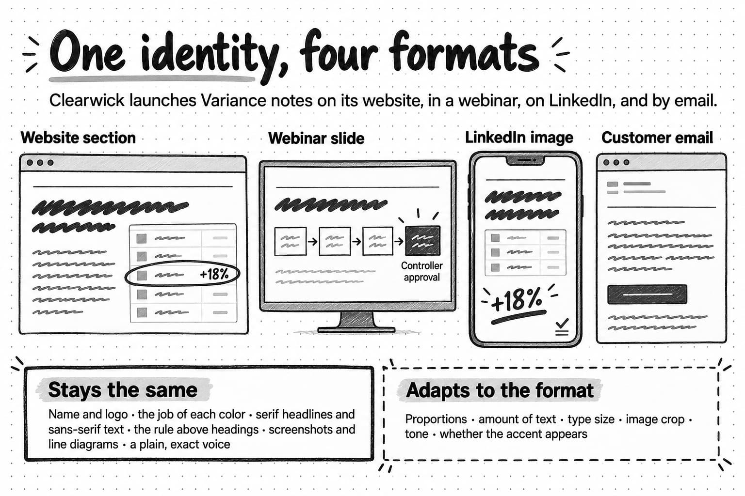
View the four-format example at full size (opens in a new tab).
None of the four pieces shares a layout with another. The slide is a wide diagram, the LinkedIn image is a tall crop, and the email is mostly text. A reader would still connect them, because each one repeats the same small set of choices for the same reasons.
What stays stable and what adapts
The elements that stay fixed are the ones that carry recognition and meaning:
- The name, logo, and feature names. The symbol replaces the wordmark where space is small, but the logo itself never changes shape or color.
- The job of each color. Marigold always marks the item that needs a decision. When a piece has no such item, as in the email, marigold is absent. Keeping that rule is what gives the color its meaning.
- The type pairing and its roles. Serif for headlines, sans-serif for explanation, and aligned figures for numbers, with an agreed fallback where the fonts cannot load.
- The rule above headings, the screenshot-and-diagram imagery, and the voice. Exact numbers with their period and source, and a clear statement of what a person approves.
The elements that adapt are the ones each format controls:
- Proportion and layout. A slide is wide, a feed image is tall, and an email is a narrow column.
- Density. The website can explain; the LinkedIn image has room for one claim.
- Type size and image crop. The feed image uses a much larger headline and a tighter crop than the website.
- Tone. The LinkedIn line speaks directly to the reader ("Here's why"), and the email addresses people who already use the product, while the voice stays exact and calm in every format.
- How often each element appears. The email carries no screenshot and no accent. The slide carries a diagram and one accent.
Put briefly, the stable elements are rules about meaning, and the adaptable ones are rules about fit. An identity that fixes everything makes the email look like a shrunken web page. An identity that fixes nothing leaves each format to its own template.
Before and after: four assets that looked like four companies
Before Clearwick wrote its identity down, the work was made by whoever had time: a founder, a contractor, a salesperson, and the event platform's default template. Each asset was finished and would have passed a quick review on its own. Read as a set, several of them worked against the position Clearwick was trying to hold.
| Asset | Before | What it taught the reader |
|---|---|---|
| Webinar banner | The event platform's template: a purple-to-blue gradient, a stock photo of people pointing at a laptop, and the headline “Revolutionize your month-end close!” | Clearwick is a generic AI company that uses excitement to sell |
| LinkedIn carousel | A design-tool template with pastel shapes, a rounded display font, emoji bullet points, and the title “5 hacks to close faster” | Clearwick is casual about accounting, which is the opposite of its position |
| Sales deck | An older green logo, dense bullet slides, and icons from three different sets, with “AI-powered automation” on the opening slide | The company is still working out what it is |
| Customer email | The newsletter tool's default layout in a different blue, opening with “Hey there! Big news!!” | A fourth, cheerful company |
Put side by side, the four assets look as if four companies made them, and the only thing they share is the name. The verbal choices do the most damage. Controllers who are asked to trust software with their numbers are told to “revolutionize” and to try “hacks,” which works against the careful, auditable position Clearwick is trying to hold.
After the identity was written down, the same four assets were remade:
| Asset | After | What changed |
|---|---|---|
| Webinar banner | A rule and serif headline, “How controllers review AI-drafted variance notes,” with a cropped screenshot and the speakers' names in sans-serif | The headline describes the session's real subject, and the image shows the product instead of a stock scene |
| LinkedIn carousel | One point per slide under the same rule, a serif headline on each, screenshot crops, and a final slide inviting readers to view a sample close | The structure and imagery match the website, and the advice is specific rather than a list of hacks |
| Sales deck | The current logo, one point per slide, and diagrams drawn in the same line style as the website | Old assets were retired, and every slide makes one claim with its evidence |
| Customer email | Plain voice, a rule as a divider, an ink button, and a two-paragraph explanation | The email sounds like the same calm company that wrote the product page |
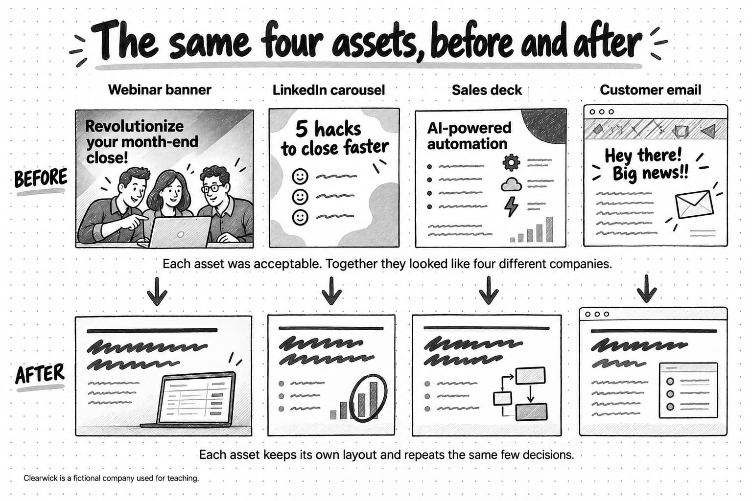
View the before-and-after comparison at full size (opens in a new tab).
The after versions are not identical. The banner is still a banner, and the carousel still behaves like a carousel. What changed is that each asset now draws on the same few decisions, so a reader who has seen one will recognize the next.
How product interfaces and marketing relate
For a software company, the product is often where customers see the identity most. Someone who uses the product every day spends hours a week on its screens and may see its marketing only occasionally. Yet the two do different jobs. A product screen has to help people complete tasks quickly and accurately, again and again, so it favors clarity, density, predictability, and accessibility. Marketing has to catch attention and persuade people who may never have used the product, so it has more room for expression, larger type, illustration, and color.
Several companies document the split. GitHub's Primer design system separates Primer Product UI, used to design and build GitHub's interface, from Primer Brand UI, used for marketing websites, and its color guidance says that each environment has its own color system. Atlassian uses its brand typeface, Charlie Sans, when it needs to express the brand, as in marketing, and Atlassian Sans and Atlassian Mono for in-app experiences. IBM uses one typeface, Plex, in both places, but its Carbon design system defines a productive type set for product screens and an expressive set for editorial and marketing work.
Product and marketing should relate without being identical. They usually share the name and logo, the core color roles, a typeface family or closely related typefaces, the icon set, and the main traits of the voice. Product writing tends to be shorter and more instructional, and marketing can be more expressive. The relationship matters in B2B software because many companies use product screenshots as their main marketing imagery. If the marketing promises a calm, precise product and the screenshot shows something cluttered, buyers are likely to trust the screenshot. Clearwick keeps one rule constant in both places: marigold marks the item that needs a person's decision, in the product's review queue and in every launch asset.
A useful identity versus a collection of fashionable choices
Every few years, B2B software websites converge on a look. A recent example is often called linear design, after the product-planning tool Linear, whose website was widely imitated: dark backgrounds, bold sans-serif type, complex gradients, translucent glass-like panels, and high contrast. Writing for LogRocket in 2025, the designer Daniel Schwarz credited the style with real usability strengths, then named its weakness: once enough products follow it, they look alike and become less memorable and less recognizable. Linear's own site was coherent and suited to its audience of software teams. The problem appears when other companies copy the surface without the reasons, and dozens of products end up sharing one appearance.
Following a convention is not always a mistake. Borrowed conventions tell a buyer which category a product belongs to, and a security product that looked like a children's game would confuse people. The question is whether an identity has anything of its own beyond the convention. The four qualities of a recognizable identity described earlier are the first tests. For distinctiveness, swap in a competitor's name: if the page still looks right, the identity is describing the category, not the company. For connection to the position, ask whether each main choice has a reason; Clearwick's restrained palette and single accent express careful review, and a neon gradient would contradict it. For legibility, try the hard formats, such as a slide built by a salesperson, a 32-pixel avatar, a dark-mode email, and a black-and-white PDF. Two further tests separate a useful identity from a set of choices that happen to be popular:
- Other people can apply it. A contractor or an AI marketing agent can produce work that fits from the written rules and a few examples, without the original designer.
- It can last. Choices tied to a passing effect, such as one rendering style or one image trend, date quickly. Choices tied to the company's position tend to last longer. Romaniuk warns that refreshing assets too often turns a long-term investment into a seasonal fashion.
Fashionable choices are not wrong in themselves. A gradient can be part of a durable identity if it has a defined job and the company keeps using it after the trend moves on. Trouble starts when the identity is mostly trend, because then there is nothing left to recognize when the trend changes.
Brand identity, brand guidelines, and a brand kit
These three terms describe the same subject at different levels, and teams often use them interchangeably.
| Term | What it is | What it contains | Who uses it |
|---|---|---|---|
| Brand identity | The system of choices that makes the company recognizable, and the reasons for them | Decisions: what the logo is, what each color does, how the company sounds, what imagery it uses and avoids | Everyone who makes or approves the company's work |
| Brand guidelines | The document that explains the identity well enough for others to apply it | Rules with their reasons, examples of correct and incorrect use, and guidance on what each format may change | Designers, writers, agencies, contractors, and AI tools |
| Brand kit | The ready-to-use files and values | Logo files in each format, color values, font files or licenses, templates, and approved images | Anyone producing an asset this week |
The identity exists before anyone documents it. A five-person company that always uses the same two typefaces, writes in the same plain style, and illustrates posts with annotated screenshots has an identity, even if it has no guidelines. Guidelines make that identity transferable, and a kit makes it easy to apply correctly. Our guide to brand guidelines covers what to include in them and how to keep them useful; this one is concerned with what they describe.
A brand kit on its own is the most common substitute for an identity, and the most incomplete one. It contains the logo files, the color values, and the fonts. It rarely contains the reasons: why the accent color is used sparingly, which kinds of image the company avoids, or how much the tone changes for a delay notice. Those reasons are what let a writer, designer, or AI marketing agent make a good decision in a situation the kit did not anticipate. Our article on why AI-generated marketing often feels off-brand looks at what happens when a tool receives the logo and palette but none of that judgment.
When a brand identity needs refinement
An identity is worth changing when it no longer does its job, not when the team is tired of it. People inside a company see its identity far more often than its customers do, so internal boredom arrives long before the market has learned the cues. Several situations are better reasons to look again:
- The position changed. The company now serves a different buyer, competes against a different alternative, or belongs to a different category, and the identity still expresses the old choice. A playful identity built for individual users may undercut a company that now sells to procurement teams.
- The identity fails in formats the company now depends on. A logo that disappears as a small app icon, a color that cannot carry legible text, or a typeface that is unavailable in the product, in email, or in the slide software everyone uses are practical failures, and they get worse as the company produces more.
- People confuse the company with someone else. If prospects mention a competitor's name when describing your ads, or recognize the category but not the company, the identity's cues are not distinctive enough.
- The identity has drifted. Years of exceptions, old templates, and individual preferences can leave a company with several partial identities. Often the right response is to restore and document the original choices rather than invent new ones.
- The company's structure changed. A merger, a rename, or a second product line raises questions about how the parts should relate, and those questions need an answer before the next launch.
Refinement and replacement are different decisions. Refinement keeps the cues people already recognize and fixes what does not work: a simpler logo, a clearer rule for color, a typeface that works in the product. Replacement discards those cues, and with them whatever recognition they had built. Romaniuk advises making "no" the default answer to a proposed change to a brand's assets, and asking for strong evidence before saying yes. Before removing a color, a character, or a shape, check whether people outside the company link it to you. If they do, keep it in some form, as Slack and Mailchimp did.
A refinement also needs a rollout. Retire old templates and files when the new ones appear, update the product and the sales deck along with the website, and tell everyone who produces work, including agencies, contractors, and the AI tools the team uses, what changed and why.
Audit a few touchpoints
An audit does not need a design agency or a full brand review. It needs a small, honest sample and an hour of attention. Use it to find which choices already make your work recognizable, which ones are intended but applied inconsistently, and which ones belong to your category or a passing trend rather than to you.
- Collect six to ten recent pieces from at least four formats. Include work made by different people: a website page, a sales or webinar slide, a social image, an email, a product screen, an ad, an event banner, or a PDF.
- Put them side by side at a similar size, and cover the name and logo. Ask whether the pieces look like they come from one company. Ask someone outside marketing as well, because they have not learned to see what the team intends.
- Go element by element. For name and naming, logo, color, typography, imagery, composition, and voice, write down what recurs and what varies.
- Sort each choice into keep, clarify, or question. Keep choices that are already consistent and that competitors do not share. Clarify choices the team intends but applies unevenly, usually because nobody wrote down the rule. Question choices that are common across your category, borrowed from a template, or at odds with your positioning.
- Write three to five rules. Each rule says what the choice is, when it applies, and why, with one example. Note at the same time what each format may change.
- Test the rules on the next real asset. If a rule cannot guide a decision someone is making that week, rewrite it.
SAMPLE
Six to ten recent pieces, at least four formats, made by different people.

COVER-THE-LOGO CHECK
With the name and logo hidden, do they look like one company? Who else did you ask?

ELEMENT BY ELEMENT
For each element, what recurs, and what varies?
Name and naming:
Logo:
Color:
Typography:
Imagery:
Composition:
Voice:

SORT
Keep (consistent and not shared by competitors):
Clarify (intended, but applied unevenly):
Question (common in the category, borrowed, or at odds with the positioning):

RULES
Rule:            Applies when:            Because:            Example:
What each format may change:

TEST
Which asset this week will use these rules first?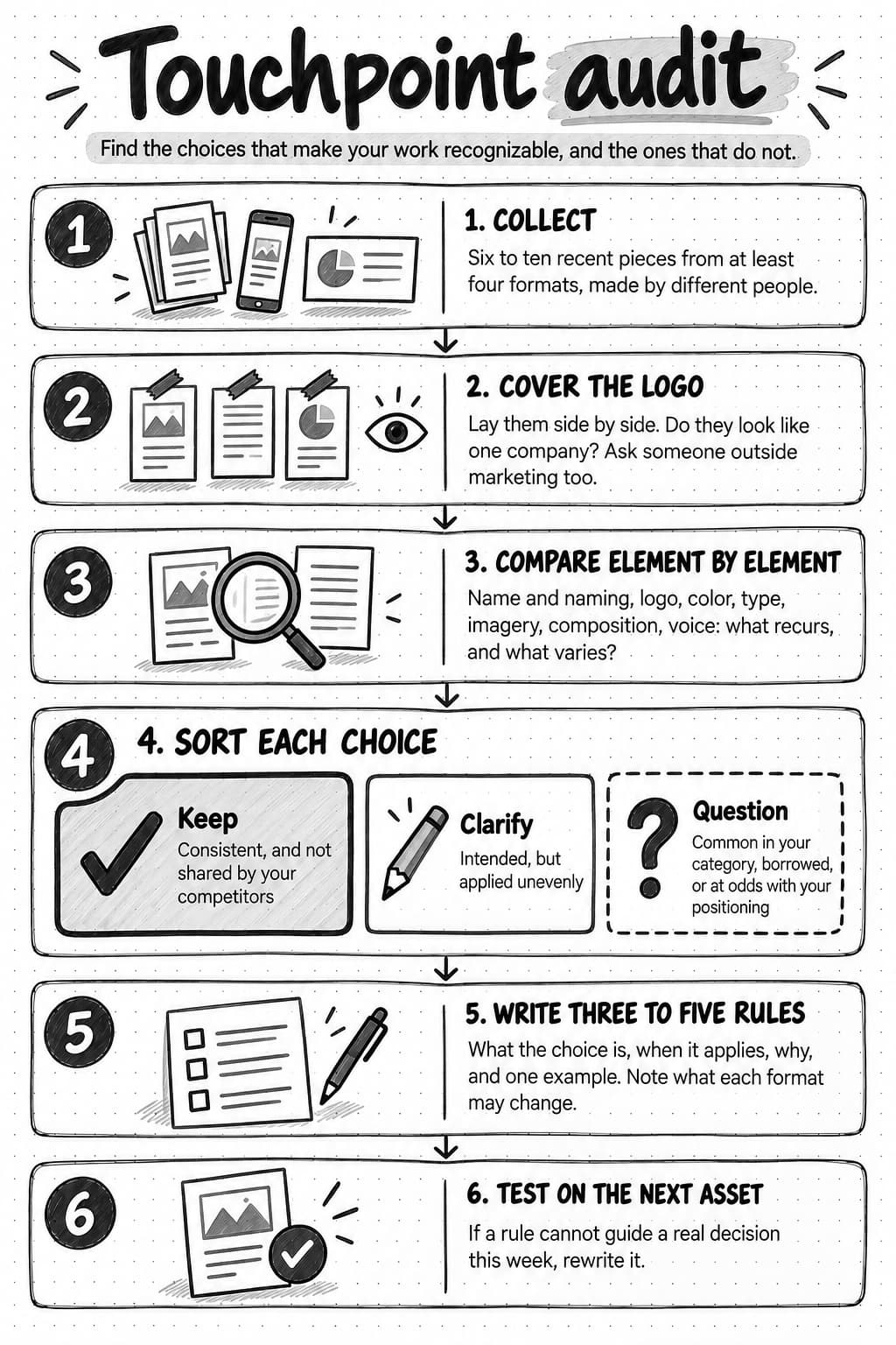
Open the full-size touchpoint audit worksheet to save a copy (opens in a new tab).
You may find fewer distinctive choices than you expected, and the verbal elements may vary most, because a template can fix a layout and a palette but not the wording. Both findings are useful. A short list of choices the company actually owns is a better foundation than a long list of preferences.
Give everyone who makes your marketing the same brand context
An identity is only as consistent as the least-informed person producing work for it. In a small B2B company, that group includes founders, product marketers, salespeople who build their own slides, contractors, agencies, and AI tools that write and design on the team's behalf. Each needs the same few things: the rules, the reasons behind them, and examples of work that fits. Without the reasons, people follow the rules where they clearly apply and guess everywhere else.
Meet Ampere—your AI marketing agent. Ampere can study your website and public pages and save two reports to Brand memory: your brand colors, and a visual identity report covering your core aesthetic, typography, layout, imagery, and dos and don'ts. Your team can review and edit both, and later work, such as social images, carousels, and landing pages, can start from them along with your saved voice and positioning. You can watch a replay of Ampere describing Notion's visual identity from public sources. Your team still decides which choices are right for the brand and approves what ships.
Sources and further reading
- David A. Aaker: Building Strong Brands (Free Press, 1996)
- David Aaker: It starts with a brand vision, Prophet (2014)
- Jean-Noël Kapferer: The New Strategic Brand Management, 5th edition (Kogan Page, 2012)
- Kevin Lane Keller: Conceptualizing, measuring, and managing customer-based brand equity, Journal of Marketing (1993)
- Paul Rand: Logos, flags, and escutcheons (1991)
- Jenni Romaniuk: Brands of distinction, Ehrenberg-Bass Institute
- Jenni Romaniuk: Q&A, seven costly sins of brand identity, Ehrenberg-Bass Institute
- Jenni Romaniuk: The four commandments, future-proofing a brand's identity, Ehrenberg-Bass Institute
- Magda Nenycz-Thiel: Easy to find, being where B2B buying happens, Ehrenberg-Bass Institute
- Byron Sharp: Mental availability is not awareness, Ehrenberg-Bass Institute
- Ward, Yang, Romaniuk, and Beal: Building a unique brand identity, Journal of Brand Management (2020)
- Domicele Jonauskaite and colleagues: Universal patterns in color-emotion associations are further shaped by linguistic and geographic proximity, Psychological Science (2020)
- Lauren I. Labrecque and George R. Milne: Exciting red and competent blue, Journal of the Academy of Marketing Science (2012)
- Lauren I. Labrecque and George R. Milne: To be or not to be different, Marketing Letters (2013)
- Andrew J. Elliot: Color and psychological functioning, Frontiers in Psychology (2015)
- Andrew J. Elliot and Markus A. Maier: Color psychology, Annual Review of Psychology (2014)
- Paul A. Bottomley and John R. Doyle: The interactive effects of colors and products on perceptions of brand logo appropriateness, Marketing Theory (2006)
- W3C: Understanding contrast (minimum), WCAG 2.2
- Slack: Say hello, new logo (2019) and Pentagram: Slack
- Slack: Brand guidelines (September 2020, PDF)
- Mailchimp: Mailchimp has a new look (2018) and Collins: Mailchimp
- Commercial Type: Means for Mailchimp (2020)
- Mailchimp: Content style guide, voice and tone and brand assets
- Notion: The thinking behind our latest brand campaign (2024)
- Dropbox: Brand guidelines
- GitHub: Brand toolkit and Primer design system
- Atlassian: Design system
- IBM: Design language and Carbon design system
- Daniel Schwarz: Linear design, the SaaS design trend that's boring and bettering UI, LogRocket (2025)
- Websites read on October 6, 2026: Slack, Mailchimp, and Notion
Frequently Asked Questions
What are the elements of a brand identity?
A brand identity has visual elements, namely the logo, color, typography, imagery, and composition or layout, and verbal elements, namely the name, the naming of products and features, and the voice. It also includes the rules for using each one, such as which color marks what. Some companies add a character, motion, or sound. All the elements should express the company's positioning, because people recognize the combination, not any single element.
Why is brand identity important for a business?
Brand identity matters because it lets people recognize a company's work across many brief encounters, so each ad, slide, email, or post builds on the last. It also gives everyone who produces marketing, including contractors and AI tools, a shared basis for decisions. Recognition is not preference: a clear identity makes a company easier to remember and understand, but the product, price, and sales experience decide whether people buy.
What is the difference between brand identity and brand image?
Brand identity is what a company intends to express through its name, logo, colors, type, imagery, layout, and voice. Brand image is what people actually conclude about the company, formed from that identity and from the product, sales conversations, reviews, colleagues' opinions, and AI answers. The company controls its identity directly but can only influence its image. Comparing the two, through sales calls, win and loss interviews, and reviews, shows whether the identity is getting through.
What is the difference between brand identity and visual identity?
Visual identity is the visual part of a brand identity: the logo, color, typography, imagery, and composition. Brand identity also includes verbal elements, such as the name, the naming of products and features, and the voice. Many designers use the two terms interchangeably. The distinction matters for B2B companies, because much of their marketing, including emails, sales follow-ups, and product messages, is mostly words, and people recognize how a company sounds as well as how it looks.
Is a logo the same as a brand identity?
No. A logo is one element of a brand identity, and people often see it small or not at all, as in a forwarded paragraph, a shared screenshot, or an AI assistant's answer. A logo also gains meaning only through repeated association with the company's work. Research on distinctive brand assets shows that colors, characters, fonts, and other elements can also become recognizable cues, so an identity that consists only of a logo gives buyers few ways to recognize the company.
What is the difference between brand identity and brand positioning?
Brand positioning is the decision about who a company serves, which alternative it competes with, and what it does better. Brand identity expresses that decision in forms people can see and hear. Positioning comes first: a company positioned as the careful choice for finance teams needs an identity that looks and sounds careful. When a team changes its identity without a clear position, it tends to change style for its own sake rather than to communicate anything.
What is the difference between brand identity, brand guidelines, and a brand kit?
Brand identity is the system of choices that makes a company recognizable, together with the reasons for them. Brand guidelines are the document that explains those choices well enough for other people to apply them, with examples and guidance on what each format may change. A brand kit is the set of ready-to-use files: logos, color values, fonts, and templates. A kit without the reasons leaves writers, designers, and AI tools guessing whenever a situation is new.
What are examples of strong brand identities in B2B software?
Slack, Mailchimp, and Notion publish enough about their identities to show the decisions behind them. Slack rebuilt its logo in 2019 because the old one was hard to use, while keeping its hash shape and aubergine purple. Mailchimp's 2018 system kept its yellow, its chimp, and its voice, and later replaced a typeface that did not work in the product. Notion keeps its black-and-white drawings and uses bright color on billboards while keeping it out of the app. What makes these identities strong is not a particular style: each company owns a few cues, documents how to use them, and kept them when it changed other things.
How do you create a brand identity for a business?
Start from positioning: decide who the company serves and what it does better, then choose each element for a reason connected to that position. Make each choice distinctive within the category and usable in difficult formats, such as a small avatar or a plain-text email. Write three to five rules with their reasons and examples, note what each format may change, and test the rules on real assets. For an existing company, audit recent touchpoints before changing anything.