How to automate marketing reporting: reports and dashboards people act on
A method for marketing leads who spend hours each week copying numbers into slides nobody reads: decide who each report is for, define the metrics once, choose how the data gets in, let AI draft commentary without inventing anything, and check that people use what you send.
40 min readWritten by Ampere
Short answer
How do you automate marketing reporting?
Automate marketing reporting by deciding who each report is for and what decision it supports, choosing a few metrics from a metric tree, writing a definition for each, then automating collection, calculation, checks and delivery. Let people or an AI agent write a short commentary from the finished numbers, and have someone check every number and cause before it goes out.
Summary
Most automated marketing reports go unread because of design, not data. They dump every chart, give no explanation, serve the wrong reader, carry numbers people have stopped trusting, or support no decision. Automating collection and delivery repeats those problems faster, so decide the reader, the question and the decision before building anything.
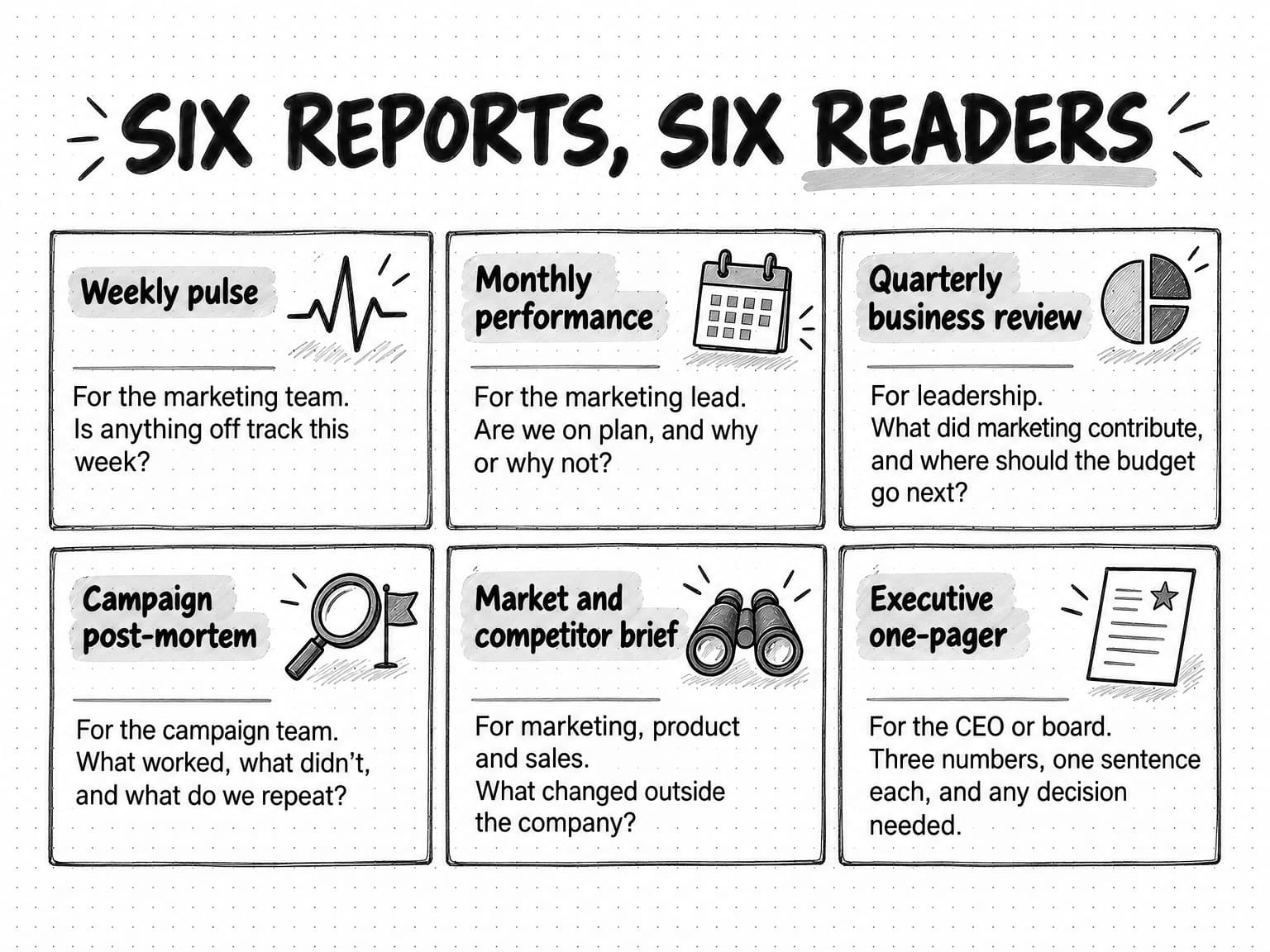
Different readers need different reports: a weekly pulse for the team, monthly performance for the marketing lead, a quarterly business review for leadership, campaign post-mortems, market briefs and an executive one-pager. A metric tree, which breaks one outcome such as pipeline into drivers and leading indicators, keeps each report to a few numbers that explain one another, and written definitions stop those numbers drifting.
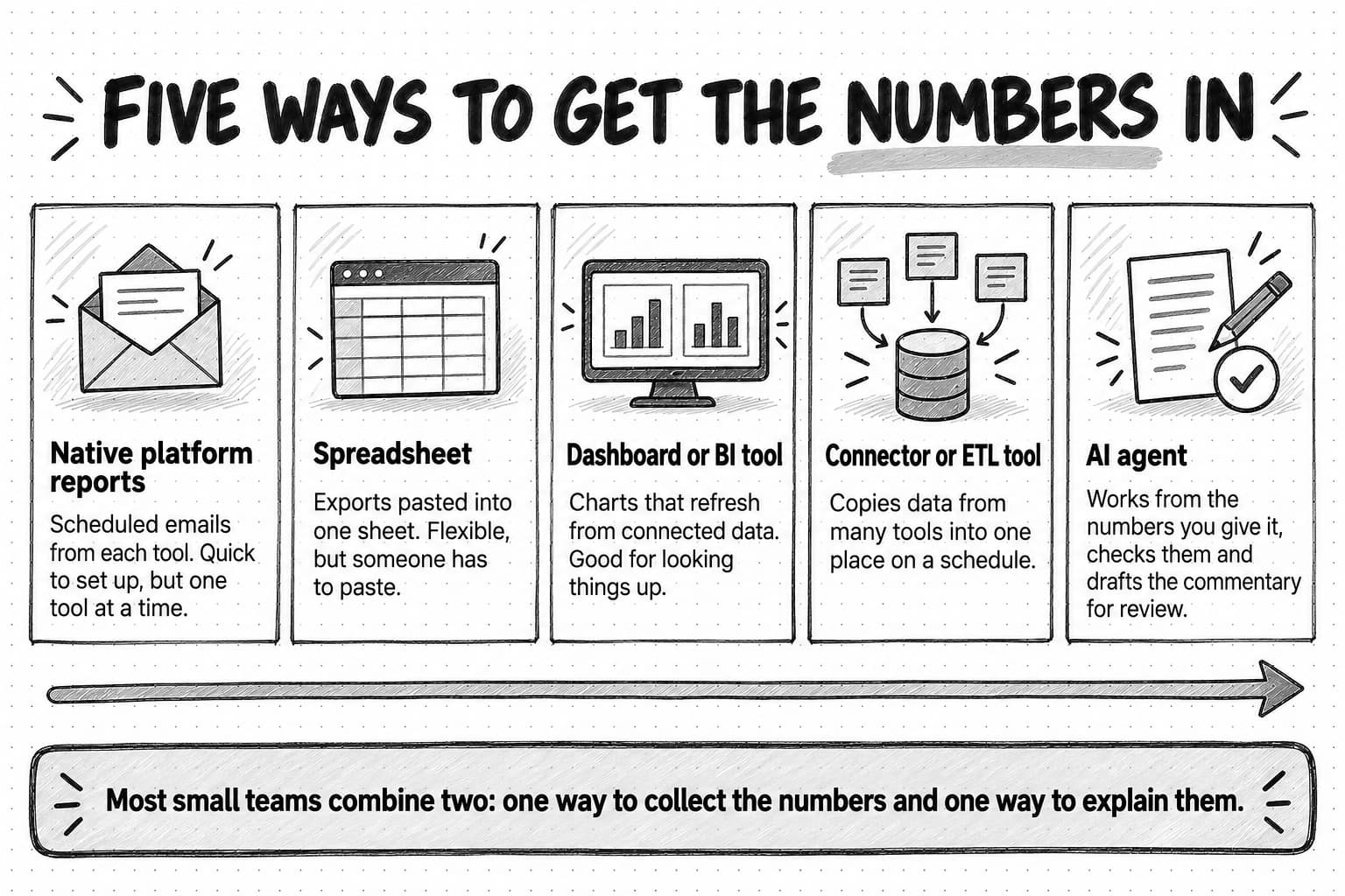
Numbers reach a report through native platform emails, spreadsheets, dashboards, connector tools or AI agents, and most small teams combine one way to collect them with one way to explain them. A dashboard is a place to look things up; a short written report is a message with a headline, owners and decisions, and it is the one to build first.
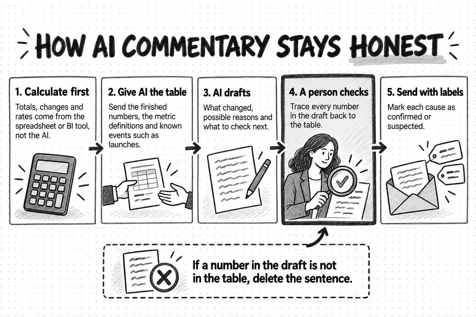
AI can draft report commentary safely when the numbers are calculated elsewhere, the AI receives the finished table, definitions and known events, every number in the draft is traced back to the table, and each cause is labeled confirmed or suspected. Alerts handle urgent problems between reports, and every report should be sent only after the data has settled.
Automated reports break quietly through broken tracking, drifting definitions, platform changes, failed refreshes and early data, so the report itself should show when each source updated and flag implausible changes. An eight-step build, a copyable weekly template and a fictional worked example show the method, and a quarterly check of whether anyone uses each report keeps the set useful.
Contents
- What marketing reporting is, and which parts to automate
- Why automated marketing reports get ignored
- Types of marketing reports and who reads them
- How to choose marketing metrics with a metric tree
- Write metric definitions before you automate anything
- Data plumbing: the main ways to get numbers into a report
- Dashboards versus written reports: when to use each
- How to use AI to write report commentary safely
- Anomaly alerts versus scheduled reports
- Delivery, cadence and timing
- Review and sign-off before a report goes out
- How automated marketing reports fail
- How to tell whether anyone uses your reports
- Step by step: build an automated weekly marketing report
- A copyable weekly marketing report template
- Worked example: a four-person team rebuilds its Monday report (fictional)
- How Ampere helps with marketing reporting
- Sources and further reading
- Frequently Asked Questions
It is Monday morning, and the marketing lead is doing what she does every Monday. She opens the ad platforms, the analytics tool, the email tool and the CRM in separate tabs, exports last week's numbers, pastes them into a spreadsheet, fixes the date formats, copies the charts into a slide deck and sends it to the leadership channel a little after noon. It takes about three hours. Nobody replies. On Thursday the CEO asks in a meeting whether demo requests are down, and the answer was on slide fourteen.
The obvious fix is to automate the copying, and that part is easy. Plenty of teams do it and end up with the same problem at lower cost: a report that arrives on time and still goes unread, because nobody designed it to answer a question anyone was asking.
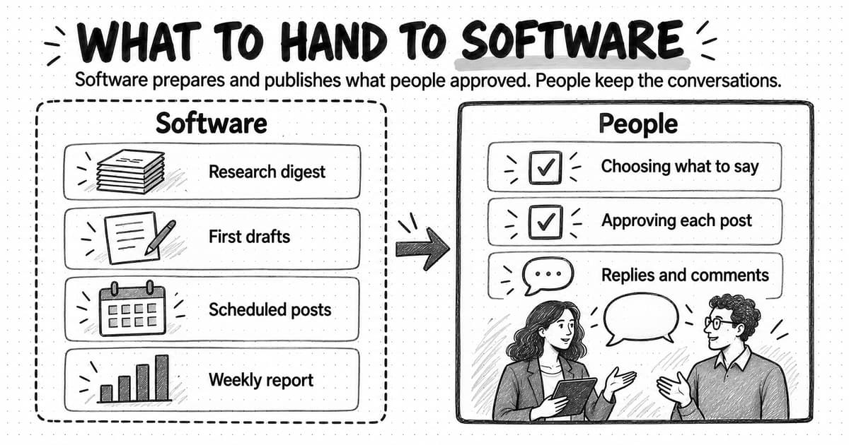
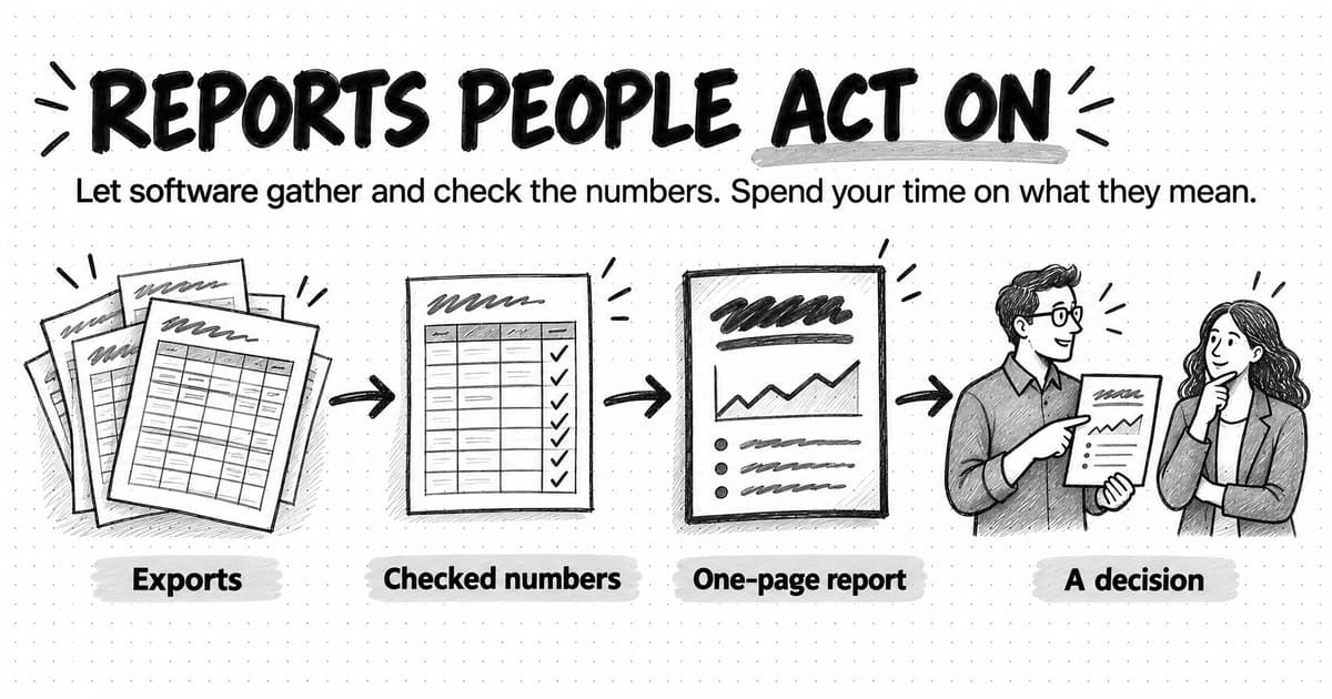
Marketing reporting automation is the use of software to collect, calculate, check and deliver marketing performance data on a schedule, so the people who read it get a reliable picture without anyone assembling it by hand. It covers four separate jobs: getting the numbers out of each tool, turning them into agreed metrics, checking that they are right, and putting them in front of the right person in a form they will read. Software does the first three well. The fourth needs design, and increasingly it involves AI writing the commentary that explains what the numbers mean.
This guide treats reporting as one system, from the reader and the metrics through data plumbing, AI commentary, alerts and failure checks. It ends with an eight-step build, a copyable weekly report template and a fictional example of one team rebuilding its Monday report.
What marketing reporting is, and which parts to automate
A marketing report is a periodic summary of how marketing is performing against its goals, written for a specific reader. It covers a fixed period such as a week, month or quarter, compares results with a plan or an earlier period, and says what the team will do about what it found. A marketing dashboard is a screen of charts and tables that people open to look things up; it refreshes from connected data and shows the current state rather than telling a story about a period. Many teams call any collection of charts a report, but the distinction matters when deciding what to automate.
Building a report involves four kinds of work, and they automate very differently.
- Collection. Exporting numbers from each platform: ad spend, website sessions, form submissions, email results, CRM opportunities. It is repetitive and error-prone by hand, which makes it the best candidate for automation.
- Calculation. Turning raw numbers into agreed metrics such as cost per demo request or pipeline by source. Once the definitions are written down, software calculates them the same way every time, which a person copying cells late on a Sunday does not.
- Checking. Confirming the numbers are complete and plausible: did every source refresh, did a tracking tag break, is this week's zero a real zero? Much of this can run as rules, though someone still decides what to do when a check fails.
- Interpretation and delivery. Saying what changed, why it probably changed and what the team will do, then getting that to the right reader at the right time. Delivery is easy to schedule. Interpretation is the part people read, and the hardest to automate well.
Most failed reporting projects automate collection and delivery and leave interpretation out, or try to automate interpretation before the definitions and checks exist. If the metrics are not defined, automation calculates the wrong thing faster. If the checks are not built, AI commentary will confidently explain a drop that was really a broken tag.
For how reporting fits alongside other recurring work, see our guides to what marketing automation is and to mapping and automating marketing workflows. Report definitions and data quality usually belong to marketing operations, even in a team too small to have a dedicated person.
Why automated marketing reports get ignored
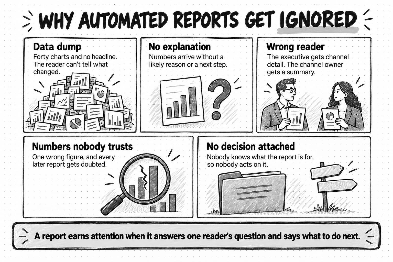
The reasons a report goes unread are rarely about the tool. They come down to five design problems, and automation makes each of them easier to repeat.
The report is a data dump. A dashboard export with forty charts gives the reader no way to tell which three matter this week. Jakob Nielsen's analysis of 45,237 page views for Nielsen Norman Group, published in 2008, estimated that people read at most 28% of the words on an average web page and more likely about 20%. That study measured web pages, not internal reports, but the habit is familiar to anyone who has watched an executive scroll a deck: people skim for the point, and if they can't find it quickly, they stop.
The numbers arrive without an explanation. "Sessions: 14,210 (−9%)" tells the reader something happened. It doesn't say whether that is a problem, what probably caused it, or whether anyone is doing anything about it, so the reader either ignores it or asks someone, and the report has failed at saving that conversation.
It goes to the wrong reader. The paid search manager needs campaign detail the CEO will never read. The CEO needs pipeline against plan and one sentence on why, which the channel manager already knows. One report sent to both becomes long enough to bore the executive and shallow enough to frustrate the specialist.
Nobody trusts the numbers. A single wrong figure, such as revenue double-counted or a campaign credited to the wrong channel, costs more than the error itself. Once a reader has caught one mistake, they discount every later report and go back to asking people directly.
No decision is attached. The most common problem is that nobody, including the sender, can say what the report is for. If it doesn't connect to a decision, such as where next month's budget goes or whether a campaign continues, reading it is optional, and busy people skip optional things.
Each fix happens before automation: decide the reader, the decision, the few metrics that answer it and how to explain them.
Types of marketing reports and who reads them
Most marketing teams need several reports, each serving a different reader at a different cadence. Treat the table below as a menu: a team of two might need only the weekly pulse and the monthly performance report, and add the others as readers ask for them.
| Report | Reader | Question it answers | Cadence | Length |
|---|---|---|---|---|
| Weekly pulse | The marketing team | Is anything off track this week, and who is on it? | Weekly | One page or one screen |
| Monthly performance | Marketing lead, sometimes the CEO | Are we on plan for the month, and why or why not? | Monthly | Two to four pages |
| Quarterly business review | Leadership, board, finance | What did marketing contribute, and where should budget go next? | Quarterly | A short document or deck |
| Campaign post-mortem | The campaign team and its sponsor | What worked, what didn't, and what do we repeat? | After each major campaign | Two to three pages |
| Market and competitor brief | Marketing, product, sales | What changed outside the company that we should respond to? | Weekly or monthly | One to two pages |
| Executive one-pager | CEO, board | Three numbers, one sentence each, and any decision needed | Monthly or quarterly | One page |
The weekly pulse is for catching problems early, not judging performance. A week is too short to say whether a channel works, but long enough to notice that demo requests stopped after a website change. It is frequent, predictable and mostly the same every week, which makes it the report most worth automating end to end.
The monthly performance report is where trends and explanations belong, because a month gives enough data to compare against plan with some confidence. Automate its collection and calculation, and give the commentary real attention.
The quarterly business review is a decision document for budgets and priorities, so it should connect marketing results to revenue as honestly as the data allows, including what attribution can't see. Our guide to measuring content marketing ROI covers influenced pipeline and self-reported attribution and includes a quarterly report template that fits inside a business review.
The campaign post-mortem compares one campaign with its own goals, and its most valuable section is usually what the team would do differently. Automation can collect the numbers; the lessons need people.
The market and competitor brief covers what happened outside the company: competitor launches, pricing changes, new ads, shifts in search results or AI answers. Many teams send it alongside the performance report because it explains some of what the numbers show. Our companion guide to automating competitor monitoring covers how to set up the watches that feed it.
The executive one-pager is the hardest to write and the most likely to be read. It forces a choice of the three numbers that matter most, one sentence for each, and a clear statement of any decision needed.
How to choose marketing metrics with a metric tree
Once you know the reader, choose the numbers. Picking whatever looks important from each platform produces the data dump described above; a metric tree is a more disciplined way to choose.
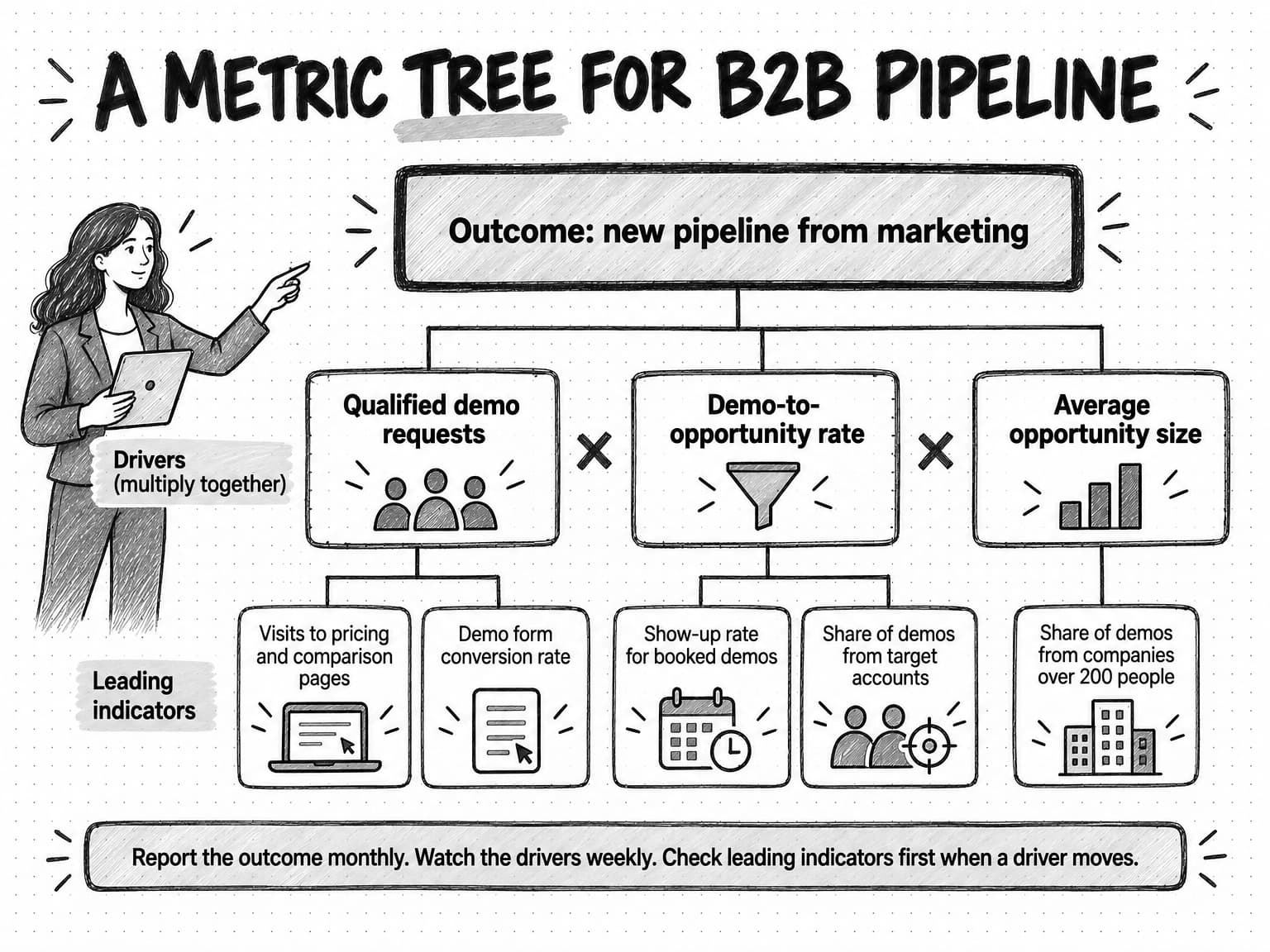
A metric tree breaks one business outcome into the smaller numbers that combine to produce it. At the top sits the outcome the business cares about, such as new pipeline. Below it sit the drivers: two to four numbers that multiply or add together to produce the outcome. Below those sit leading indicators: earlier, more frequent signals that tend to move before a driver does. When the outcome moves, the tree shows which driver moved, and the leading indicators show where to look first.
Here is an example for a B2B software company that sells through demos:
- Outcome: new pipeline sourced by marketing, in dollars, per month.
- Drivers: qualified demo requests, times the rate at which demos become sales opportunities, times the average size of those opportunities. If pipeline falls, one of these three fell.
- Leading indicators for demo requests: visits to the pricing and comparison pages, and the conversion rate of the demo form.
- Leading indicators for the demo-to-opportunity rate: the share of booked demos that show up, and the share that come from target accounts.
- Leading indicator for opportunity size: the share of demos from companies above a size threshold, such as 200 people.
The tree improves the report in three ways. It limits the metrics: a weekly pulse built from it needs six or seven numbers, not forty. It gives every number a reason to be there. And it shapes the commentary. Instead of "sessions are down 9%," the report can say "pipeline is behind plan because demo requests fell; the form's conversion rate is unchanged, so the drop is in traffic to the pricing page, which fell after we paused the comparison-page campaign."
Four rules keep a metric tree honest. Start from an outcome the business already tracks, with the same definition finance or sales uses; a marketing-only outcome such as an "engagement score" makes the report easy to dismiss. Keep vanity metrics off the tree unless you can say which driver they predict; impressions, followers and open rates can stay in the channel owner's own dashboard. Match cadence to the level of the tree: outcomes are noisy week to week, so report them monthly or quarterly, watch drivers weekly, and leave fast-moving leading indicators to dashboards and alerts. Draw a separate tree for each motion: a self-serve product and a sales-led product have different drivers, and forcing both into one tree hides them.
Content, social and brand work often sits low on a pipeline tree or off it, because its effect is slower and harder to trace. The report should treat it with leading indicators and periodic evidence such as self-reported attribution rather than a pretend attribution figure; the content marketing ROI guide explains how.
Write metric definitions before you automate anything
A metric tree names the numbers. A metric definition says exactly how each one is calculated, from which source, and who owns it. A collection of definitions is usually called a data dictionary. In a team of two it can be one tab in a spreadsheet, and it prevents the most expensive reporting argument there is: two people bringing different numbers for the same metric to the same meeting.
Definitions matter more once a report is automated, because automation hides the calculation: nobody looks at the filters until a number looks wrong.
Platforms change their own definitions too. Google Analytics now calls the events that measure important business actions "key events" and reserves "conversion" for actions used to measure ad campaign performance, as its help article on conversions versus key events explains. A report that says "conversions" without saying which kind invites confusion. Small details matter as well: Google's guide to campaign URLs notes that parameter values are case sensitive, so utm_source=google and utm_source=Google are recorded as different sources, and an automated report will faithfully show both rows.
A useful definition has a small set of fields:
| Name | The exact label used in every report, such as Qualified demo requests |
|---|---|
| Plain-language meaning | One sentence a new hire would understand |
| Calculation | The formula, including filters and exclusions |
| Source | The system of record and the exact report, field or event |
| Time basis | Which date counts: when the form was submitted, when the deal was created, or when it closed |
| Owner | The person who decides when the definition changes |
| Known limits | What the number misses or overcounts |
| Change log | Dated notes on every change to the definition |
Here is one entry in practice:
Name:          Qualified demo requests
Meaning:       Demo requests from people at companies that fit our customer profile.
Calculation:   Count of demo form submissions where company size >= 20 employees
               and the email domain is not a free email provider.
               Excludes existing customers and duplicates within 7 days.
Source:        CRM, "Demo request" form object, created date
Time basis:    Submission date, in the company's reporting time zone
Owner:         Marketing lead
Known limits:  Company size is self-reported and sometimes wrong.
               Requests booked directly by sales are not counted.
Change log:    2026-07-01 Added the free-email-domain exclusion.
Link to the dictionary from every report, so readers can check a number without asking. Treat a definition change like a product change: log it, mention it in the next report, and mark the chart where the series breaks, or the change will show up as a mysterious jump that someone spends a morning explaining. Our guide to writing marketing SOPs covers how to keep procedures like this that both people and AI agents can follow.
Data plumbing: the main ways to get numbers into a report
With metrics and definitions settled, the practical question is how numbers move from each platform into the report. There are five common approaches.
Native platform reports
Most marketing tools can email their own reports. Google Analytics lets administrators schedule emailed reports, up to 50 reports per property and 50 recipients per report, sent daily, weekly, monthly or quarterly, and ad platforms, email tools and CRMs offer similar features. Native reports are free, quick to set up and use each platform's own definitions. But each covers one tool, so a reader who receives five emails from five platforms has to join them in their head. They suit a channel owner who needs detail on one channel, rarely anyone else.
Spreadsheets
Exports from each tool go into one sheet, formulas calculate the agreed metrics, and a summary tab shows the result. A spreadsheet is flexible, cheap and understood by everyone, and it keeps the calculation visible, which helps trust. The cost is the manual step: someone exports and pastes every period, and every paste is a chance to grab the wrong date range or overwrite a formula. Spreadsheets suit a small team's monthly report while definitions are still settling, and suit anything that refreshes daily poorly.
Dashboards and BI tools
A business intelligence (BI) tool connects to data sources and shows charts that refresh on their own. Google's free Data Studio, called Looker Studio until Google renamed it in April 2026, is a common starting point. Its scheduled delivery emails the report as a PDF to up to 50 recipients, at most once a day on the free version and up to hourly with Pro. Dashboards are excellent for looking things up between reports. Their weakness is that they show what happened and leave interpretation to the reader; a scheduled PDF of a dashboard is still a set of charts without a headline.
Connectors and ETL tools
A connector or ETL tool (extract, transform, load) copies data on a schedule from each platform into one place, usually a spreadsheet, a data warehouse or a BI tool. That solves the joining problem: ad spend, website behavior and CRM pipeline sit in one table and are calculated with one set of definitions. Connectors cost money and add one more system that can fail; field names and available history can change when a platform changes. For a team reporting across more than three or four tools, one usually pays for itself in saved hours and fewer paste errors.
AI agents
An AI agent uses a language model to work through a multi-step task, such as reading the numbers it is given, checking them against definitions and earlier periods, researching outside context and drafting commentary. Our explainer on how AI agents work covers the mechanics, and our guide to automating marketing with AI agents covers scheduled agent work in general. For reporting, an agent fills the interpretation layer the other options leave empty: given a finished table, the definitions and the period's known events, it can draft a headline, explain which driver moved, suggest causes to check and write versions for different readers. Its weakness is the one every language model shares, stating untrue things with confidence, which the AI commentary section below deals with. An agent can also only collect data it has access to; without access to your analytics or CRM, you give it exports.
Choosing a combination
| Approach | Best for | Main cost | Main risk |
|---|---|---|---|
| Native platform reports | Channel owners who need detail on one tool | Readers must combine several emails | No cross-channel view |
| Spreadsheet | Small teams, monthly reports, definitions still settling | Manual exports every period | Paste errors and broken formulas |
| Dashboard or BI tool | Looking things up between reports | Setup and upkeep | Charts with no explanation |
| Connector or ETL tool | Many tools, one set of definitions | Subscription and setup | Silent sync failures, field changes |
| AI agent | Drafting commentary, checking, outside context | Review time | Confident errors if not checked |
Most small teams need only two of these: one way to collect the numbers and one way to explain them. A spreadsheet or connector feeding a dashboard handles collection and lookup, and a person or an AI agent writes a short commentary on top. Larger teams add a warehouse and a dedicated BI tool, but collection and explanation stay separate jobs.
Dashboards versus written reports: when to use each
A dashboard is a place to look. It is the right tool when the reader already knows what they are looking for, needs current numbers and wants to filter: a channel owner checking a campaign, a marketing lead preparing for a meeting. Dashboards are bad at saying what matters, because every chart looks equally important.
A written report is a message. It is the right tool when the reader needs to understand what happened over a period, why, and what the team will do, without knowing which chart to look at. It makes a claim ("pipeline is behind plan because demo requests fell after the pricing page change"), supports it with a few numbers and asks for a decision when one is needed.
Some organizations take prose further. In his 2017 letter to shareholders, Jeff Bezos described Amazon's practice of replacing slide presentations with "narratively structured six-page memos." Most marketing teams don't need six pages, but the principle travels: prose forces the writer to connect the numbers into an argument, and lets the reader follow it without a presenter in the room.
A practical split is a dashboard for the full set of metrics, linked from every report; a short written report for the few numbers that matter to one reader, with a headline, owners and decisions; and alerts for anything that can't wait for the next report. If you can build only one, build the written report first. A team can answer occasional questions from the source tools, but it is much harder to run marketing well when nobody explains the numbers.
How to use AI to write report commentary safely
AI writes well enough that it is tempting to paste in the exports and ask for a summary. That works often enough to be dangerous. Language models can misread a table, miscalculate a percentage, attach a number to the wrong row or offer a plausible cause the data doesn't support, and the prose is fluent either way. Our guide to preventing AI hallucinations in marketing explains why this happens. For reports, six rules keep commentary useful and honest.
1. Calculate the numbers before the AI sees them. Totals, changes, rates and comparisons with plan should come from the spreadsheet, the BI tool or code, using the written definitions. Give the AI the finished table, not raw exports to add up. When an agent can run code in its own environment, it can do the arithmetic there; what matters is that every number comes from a calculation you could rerun, not from text the model wrote.
2. Give it context, not just numbers. The AI can only explain a change if it knows what happened. Include the definitions, the plan for each metric and a short list of the period's known events: a launch, a website change, a public holiday, a tracking fix. Without that list, the model either says nothing useful or guesses.
3. Require every number to be traceable. Ask for commentary that uses only numbers from the table, and check that it did. A simple reviewer's rule: if a number appears in the draft and not in the table, delete the sentence.
4. Separate what changed from why. "Demo requests fell 18% week over week" is a fact the table supports. "Demo requests fell because of the pricing page change" is a claim about cause. Ask the AI to label each cause as confirmed, with the evidence, or suspected, with what to check. A reader can act on a suspected cause labeled as one; a suspected cause stated as fact misleads them.
5. Ask for uncertainty when the data is thin. A 40% jump in a metric that went from 5 to 7 is not news. Give the AI raw counts alongside percentages and ask it to say when a change is too small or too recent to interpret.
6. Keep a person on the final read. Someone who knows the business checks the numbers against the table and confirms or softens every causal claim. With the first five rules in place this takes minutes, and it protects trust in every later report. Our guide to human-in-the-loop AI covers where review points belong in AI-assisted work.
A brief that applies these rules might look like this:
Draft the commentary for our weekly marketing pulse.
Reader: the marketing team and the CEO.

Use only the numbers in the attached table. Do not calculate new figures.
If you need a number that is not in the table, say what is missing.

Attached:
- This week's metrics, with last week, the four-week average and plan
- Metric definitions
- Known events: pricing page redesign went live Tuesday; comparison-page
  ad campaign paused Wednesday; tracking fix on the webinar form Thursday

Write:
1. A one-sentence headline stating the most important change.
2. For each metric that moved more than 10% against the four-week average:
   what changed, and the likely cause marked CONFIRMED (with evidence)
   or SUSPECTED (with what to check).
3. Anything too small or too recent to interpret, and why.
4. Open questions for the team.
Keep it under 250 words. No adjectives about performance ("great", "worrying").
Keep the last line. Words like "strong" and "concerning" are where an AI draft drifts from reporting into opinion, and they add nothing a number and a comparison don't already say.
Anomaly alerts versus scheduled reports
A scheduled report arrives on a fixed day whether or not anything happened. An alert fires when something crosses a line, whatever the day. Confusing the two causes familiar problems: urgent issues sitting unseen until Monday's report, and reports so full of red flags that nobody reads them.
Use an alert when a problem is worth fixing before the next report, the condition can be stated precisely, and one person can act on it: demo form submissions at zero for six hours on a weekday, a campaign spending twice its daily budget, a tracking tag missing from a key page. Use a scheduled report for trends, comparisons with plan and anything that needs explanation or a decision.
Some analytics tools detect anomalies for you. Google Analytics describes its anomaly detection as fitting a statistical model to past data, predicting the latest value and flagging a point that falls outside the expected range; it trains on two weeks of history for hourly anomalies, 90 days for daily ones and 32 weeks for weekly ones. The general lesson is that automated detection needs history to know what normal looks like, so a new campaign, a new page or a recently changed definition will produce false alarms or miss real ones until enough data builds up.
| Question | Alert | Scheduled report |
|---|---|---|
| When does it arrive? | When a condition is met | On a fixed day and time |
| Who receives it? | One owner who can act | Everyone who needs the picture |
| What does it ask for? | A check or fix today | Understanding and, sometimes, a decision |
| What is a good example? | Demo requests at zero since the form change | Pipeline behind plan this month, mostly in one segment |
| What goes wrong? | Too many alerts, so people mute them | Urgent issues wait for the next report |
Give every alert an owner and a first step, written into the alert itself. Review alert volume monthly, and raise the threshold or remove any alert that fires repeatedly without leading to action. Mention significant alerts in the next scheduled report, so the report stays the complete record. Alerts can also cover what happens outside the company, such as competitor price changes or new ads, which our guide to automating competitor monitoring covers.
Delivery, cadence and timing
When and how a report arrives changes whether it gets read, and the defaults in most tools are rarely right.
Send it after the data settles. Google Analytics says in its data freshness documentation that processing can take 24 to 48 hours and that attribution for key events can change for up to 12 days, and that these times are typical, not guaranteed. Ad platforms and CRMs have their own delays, and deals get updated days after the call. A weekly report scheduled for 6 a.m. Monday will show Sunday as a dip almost every week. Schedule it later, end the period a day or two earlier, or label recent days as provisional.
Send it where people already are. If the team works in a chat tool, a short post with a link to the full version is read more than an email attachment. Whatever the channel, the first two lines should carry the headline, because many readers will see only those.
Match cadence to how fast the reader can act. A weekly report on numbers that change monthly trains readers to ignore it; a monthly report on a campaign that spends its budget in ten days arrives too late. Use the metric tree: outcomes monthly or quarterly, drivers weekly, leading indicators in dashboards and alerts.
Put the dates, time zone and last-updated times on the report. "Last week" means different things in different offices. One line at the top prevents a surprising number of arguments.
Keep the same shape every time. A reader who knows where the headline and open issues sit can skim the report in a minute.
Review and sign-off before a report goes out
A fully automated report nobody checks is one broken tag away from telling the CEO that marketing produced nothing last week, so keep a light review.
For a weekly pulse, a two-minute check by the report's owner is usually enough: did every source refresh, do the numbers look plausible against last week, and does the headline match the table? For a monthly report, add a read of the commentary by someone who knows what happened that month. For a quarterly business review, which feeds budget decisions, finance or sales should confirm that pipeline and revenue match their own systems.
Let the automation do most of the checking. Have the report show the last-updated time for every source, flag any metric that is zero or moved more than a set amount, and compare totals with the source system where possible. The reviewer then reads the flags and decides, rather than rechecking every cell.
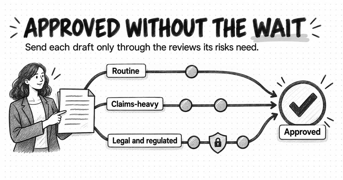
Agree in advance what happens when a check fails: send the report with a clear note about which number is wrong and when it will be fixed, or delay it a few hours. Never send it silently with a known error; the reader will find it and stop trusting the next report. If your team already has a review process for content, our guide to content approval workflows covers how to set review tiers so routine items move quickly.
How automated marketing reports fail
Manual reports fail loudly: someone forgets to send one. Automated reports fail quietly: the email arrives on time and the numbers are wrong. Five failure modes cause most of the trouble.
Broken tracking. A form is rebuilt without its tracking event, a tag change removes a pixel, a landing page goes live without the analytics snippet, or campaign links are tagged inconsistently. The data stops arriving or lands in the wrong place, and the report shows a drop that isn't real. Check: compare each metric with the same weekday last week and its recent average, and treat a sudden zero or a drop of more than half as a tracking question first.
Metric drift. The same name slowly comes to mean something different: someone adds a filter, sales changes which leads they accept, a form field changes who counts as qualified. Six months later the year-over-year comparison means nothing. Check: one written definition per metric, with an owner and a change log.
Platform changes. Tools rename metrics, change how they count or retire fields that connectors depend on. Email open rates are a well-known example. Apple's Mail Privacy Protection, announced in June 2021, stops senders from using invisible pixels to learn when a message is opened, which made opens for those readers far less meaningful even though open rates kept appearing in every email tool's reports. Check: follow your main platforms' release notes, note definition changes in the report, and prefer metrics closer to real behavior, such as clicks, replies and form submissions.
Silent failure. The job runs and the email goes out, but a connector didn't sync, an access token expired, or the dashboard is showing cached data. Check: show when each source was last updated at the top of the report, and alert the owner when a source is older than expected.
Early data. The report runs before the numbers settle, so the latest period always looks worse than it will. Readers learn that the latest week is always down and start ignoring real drops. Check: send after processing delays and label recent days as provisional.
A sixth failure isn't technical: the report outlives its purpose. The campaign ended, the person who asked for it left, or the decision it supported is no longer made, and nobody turns it off because it costs nothing to keep sending. That is why the last step of any reporting setup is checking whether anyone uses it.
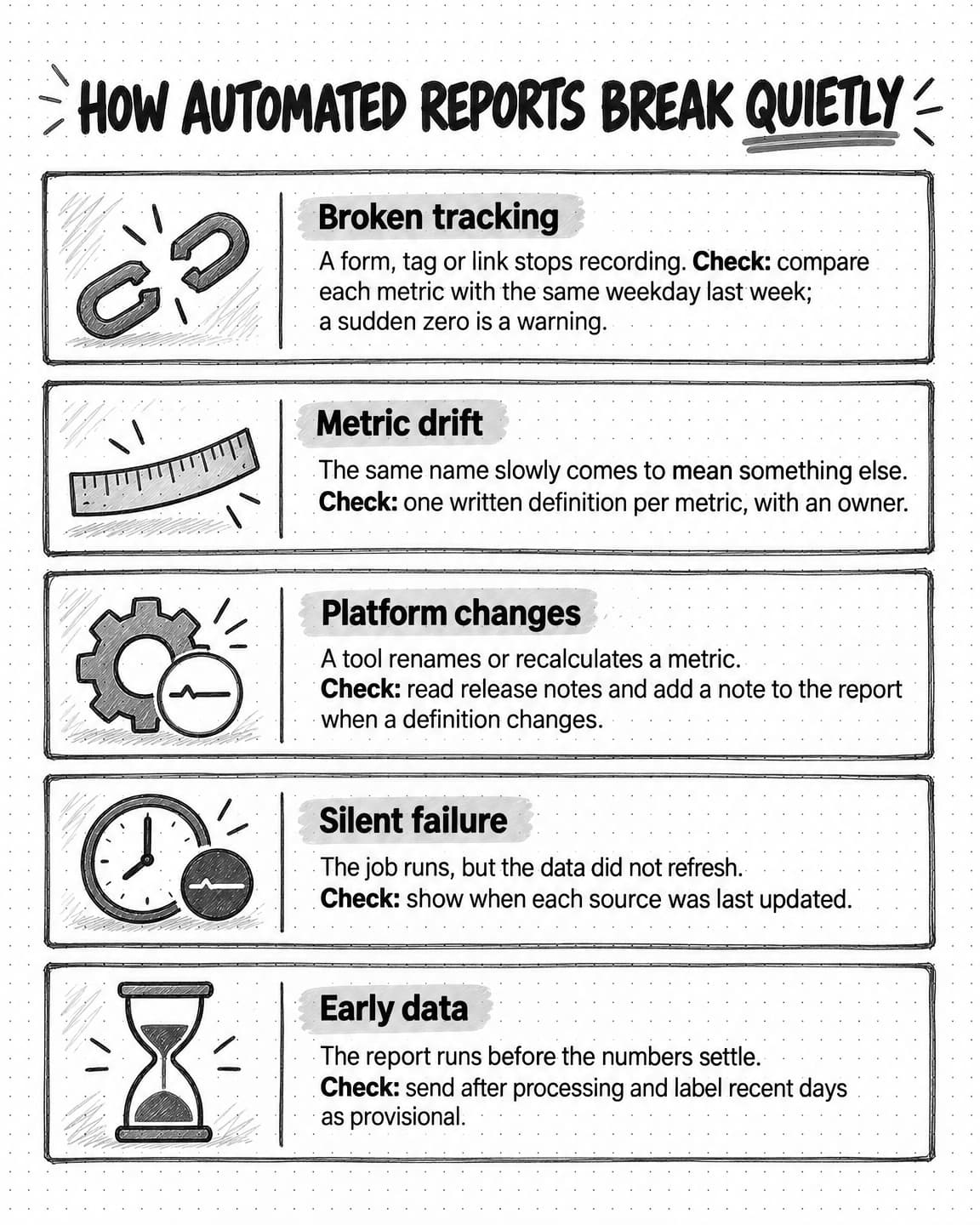
View the five failure modes and checks at full size (opens in a new tab).
How to tell whether anyone uses your reports
Most teams never check whether a report changes what anyone knows or does. Treat it as a product with users, and a few signals will tell you.
Decisions that cite it. The strongest signal is a decision someone made because of the report: budget moved, a campaign paused, a page fixed. Keep a short log of them in the report itself, under "decisions since last report." A report that contributed to no decision in a quarter needs a redesign or retirement.
Questions it prompts and prevents. Replies and follow-up questions show that someone read it closely. If the CEO still asks in meetings for numbers the report already contains, it is not reaching them in a usable form; track those questions for a month, because each one points to a missing headline or a buried number.
Opens and views, with caution. Dashboard view counts and email opens can reveal a report nobody opens at all. They can't prove one is read, and, as the previous section noted, email opens are increasingly unreliable.
The removal test. Once a quarter, stop sending a report you suspect nobody reads, with a note saying so. If nobody asks for it within a few weeks, you have your answer. If someone does, ask what they used it for and design the next version around that.
Each quarter, review every report against its reader: still the right reader, question, cadence and length? Our guide to marketing operations covers where this kind of maintenance fits in a lean team's routine.
Step by step: build an automated weekly marketing report
Here is the most common case, a weekly pulse for a small B2B marketing team. The same steps apply, with more review, to monthly and quarterly reports.
- Name the reader and the decision. Write one sentence, such as: "This report helps the marketing team and the CEO see each Monday whether we are on track for this month's pipeline target, and who is fixing anything that isn't." If you can't write it, don't build the report yet.
- Pick five to eight metrics from the metric tree. Take the outcome and its drivers, plus the one or two leading indicators most likely to explain a change. Leave everything else on the dashboard.
- Write a definition for each metric. Use the fields above, agree them with whoever owns the source data, and keep them in one shared place the report links to.
- Choose where each number comes from. For each metric, pick the source system and how it reaches the report: a native scheduled export, a spreadsheet import, a connector or a manual export. Note each source's processing delay.
- Schedule it after the data settles. Deliver after the slowest source has processed the previous week, and state the period, time zone and each source's last-updated time at the top.
- Draft the commentary and trace every number. The report owner or an AI agent drafts the headline and explanations from the finished table, the definitions and the week's known events. A person checks every number against the table and every cause for a confirmed or suspected label.
- Send it with a headline and named owners. The first line states the most important change. Every open issue has one person's name and a next step.
- Check every quarter whether anyone uses it. Review the decision log and the questions it prompted or failed to prevent, then adjust the reader, metrics, cadence or length, or retire it.
The first run takes the longest, mostly in steps 2 and 3, where the team agrees what matters and what each number means. After that, the weekly pulse needs a short review rather than hours of assembly.
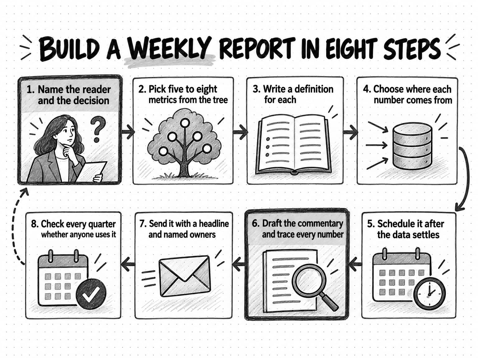
View the eight-step build at full size (opens in a new tab).
A copyable weekly marketing report template
The template below is a starting point for a one-page weekly pulse. It works as an email, a chat post, a document or the top of a dashboard. Replace the bracketed parts, delete sections you don't need, and keep the order the same every week so readers learn where to look.
WEEKLY MARKETING PULSE
Week of [start date] to [end date], [time zone]
Data last updated: [source A: date and time] [source B: date and time]
Provisional: [any days or sources whose numbers may still change]
Definitions: [link]   Full dashboard: [link]

HEADLINE
[One sentence: the most important change this week and what it means for the month.]

NUMBERS AGAINST PLAN
Metric                      This week   4-week avg   Plan    Status
[Outcome or main driver]    [ ]         [ ]          [ ]     [on track / behind / ahead]
[Driver 2]                  [ ]         [ ]          [ ]     [ ]
[Driver 3]                  [ ]         [ ]          [ ]     [ ]
[Leading indicator]         [ ]         [ ]          [ ]     [ ]
Month to date: [outcome] of [monthly plan] ([percent]), [days] days left

WHAT CHANGED AND WHY
- [Change]. Cause: [CONFIRMED: evidence] or [SUSPECTED: what to check]

TOO SMALL OR TOO RECENT TO READ
- [Metric]: [why it should not be interpreted yet]

OPEN ISSUES
- [Issue]. Owner: [name]. Next step: [action] by [date]

ALERTS THIS WEEK
- [Alert, when it fired, what was done]

OUTSIDE THE COMPANY
- [Competitor, market or search change worth knowing, with source link]

DECISIONS NEEDED
- [Decision], from [person], by [date]

DECISIONS SINCE LAST REPORT
- [Decision made because of an earlier report]
The "too small or too recent" section stops readers, and AI commentary, from over-reading noise, and it is often the most useful part of a quiet week. "Outside the company" keeps market context next to the numbers. "Decisions since last report" is the running record that the report matters, and the first thing to check in the quarterly review. For a monthly report, add a comparison with plan and the same month last year and a paragraph on what changes next month; for a quarterly business review, add budget and revenue contribution using the methods in the content marketing ROI guide.
Worked example: a four-person team rebuilds its Monday report (fictional)
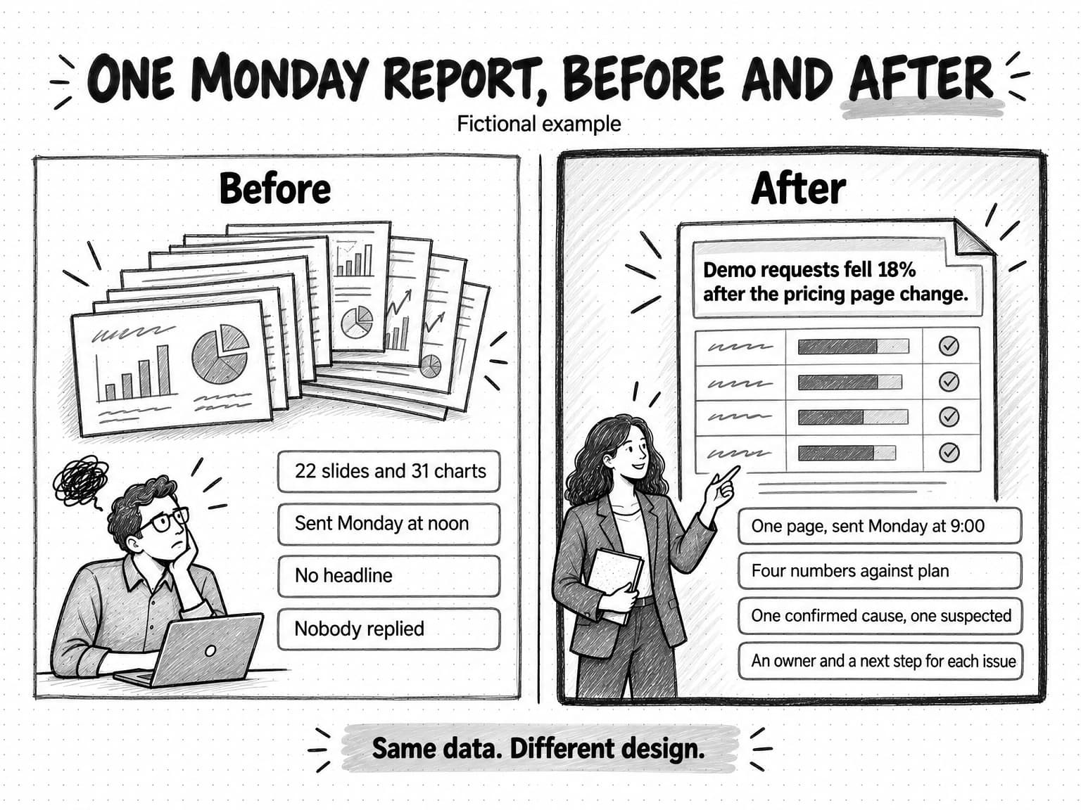
Quillstack is a fictional B2B software company with a four-person marketing team: a marketing lead, a demand generation manager, a content marketer and a designer. Every Monday, the demand generation manager spent most of the morning building a report from the ad platforms, the analytics tool, the email tool and the CRM. The result was a deck of 22 slides with 31 charts, sent to the leadership channel around noon, with no headline. In the quarter before the rebuild it received no replies, and the CEO regularly asked in Thursday meetings for numbers it already contained. All numbers in this example are illustrative.
Reader and decision. The marketing lead wrote one sentence: each Monday, the team and the CEO should see whether marketing is on track for this month's pipeline target, and who is fixing anything that isn't. The full set of charts moved to a dashboard linked from the report, and the report became one page.
Metrics and definitions. The team drew a metric tree from new pipeline sourced by marketing, with qualified demo requests, demo-to-opportunity rate and average opportunity size as drivers. The pulse kept four numbers against plan: qualified demo requests, demo-to-opportunity rate, pricing page visits and the pricing page's demo form conversion rate, with pipeline shown month to date because a single week of it was too noisy to judge. Writing definitions took two meetings, because marketing and sales counted qualified demo requests differently: sales excluded companies under 20 employees. They adopted the sales definition, logged the change and marked the series break on the dashboard.
Plumbing and commentary. With four sources, the team chose a connector feeding a spreadsheet, which fed the dashboard. The report was scheduled for 9:00 on Monday and covered the week to the previous Saturday, so Sunday's partly processed data didn't make every week look like a dip. The demand generation manager gave an AI agent the finished table, the definitions and the week's known events, using a brief like the one above, and checked the draft against the table in about fifteen minutes.
The first week that mattered. In the third week, the headline read: "Demo requests fell 18% after the pricing page change." Qualified demo requests were 41, against a four-week average of 50 and a weekly plan of 52. Pricing page visits were flat, but the page's demo form conversion rate fell from 3.1% to 2.2%. The draft offered two causes. One was confirmed: the redesigned pricing page, live since Tuesday, had moved the demo button below a long feature table, which the content marketer checked on the live page. The other was suspected: a public holiday in one region, which needed another week of data to judge. The designer owned the fix, restoring a demo button near the top of the page by Wednesday.
The CEO replied within the hour, asking whether to roll back the redesign. The team restored the button instead, and two weeks later the form's conversion rate was back near its earlier level. The decision went into "decisions since last report."
The data didn't improve; the connector pulled the same numbers the demand generation manager used to export by hand. What changed was the design: one reader, one question, four numbers against plan, labeled causes and named owners.
How Ampere helps with marketing reporting
Ampere, your AI marketing agent, can take on the interpretation and research layers of a reporting process like this one, while your analytics tools, spreadsheets and dashboards keep doing the collection. You brief Ampere in plain English, it works in its own session workspace with a browser, files and internet access, and it returns the result for your review.
For performance reporting, give Ampere the period's exports or a finished metrics table, your metric definitions and the week's known events. It can check the table for gaps and implausible changes, draft the headline and commentary in the structure of the template above with causes marked confirmed or suspected, and write versions for different readers, such as a one-page pulse for the team and a three-line summary for the CEO. It can deliver the result as a document, spreadsheet, presentation, PDF or self-contained HTML report. Ampere does not connect to your analytics, ad platform or CRM accounts today, so you provide those exports each period, and the numbers in the final report should come from your own calculations. Like any AI draft, its commentary can be wrong, so a person should check every number and cause before the report goes out.
For the "outside the company" section, Ampere can research competitors, public ad libraries, reviews, search results and AI-search visibility, and save evidence-backed reports to Brand memory so later work starts from the same picture of your market. Scheduled Tasks can rerun that research hourly, daily, weekly or monthly and return each result to a Project for review, with optional run-update emails to members of your Organization. Monitoring checks supported public sources hourly, daily or weekly and files in-app alerts with evidence when something you track changes. Public data coverage is never complete, so treat these findings as evidence to check rather than a full census.
Ampere drafts and researches; it does not send your reports to stakeholders or change anything in your marketing tools. Your team decides what goes out and to whom.
Sources and further reading
- Jakob Nielsen, How little do users read?, Nielsen Norman Group, May 5, 2008. Analysis of 45,237 page views; users read at most 28% of the words on an average page, about 20% more likely.
- Google Analytics Help, Schedule reports. Administrators can schedule up to 50 reports, each to up to 50 recipients, daily, weekly, monthly or quarterly.
- Google Analytics Help, Data freshness. Processing can take 24 to 48 hours; attribution for key events can change for up to 12 days; times are typical, not guaranteed.
- Google Analytics Help, Anomaly detection. Bayesian state-space model; training periods of two weeks, 90 days and 32 weeks for hourly, daily and weekly anomalies.
- Google Analytics Help, Conversions vs. key events in Google Analytics.
- Google Analytics Help, URL builders: Collect campaign data with custom URLs. Campaign parameter values are case sensitive.
- Google Cloud, Data Studio release notes, entry of April 16, 2026: Looker Studio rebranded as Data Studio.
- Google Cloud, Schedule automatic report delivery, Data Studio documentation. PDF delivery, 50 recipients per schedule, once a day without Pro and up to hourly with Pro.
- Apple Newsroom, Apple advances its privacy leadership with iOS 15, iPadOS 15, macOS Monterey, and watchOS 8, June 7, 2021. Mail Privacy Protection.
- Jeff Bezos, 2017 letter to shareholders, Amazon. Narratively structured six-page memos in place of slide presentations.
Frequently Asked Questions
What should a marketing report include?
A marketing report should include a one-sentence headline, a few metrics compared with plan and an earlier period, an explanation of what changed with each cause labeled confirmed or suspected, open issues with named owners, and any decisions needed. It should also state the dates, time zone and when each data source was last updated, and link to metric definitions and a dashboard for detail.
What is an example of a marketing report?
An example of a marketing report is a one-page weekly pulse for a B2B team. It opens with a headline such as "Demo requests fell 18% after the pricing page change," then shows four numbers against plan, explains one confirmed and one suspected cause, names who is fixing each issue, and lists decisions needed. A monthly performance report or quarterly business review follows the same structure with longer periods.
What is the difference between a marketing report and a marketing dashboard?
A marketing report is a message for a specific reader about a fixed period: it states what changed, why, and what the team will do. A marketing dashboard is a screen of charts that refreshes from connected data so people can look up current numbers and filter them. Dashboards suit lookup; reports suit decisions, and most teams link the dashboard from the report.
How do you create a marketing dashboard?
To create a marketing dashboard, start from the questions its users need to answer, choose metrics from a metric tree, and write a definition for each. Then connect the data sources to a BI tool such as Data Studio, directly or through a connector, group the charts by question, and show when each source last updated. Review it with its users after a few weeks and remove unused charts.
What are the main types of marketing reports?
The main types of marketing reports are the weekly pulse, the monthly performance report, the quarterly business review, the campaign post-mortem, the market and competitor brief, and the executive one-pager. Each serves a different reader, from the marketing team to the board, and answers a different question, so a team should design each for its reader instead of sending one report to everyone.
What metrics should a marketing report track?
A marketing report should track the outcome the business already measures, such as pipeline or revenue, the two to four drivers that combine to produce it, and a few leading indicators that move first. A metric tree makes the choice: for a demo-led B2B company, that means qualified demo requests, demo-to-opportunity rate and opportunity size, plus pricing page visits and form conversion rate.
What are the best marketing reporting tools?
The best marketing reporting tools depend on the job. Native reports from analytics and ad platforms cover one channel each; spreadsheets suit small teams and settling definitions; BI tools such as Data Studio suit dashboards; connector or ETL tools combine many sources; and AI agents draft commentary from finished numbers. Most small teams need one tool to collect the numbers and one way to explain them.
What is an executive summary in a marketing report?
An executive summary in a marketing report is the short opening that tells a senior reader what matters without reading the rest: the most important change, the few numbers that show it against plan, the likely cause, and any decision needed. A good test is whether the CEO could act on it alone. For leadership, it can stand on its own as a one-page report.