What are brand guidelines? What to include and how to use them
The documented decisions, reasons, and examples that let anyone producing your marketing make the choices you would make, and how to keep them useful as the company changes.
47 min readWritten by Ampere
Short answer
What are brand guidelines?
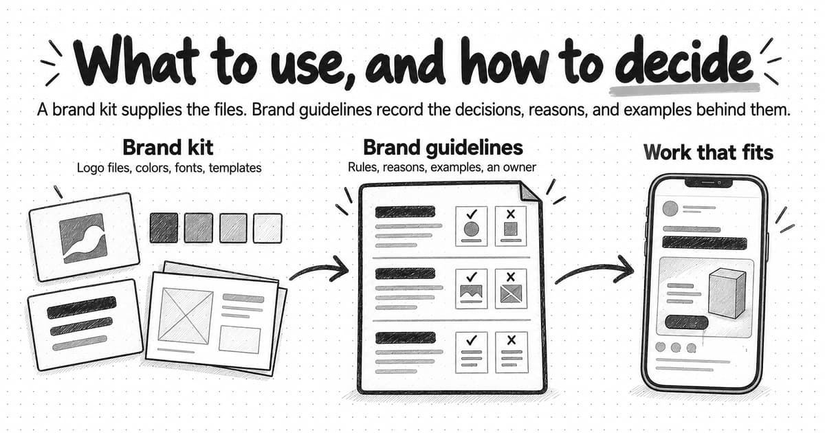
Brand guidelines are a company's documented decisions about how its brand looks and sounds, written so other people can apply them. Useful rules state the decision, the reason for it, and examples of correct and incorrect use, and the guidelines say which choices are fixed and where judgment applies. A brand kit supplies the files; guidelines explain how to decide what to make with them.
Summary
A brand kit of logo files, color values, fonts, and templates tells people which files and values to use. It does not say what the accent color is for, what the images should show, how the company sounds, or which figures are still current. Brand guidelines record those decisions with reasons and examples, so a freelancer, an agency, or an AI tool can make the choice the company would make.
Useful guidelines cover logo, color, typography, imagery, layout, voice, terminology, and a short messaging summary, and explain what each element is for, not only its specification. Facts that change with each release, such as features, pricing, customer counts, and performance figures, belong in linked sources with owners and dates, because a figure copied into a brand document goes stale while still looking approved.
A brand rule is actionable when someone new to the brand can apply it and reach the same decision. That usually takes the decision, when it applies, a result a reviewer can check, the reason, an example with a near-miss counterexample, and the exception route; the guide includes a template with those parts. The reason is what lets people extend a rule to formats it never mentions.
Good guidelines fix the decisions that carry recognition or trust, such as logo use, color roles, names, and claims, and leave layout, screenshot choice, and headline wording to judgment. A recorded exception is a deliberate decision, while an unnoticed inconsistency needs correcting along with its cause. A longer or stricter document is not a better one; the measure is whether people can make the decisions their work requires.
A worked example follows one fictional software company's LinkedIn carousel, made with only a brand kit and then with guidelines: the kit got the files right, and the guidelines settled color use, imagery, voice, naming, and claims. When a format such as vertical video departs from the static rules, list each difference and ask whether the format required it.
Employees, freelancers, agencies, and AI tools need the same guidance. Uploading a guidelines PDF to an AI tool shows only that the file is there; the relevant rules also have to be readable by the tool, clearly worded, and supplied with the brief, and the result still needs review. To test the guidelines, give one short assignment to people new to the brand and compare where their decisions differ.
Contents
- What brand guidelines are and who uses them
- How brand guidelines differ from a brand kit, a style guide, and other brand resources
- What to include in brand guidelines
- Example: an excerpt from a fictional company's guidelines
- What belongs in the guidelines and what belongs in a linked source
- What makes a brand rule actionable
- Fixed rules and areas of judgment
- Worked example: one assignment with a brand kit, then with guidelines
- Adapting guidelines to presentations, social content, email, websites, and video
- How people and AI tools use the same guidelines
- When the guidelines do not cover a situation
- Ownership, updates, and access
- Test whether your guidelines are useful
- Keep the brand context your work depends on current
- Sources and further reading
- Frequently Asked Questions
A founder at a small software company hires a freelance designer to make a LinkedIn carousel for a feature launch, and sends over the brand kit: the logo files, four color values, two fonts, a slide template, a few product screenshots, and last year's sales deck for reference. Two days later the carousel arrives. The logo is the right file and every color comes from the kit, yet the founder ends up rewriting most of it. The company's accent color fills the cover slide. A padlock-and-shield illustration sits where a product screenshot should be. The headline promises that buyers will "never fear a security review again," and a badge on the cover repeats a performance figure from the old deck that the company stopped citing months ago.
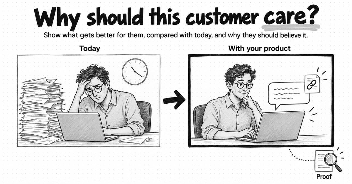
The designer did not ignore the brand. The kit answered one question, which files and values to use, and none of the questions the carousel actually raised: what the accent color is for, what the images should show, how the company talks about risk, and which figures are still current. Those answers lived in the founder's head. Brand guidelines are where a company writes such decisions down, with the reasons behind them and examples of each, so that people who were not part of the original discussions can make the same choices.
That difference, between a collection of brand assets and guidance that helps someone make a consistent decision, runs through this guide. It covers what to include, how to write rules that people and AI tools can apply, what to do when the guidelines are silent, and how to test whether yours work.
The company in the opening example is Wrenhold, a fictional business used throughout this guide. It sells an AI agent that drafts answers to the security questionnaires software companies receive from prospective customers, and a security lead approves every answer before it is sent. The real examples come from public guidelines published by the NHS, Red Hat, GOV.UK, Google, Monzo, and Intuit. None of it requires a fifty-page brand book. A few pages of well-chosen rules, kept current, would have settled most of what the freelancer had to guess.
What brand guidelines are and who uses them
Brand guidelines are a company's documented decisions about how its brand looks and sounds, written so that other people can apply them. A useful set records each decision, the reason for it, examples of correct and incorrect use, and what may change from one format to another. The same document goes by several names, including brand standards, brand book, brand guide, and brand style guide. The name matters less than whether the document answers the questions people face when they make something.
The audience is broader than the design team. Writers, designers, and marketers use guidelines every week. So do people who make marketing occasionally: a founder writing a LinkedIn post, a salesperson building a slide for a prospect, a product manager writing release notes, or a recruiter writing a job ad. Outside the company, freelancers, agencies, partners preparing co-marketing material, event organizers, and journalists who need a logo file all rely on them. Reviewers use them too, because a written rule gives feedback a basis other than taste. First drafts may also come from AI tools and AI marketing agents, which can only follow the brand they have been given.
These readers fall into two groups. People who already know the brand use guidelines to settle a question, such as which logo version fits a dark background. People who are new to it use them to learn how the company makes decisions at all. Write for the second group. A document that makes sense only to people who already know the answers will mostly be read by people who don't.
Public guidelines show how much the form can vary. The NHS identity guidelines give logo sizes and margins for each print and screen format, and explain why only one NHS logo appears on a page: a second one looks untidy and weakens the identity. Red Hat publishes numbered versions of its brand standards and sets a limit on each voice trait, with examples of copy that falls short, copy that fits, and copy that goes too far. The GOV.UK style guide covers only writing, and much of its value lies in how it handles change: who can propose a new rule, what evidence to include, and how often proposals are reviewed. None of them is a template for a ten-person software company, but each shows a habit worth copying.
How brand guidelines differ from a brand kit, a style guide, and other brand resources
Teams use these terms loosely, and the overlap causes real confusion: a company that has a brand kit may believe it has guidelines, and a company with a design system may assume its marketing is covered. The clearest way to separate them is by the question each one answers.
| Resource | What it is | The question it answers | Wrenhold example |
|---|---|---|---|
| Brand identity | The recurring visual and verbal choices that make the company recognizable | How does the company look and sound? | One green accent, used only to mark where an answer comes from |
| Brand guidelines | Those choices written down with reasons, examples, and limits | How do I apply the choices to the piece I'm making? | "Use green only on citations, once per frame, because green means this has a source" |
| Brand kit | Ready-to-use files and values | Which file, and which exact value? | Logo files for light and dark backgrounds, the green's color values, font files |
| Style guide | Editorial rules for writing: spelling, grammar, punctuation, numbers, and preferred terms | How do we write this word, date, or name? | Write "security questionnaire," never "security survey" |
| Design system | Reusable interface components with code and usage guidance, mostly for the product | Which component do I use, and how does it behave? | The citation label component in the product's answer view |
| Templates | Pre-built layouts for recurring formats | What should this slide or post start from? | A 16:9 slide layout with the source line already in place |
| Asset library | A store of approved files: logos, screenshots, photos, icons, and past work | Where is the approved version? | Current product screenshots that use fictional sample data |
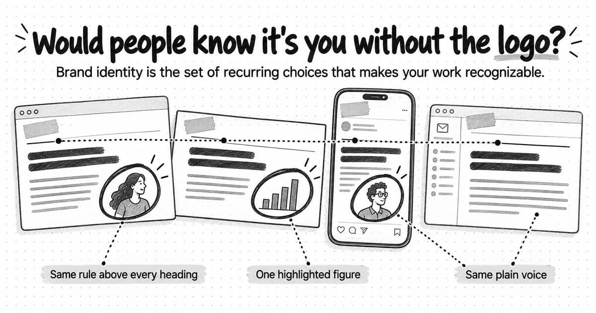
The brand identity exists before anyone documents it, and our guide to brand identity covers its elements in detail. Guidelines are the written explanation of that identity. The kit, the templates, and the asset library are the materials that make it easy to apply correctly.
Some of the boundaries blur in practice. "Brand style guide" often means the whole set of brand guidelines, while an editorial style guide such as the GOV.UK style guide covers only writing. Many design systems include voice and content guidance alongside their components. What matters is that someone making a piece of work can find the decision they need, whichever document holds it.
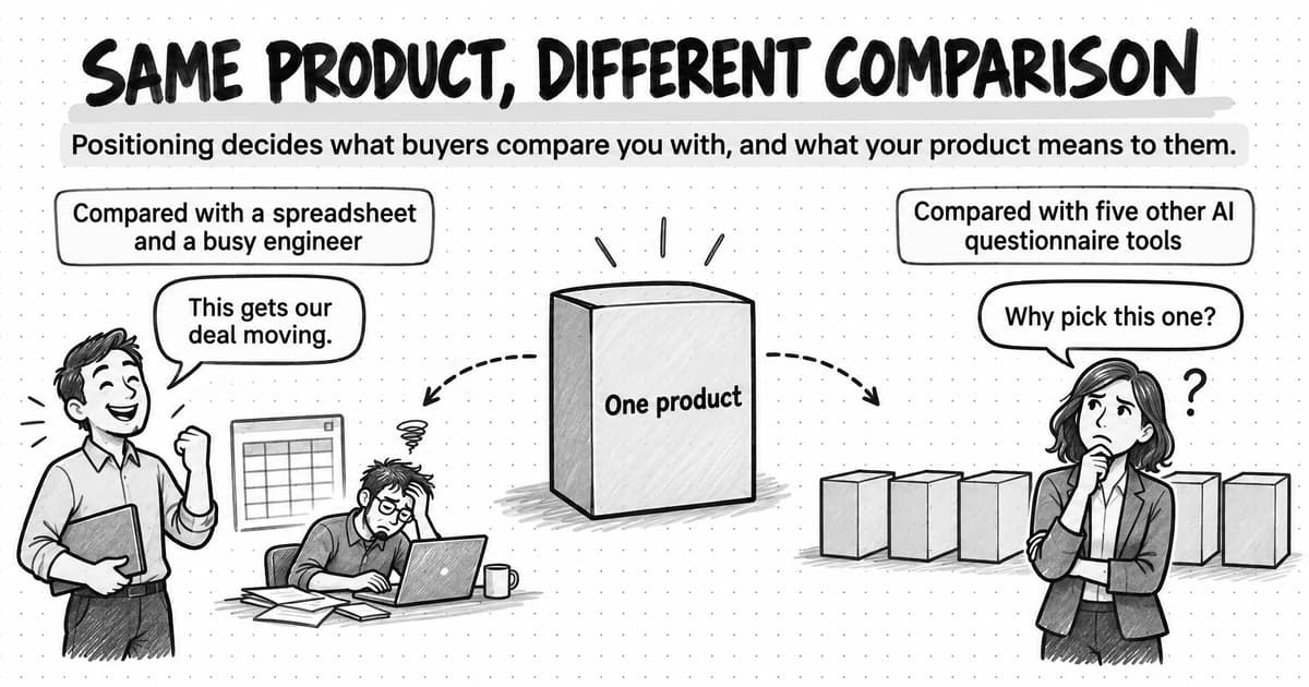
The most important distinction in the table is between the resources that tell people what to use and the one that tells them how to decide. A template fixes a layout, but it cannot tell anyone what to do in a format it was not built for. A kit supplies the exact green, but not when green belongs on the page. Guidelines carry the reasoning that lets people extend the system to work nobody anticipated. The two kinds of resource need each other. Guidelines without a kit leave people rebuilding logos from screenshots, and a kit without guidelines leaves them guessing. Our article on why AI-generated marketing can look polished and still feel off-brand describes the same gap when the work comes from an AI tool.
What to include in brand guidelines
Most brand guidelines cover the same elements, and lists of them are easy to find. What separates useful guidelines from a specification sheet is whether each section explains what the element is for and how to make decisions with it. The sections below describe the guidance that helps for each element. A small company can cover all of them in a few pages.
Logo
Most logo sections specify clear space, minimum size, and a set of misuses, such as stretching, recoloring, or adding effects. Those rules are worth keeping, but the most frequent logo decisions are about choice and placement: which version to use at small sizes, which backgrounds are allowed, whether the logo can sit on a photo or screenshot, and how it appears beside a partner's logo or inside a customer's slide deck. A rule such as "Below 96 pixels wide, use the symbol on its own" answers a question people actually face.
Color
A palette with color values tells people what the colors are. It does not tell them what each color is for. Useful color guidance gives each color a job and a rough proportion: which color carries text, which colors form backgrounds, and what the accent marks. It also lists the combinations that are legible. The Web Content Accessibility Guidelines set a contrast ratio of at least 4.5:1 for normal text, so a guideline that names the approved text and background pairs saves every designer from testing them again. Add what to do in single-color, dark-mode, and print contexts if the company uses them.
Typography
Name each typeface and its role, then give the sizes that work in each format: a slide read across a room needs much larger type than a web page. Include the fallback for places where the brand fonts will not load, such as many email programs and slides built on a colleague's computer. Conventions for capitalization and for numbers, dates, and currencies belong here or in the editorial style guide.
Imagery
Imagery guidance should say what pictures are for before it says how they look. For a software company, that usually means deciding how product screenshots are cropped and annotated, what sample data they show, and when illustration or photography is used instead. A list of what to avoid can be the most useful part of the section. Wrenhold sells to security teams, and its guidelines exclude padlocks, shields, hooded figures, and streams of code, because those images are common across the category and say nothing specific about the product. Include who may supply images and how image rights are checked.
Layout and composition
Layout guidance covers margins, alignment, grids, how much goes in one frame, and any recurring device, such as a rule above every heading or a source line at the bottom of a slide. It is also where templates belong, with a note on what each template is for. Layout is easily lost in adaptation, because every new tool and template brings its own defaults.
Voice and tone
Voice is how the company sounds in every situation; tone is how that voice adjusts to the reader's situation, such as a launch announcement compared with a delay notice. Useful voice guidance turns each trait into observable choices, with a boundary and an example: what "confident" means for this company, what it does not mean, and a sentence that shows it. Tone rules are more useful when they say why. Intuit's content design system keeps the replies of its AI assistants neutral and professional, and explains that breezy or funny replies did not test well with customers and that AI models cannot read the room. Our guide on how to define your brand voice covers how to write a voice down, including how to turn adjectives into instructions.
Terminology
Terminology covers the words the company has decided on: the product and feature names and how they are capitalized, the name of the category, how the company refers to its customers, and words to use or avoid. These decisions look small, but they are easy to break, because nobody can infer them. A freelancer cannot guess that Wrenhold writes "Source check" as two words, or that the company says its product "drafts answers" and never that it "automates" them.
Messaging
Brand guidelines usually summarize the company's position: who it serves, what it does better, and the core message. Keep that summary short and link to the full positioning and messaging work instead of copying it. Our guides to brand positioning and creating a brand messaging framework cover those decisions themselves. Guidelines should say where those decisions live, who owns them, and how to use them. A few messaging decisions are worth stating in the guidelines themselves, because people meet them in everyday work: whether the company names competitors in its marketing, and how it talks about pricing.
Where to start if nothing is written down
If your company has no guidelines yet, start with the decisions people get wrong most often rather than a table of contents. Collect ten or so recent pieces you are happy with and note the choices they share: which logo version appears where, what the accent color marks, which typefaces appear at which sizes, what the images show, how the headlines sound, and which names recur. Write each shared choice as a rule with a reason and an example. Add a rule for claims that points to your product facts, then an owner and a date. The Wrenhold excerpt in the next section shows what a short set of that kind can look like.
Example: an excerpt from a fictional company's guidelines
Security questionnaires often run to hundreds of questions about data handling, access controls, and compliance. Wrenhold's agent drafts each answer from the customer's approved security documents and cites the document and section it used. The company presents itself as the careful option for teams whose answers will be checked, because every answer can be traced to its source, so its marketing has to look precise and sound calm.
The excerpt below shows a few of Wrenhold's visual and verbal rules as they appear in its guidelines. The full document runs to five pages.
| Area | Rule | Because |
|---|---|---|
| Logo | Use the wordmark where it can be at least 96 pixels wide and the symbol below that. Place either one on a plain ink or paper background, never on a screenshot or photo. | The symbol stays legible at small sizes. A logo placed on a screenshot looks like part of the product. |
| Color | Text is ink and backgrounds are paper or light gray. Source green marks a citation, at most once per frame. Text on green is ink. | Green means this has a source. Ink on green keeps the text legible. |
| Typography | One sans-serif typeface for all text, and a monospace typeface only for citations and document names. Headings in sentence case. On slides, no text smaller than 24 points. In email, fall back to Arial. | The monospace face makes a citation look like a reference, distinct from the marketing copy around it. |
| Imagery | Cropped product screenshots showing a question, the drafted answer, and its source. Sample data uses the fictional company Example Co. No padlocks, shields, hooded figures, or streams of code. | The product's answers are the evidence. Security clichés make Wrenhold look like every other vendor in the category. |
| Layout | Left-aligned, one point per frame. Any frame that states a figure ends with a source line naming the document and date. | The source line repeats the product's promise in every asset. |
| Voice | Calm and exact. Say what Wrenhold drafted and who approves it. Write: "Wrenhold drafts each answer and links the policy it came from. Your security lead approves it before it is sent." Not: "Never fear a security review again." | Readers are accountable for every answer they send, and fear-based copy suggests a vendor that hides the review step. |
| Terminology | "Security questionnaire," not "security survey." "Drafts answers," not "auto-fills" or "automates." "Source check" is two words. The product is always "Wrenhold." | Exact verbs keep the reviewer's role visible, and consistent names are easier to find in search. |
| Claims | Use figures, customer counts, and certifications only from the current product facts page, with the date shown there. If a figure is not on that page, leave it out and ask product marketing. | Facts change with each release, and that page is updated when they do. |
| Ownership | Owner: head of marketing. Questions go to the #brand channel. Version 1.4, reviewed September 15, 2026. | Everyone can see whom to ask and how current the document is. |
Three features of the excerpt are worth copying even if none of its rules apply to your company. Every rule has a reason. The rules describe results someone can check, so a reviewer can point to the line a piece breaks. And the facts that change often, such as figures and certifications, are not in the document at all: the claims rule tells people where to find them.
What belongs in the guidelines and what belongs in a linked source
Some information changes when the brand changes, and some changes every month. Brand guidelines work best when they hold the first kind and link to the second. A logo rule, a color's job, or a voice trait may stay the same for years. A product's features, pricing, integrations, customer count, and performance figures can change with every release. If guidelines copy that second kind of information, the copy goes stale while still looking authoritative.
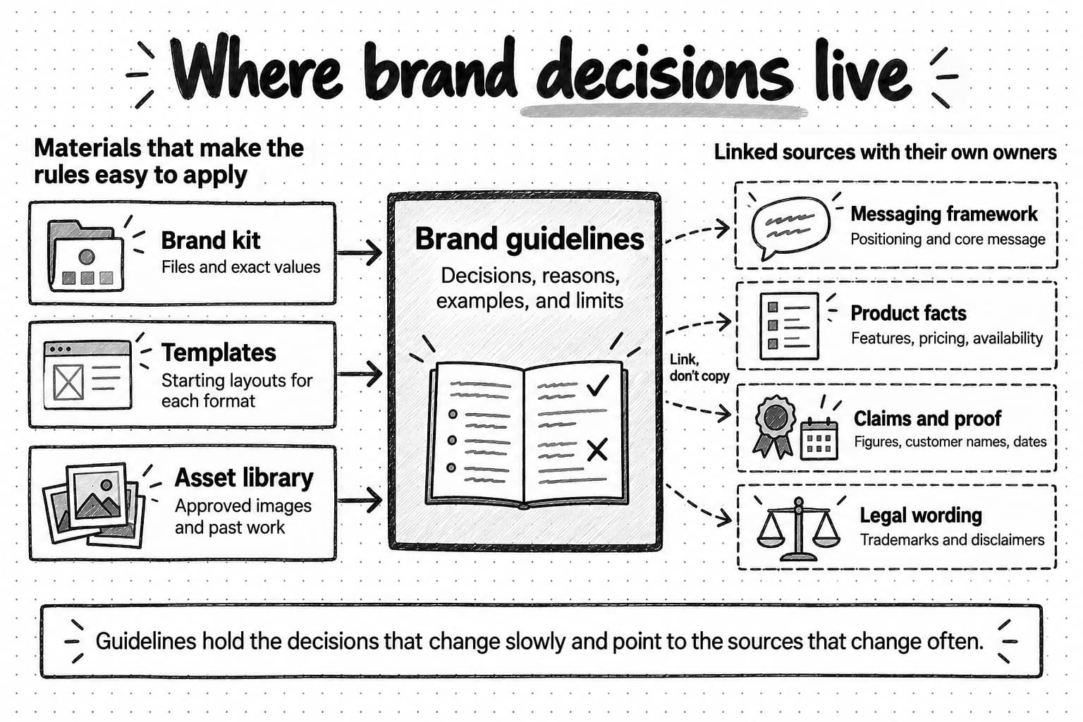
View the map of where brand decisions live at full size (opens in a new tab).
| Information | Where it belongs | Why |
|---|---|---|
| Logo, color, type, imagery, layout, voice, and terminology rules | The guidelines | They change only when the brand changes |
| Positioning statement and core message | A short summary in the guidelines; the full version in the messaging framework | Strategy changes on its own schedule and has its own owner |
| Product features, availability, integrations, and pricing | A product facts page | It changes with releases and is owned by product or product marketing |
| Approved claims, such as customer counts, performance figures, and certifications | A claims register or the product facts page, with the date and source of each | Each claim depends on evidence that can expire |
| Customer logos and quotes | A proof library that records permission | Permission can be limited or withdrawn |
| Trademark use, disclaimers, and regulated wording | A page owned by legal | Legal requirements change independently of the brand |
| Direction for one campaign | The creative brief | It applies to one piece of work, not to the brand |
The guidelines should still say how to use each linked source, as Wrenhold's claims rule in the excerpt does. That rule stays correct when the facts change, because it contains no facts of its own.
This matters most for claims. A claim is valid because of its evidence, not because of where it appears. The figure in the freelancer's carousel, "cuts questionnaire time by 80%," came from a 2025 pilot with three customers that Wrenhold no longer cites. If that figure had appeared as an example headline in the brand guidelines, it would have looked approved. A brand document does not make an outdated claim valid. It only makes the claim easier to repeat. Approved claims need an owner, a source, and a date, and someone has to remove them when the evidence no longer supports them.
What makes a brand rule actionable
A rule is actionable when someone who has never met the person who wrote it can apply it to a new piece of work and reach the same decision. In practice, that usually requires six things:
- The decision. What to do, stated plainly.
- When it applies. The formats or situations it covers.
- Something a reviewer can check. The rule describes a visible result, so two people looking at the same asset can agree whether it follows the rule.
- The reason. Why the company made this choice.
- An example, and a counterexample where the boundary is unclear. One piece that follows the rule and one that nearly does.
- The limit and the exception route. What the rule does not cover, and who can approve an exception.
Not every rule needs all six at length. A minimum logo size needs a number and a picture. A rule about how the company describes risk needs much more, because two reasonable people could read it differently.
A vague instruction and an actionable version
A common instruction in brand guidelines reads: "Use our brand colors consistently and don't overuse the accent." It sounds clear, but it does not tell anyone what consistent use looks like or how much is too much. The freelancer in the opening example could have followed it to the letter: every color on the cover slide came from the palette.
Wrenhold's actionable version of the same rule reads:
| Part | Wrenhold's color rule |
|---|---|
| Decision | Use Source green only to mark a citation: the small label or underline that shows where an answer or figure comes from. |
| When it applies | Every format, including slides, social images, web pages, video, and the product. |
| What a reviewer can check | Green appears at most once per frame and never on headlines, backgrounds, or buttons. Text on green is ink, never white. |
| Reason | Green is the only accent color, and it means this has a source. If it decorates other things, readers stop noticing the citations, which are the product's main promise. Ink text keeps the contrast legible. |
| Example | A LinkedIn image of a drafted answer, in which only the label "Security policy, section 4.2" is green. |
| Counterexample | A cover slide filled with green behind an ink headline. Every color comes from the palette and the text on green is ink, yet the rule is still broken, because green no longer marks a source. |
| Limit and exceptions | Event signage may use a green background with the owner's approval, recorded as an exception. |
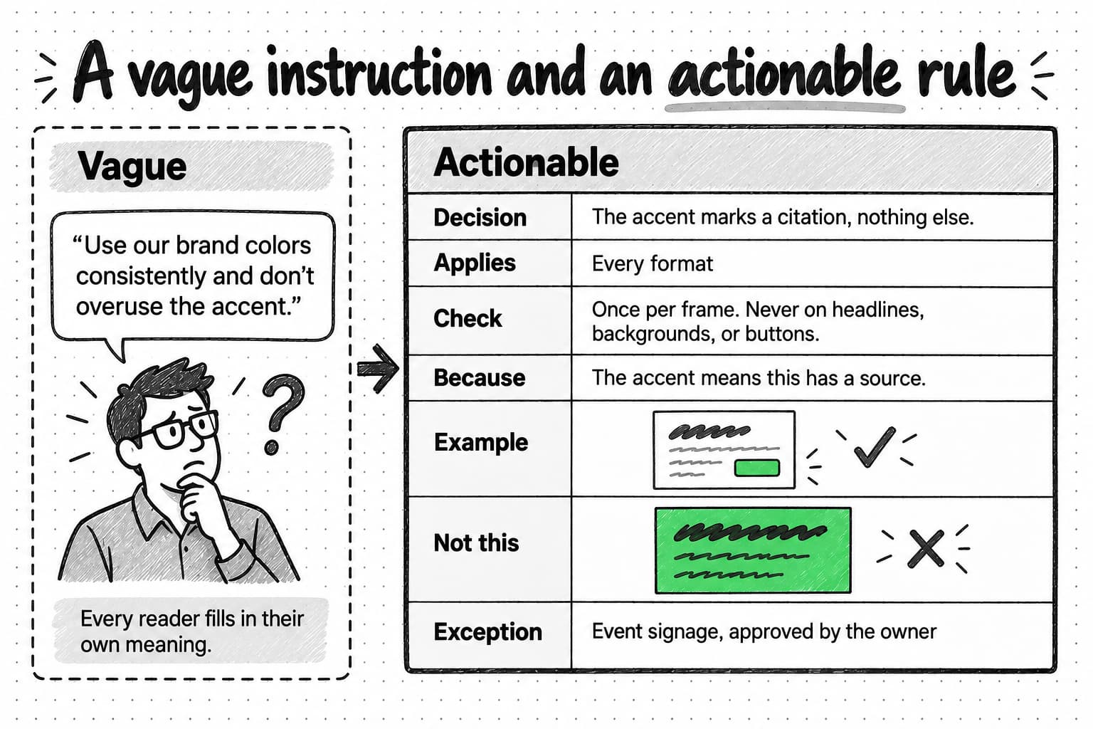
View the vague and actionable rules at full size (opens in a new tab).
The actionable version is longer, but each added line removes a guess. The verbal rules need the same treatment. "Sound confident and trustworthy" becomes: "Say what Wrenhold drafted and who approves it, in the same sentence or the next one. Avoid fear, such as breach or hackers, and certainty the product cannot promise, such as 100% accurate or never. Our readers are accountable for every answer they send, so they distrust vendors who sound like they are hiding the review step." The example is "Wrenhold drafts each answer and links the policy it came from. Your security lead approves it before it is sent." The counterexample is the freelancer's headline.
How examples, counterexamples, and explanations improve a rule
Each part of an actionable rule does a different job.
An example shows what following the rule looks like in a real format, which is faster to understand than any description. Choose real work over idealized mockups, and show the rule in more than one format when the formats differ, because a rule that looks clear on a web page can be ambiguous on a slide.
A counterexample marks the boundary. The most useful counterexamples are near misses: work that follows most of the guidelines and breaks one rule in a way that is easy to overlook, like the green cover. A page of stretched and rotated logos teaches less, because almost nobody would make those mistakes in the first place. Red Hat's brand standards use near misses on both sides of each voice trait. For the trait it calls experienced, the version that falls short is a vague claim to be trusted by enterprises worldwide, the version that fits names the share of Fortune 500 companies that rely on Red Hat, and the overdone version claims more enterprise customers than any other platform. Seeing both misses shows where the trait begins and ends.
An explanation lets people apply the rule to situations it does not mention. A designer who knows that Wrenhold's green means this has a source can work out what to do in situations the rule never describes, such as when an animated citation label should turn green: at the moment the narration names the source. Without the reason, the designer can only copy the examples. Explanations also make exceptions easier to judge, because they show what an exception would cost. The same holds for AI tools. Anthropic's prompting guide compares a bare instruction never to use ellipses with one that explains why: the response will be read aloud by a text-to-speech engine that cannot pronounce them. The guide notes that the model can generalize from the explanation.
When you add or rewrite a rule, this structure covers the parts that make it usable:
RULE
Area:           Logo, color, type, imagery, layout, voice, terminology, or claims
Decision:       What to do, stated so a reviewer can check the result
Applies when:   The formats or situations it covers
Because:        The reason, in one or two sentences
Example:        A real asset or sentence that follows the rule
Not this:       A near miss that breaks it
Left to judgment: What the person doing the work decides
Exceptions:     Who approves one, and where it is recorded
Owner, updated: Name or role, and date
Fixed rules and areas of judgment
Guidelines work better when they say which decisions are fixed and which are left to the person doing the work. If everything is fixed, people treat the rules as obstacles, work around them, and stop reading. If nothing is fixed, the guidelines describe a mood and settle nothing.
Fix the decisions that carry recognition or protect trust. For most B2B companies, that means the logo and its placement rules, the job of each color, the typefaces and their roles, product and feature names, the rules for claims and evidence, accessibility minimums, and any legal wording. Leave room for judgment in the decisions that depend on the format and the audience: the layout of a particular slide, which screenshot to show, how much text a piece can carry, the exact wording of a headline within the voice, how the tone adjusts to the reader's situation, and which part of the message leads for a given audience.
Mark the difference in the document, so nobody has to guess which kind of rule they are reading. Monzo's writing principles show one way to do it. One principle, straightforward kindness, applies to everything the company writes. Its third principle, warm wit, is set to none for operational messages and customer service and turned up for marketing, campaigns, and social media, with a fallback for doubtful cases: if the news could be negative, or there is any doubt, keep it simple. The Google developer documentation style guide takes the opposite starting point. It tells writers that it "contains guidelines, not rules," allows them to depart from it when that improves the content, and asks them to stay consistent within a document once they do. Both approaches tell the reader where judgment is expected.
Intentional exceptions and unnoticed inconsistencies
Two pieces of work can depart from the guidelines in the same visible way and mean very different things. An intentional exception is a departure that someone decided on for a reason, with the owner's knowledge, for a limited purpose, and that was recorded. Wrenhold prints its conference booth banner with a full green background, because a banner has to be visible across an exhibition hall. The head of marketing approved it, and the guidelines list it as an exception for event signage only.
An unnoticed inconsistency is a departure nobody chose. A sales template still carries last year's logo, or an agency uses green for every highlight because the palette allows it. The difference matters for what happens next. An exception that keeps recurring is a sign that the guidelines need a new rule or a format variant. An inconsistency needs correcting, and so does its cause, which is usually an old file still in circulation or a rule that was never written down.
Why length and strictness are poor measures of quality
A longer or stricter document is not a better one. Every rule costs reading time, and rules nobody needs bury the ones that matter. Rules that are stricter than the work requires get ignored, or produce workarounds that are harder to spot than an honest exception. Every rule also has to be maintained, and a long document goes out of date in more places at once. The better question is whether the people who use the guidelines can make the decisions their work requires. A two-page document that answers those questions is more useful than a fifty-page book that people consult only for the logo files.
Worked example: one assignment with a brand kit, then with guidelines
To see what guidelines add to a kit, return to the carousel from the opening. Wrenhold had just launched Source check, a feature that flags any drafted answer whose source document is more than twelve months old, so the security lead knows which answers may rest on an outdated policy. The founder asked a freelance designer for a five-slide LinkedIn carousel announcing it.
The first time, the designer received only the brand kit: logo files for light and dark backgrounds, the four color values, the font files, a 16:9 slide template, six product screenshots, and last year's sales deck for reference. After that carousel, Wrenhold wrote its guidelines down: five pages, revised several times since. Now picture the same brief sent to a different designer with the same kit, the guidelines, and a link to the product facts page.
| Decision | With only the kit | With the guidelines | The rule that settled it |
|---|---|---|---|
| Which colors, and how much of each | Green fills the cover, with a white headline on top | Paper background and ink text; green only on the citation label in the screenshot | Color: green marks citations only, and text on green is ink |
| What the images show | A padlock-and-shield illustration on the cover | A cropped screenshot of a drafted answer whose source is flagged as 14 months old | Imagery: product screenshots, no security clichés |
| How the headline sounds | "Never fear a security review again" | "See which answers rely on an outdated policy" | Voice: calm and exact |
| What the feature is called | "SourceCheck" | "Source check" | Terminology |
| Which figures appear | "Cuts questionnaire time by 80%," copied from the old sales deck | No figure, because the product facts page lists none for this feature | Claims come only from the product facts page |
| Where the logo goes | The symbol in a corner of every slide, sitting on the screenshots | The logo on the first and last slides, on a paper background | Logo placement |
| How the 16:9 template fits a 4:5 carousel | The template squeezed to fit, with 14-point text | One point per slide in a 4:5 layout, large type, and a source line under any figure | Layout and format adaptation |
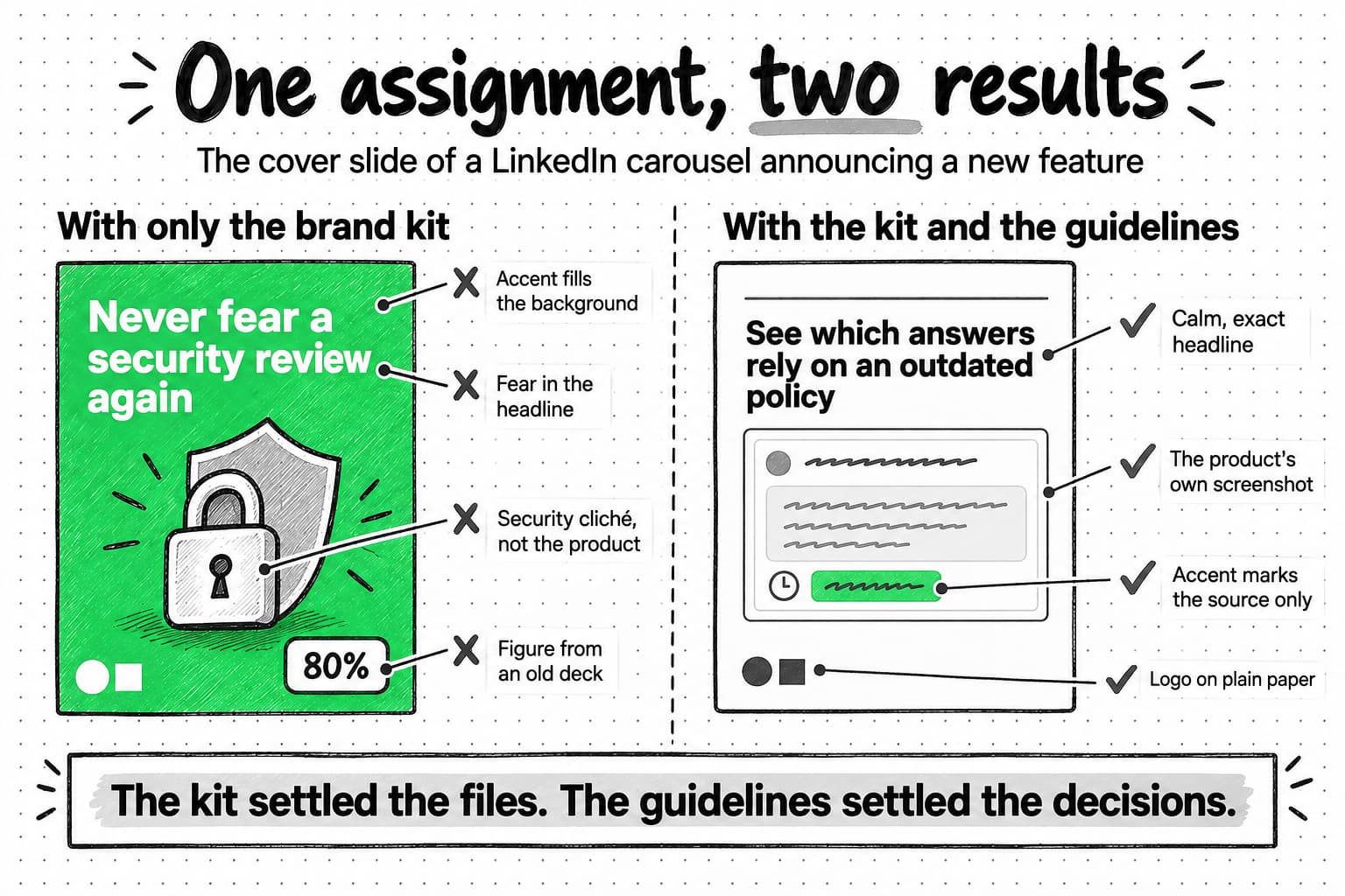
View the kit and guidelines comparison at full size (opens in a new tab).
In both versions the kit did its job. The logo files, color values, and fonts were correct. The kit prevented the errors that are easiest to spot. The guidelines prevented the ones that change what the company appears to be: a careful vendor that suddenly sounds afraid, decorates its slides with clichés, and repeats a figure it can no longer support.
The guidelines did not settle everything, and they should not have. The second designer still chose the headline wording, which screenshot to crop, and the order of the five slides. A third designer would have made different choices, and the carousel would still have looked like Wrenhold's. Those are the decisions the guidelines deliberately leave to judgment.
Adapting guidelines to presentations, social content, email, websites, and video
Formats differ in ways the guidelines have to anticipate. A rule written for a web page can fail on a phone screen, in an email program that blocks images, or in a video that is only watched with the sound off. Useful guidelines say what changes in each format the company uses and what stays the same.
| Format | What the format demands | What the guidelines should cover |
|---|---|---|
| Presentations | Text read from across a room; slides built by salespeople from a template; partner and customer logos | Minimum type size, points per slide, which layouts exist, how to place other companies' logos, what to do inside a partner's template |
| Social content | A second of attention on a phone; platform crops and overlays | Safe areas, minimum type size, when the symbol replaces the wordmark, how much text an image carries, how captions sound |
| Fonts and images that may not load; dark mode that changes colors | Fallback fonts, logo versions for dark backgrounds, live text in place of text in images, button colors | |
| Websites | Long reading, many contributors over time, accessibility requirements | Type scale, link styles, contrast pairs, screenshot treatment, which design-system components to use |
| Video | Motion, sound, captions, and an end frame | How the logo appears and when, caption style, the length of on-screen text, how the voice sounds in narration, how color and type move |
Guidelines that describe only static layouts leave most of these questions to whoever makes the asset, and each person will answer them differently.
An acceptable adaptation and an unintended change
A few months later, Wrenhold commissioned two 20-second vertical videos about Source check for social media from different editors. Both received the kit and the guidelines, and both videos depart from the static layout rules. Only one of them is still recognizably Wrenhold.
In the first video, captions appear one sentence at a time in the brand's sans-serif, much larger than on any slide. A screen recording is cropped to a single drafted answer. When the narration mentions the source, its citation label turns green. The narration is calm and says that a security lead approves each answer. The video ends on the logo on a paper background. It has no source line, because it states no figure. The color's job, the imagery, the voice, and the terminology are the same as in every other Wrenhold asset.
The second video opens on a dark background with a glowing green padlock. Every caption has its key word in green. Stock footage of a hooded figure at a keyboard fills the middle, and the final caption reads "Security reviews on autopilot" above the 80% figure from the old sales deck. Nothing in it is off-palette, and the logo is the correct file. It still changes the brand. Green no longer marks a source, the imagery sells fear, and "autopilot" contradicts the product's central promise that a person approves every answer.
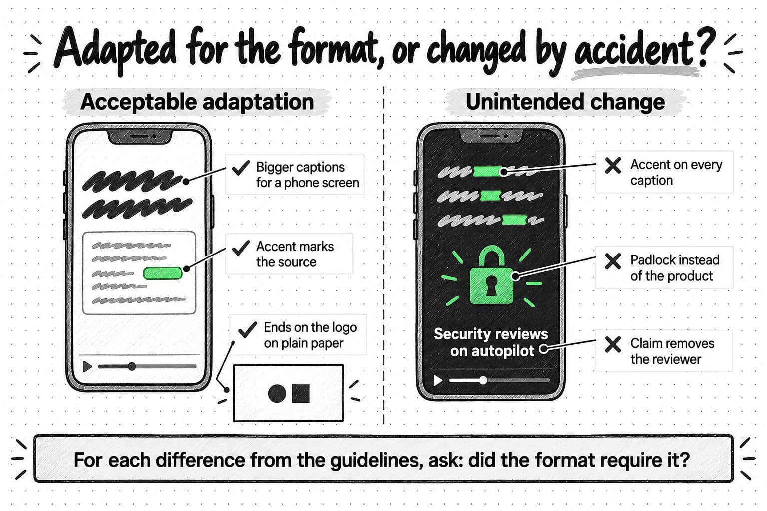
View the two video adaptations at full size (opens in a new tab).
A useful test for any adaptation is to list each difference from the guidelines and ask whether the format required it. The vertical frame, the motion, and the larger type pass that test. The padlock, the green captions, and the autopilot claim do not. They are the editor's own choices, and each one breaks a rule that applies in every format.
How people and AI tools use the same guidelines
Everyone producing work for the brand should work from the same guidelines, but they arrive with different amounts of context, and the guidelines have to reach each of them in a usable form.
- Employees learn much of the brand informally, by seeing which drafts get approved. That helps, but they also inherit old templates and outdated decks. They need one link to the current guidelines and to hear when something changes.
- Freelancers arrive with no history and a deadline. Give them a short starting pack: the guidelines, the templates for their format, two or three examples of approved work in that format, the linked sources, and the name of the person who answers questions.
- Agencies produce more work, often through their own team and their own templates. Agree on which decisions the agency can make, who approves exceptions, and how the agency hears about updates.
- AI marketing agents and other AI tools can produce drafts in large numbers. They need the relevant rules on every assignment, in a form they can read and apply, and their work needs the same review as anyone else's.
What an AI tool needs from your guidelines
Uploading a brand guidelines PDF to an AI tool guarantees only that the file is there. Four checks show whether the guidance reached the tool and shaped the result.
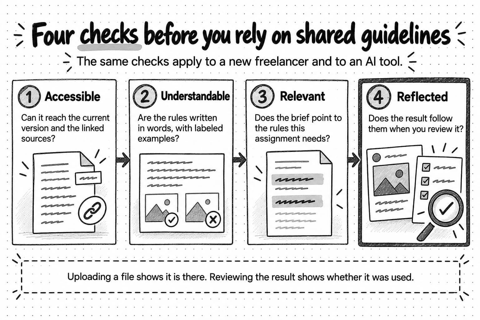
View the four checks at full size (opens in a new tab).
Is the guidance accessible? The tool has to receive the parts of the guidelines that matter. Tools handle uploaded files in different ways. Anthropic's and OpenAI's developer documentation describe PDFs being read as both extracted text and page images, but OpenAI's API passes other document types, such as Word files and slide decks, as text only, which drops the logo diagrams, color swatches, and example spreads that carry many visual rules. Tools that search a large upload, such as OpenAI's file search, pass along only the passages that match the request. OpenAI's help article on building custom GPTs advises using uploaded files "for reference material, not rules or behavior," putting rules and tone in the instructions instead, and notes that complex layouts make uploaded content harder to use. Check, too, that the tool has the current version and can reach the linked sources, such as the product facts page.
Is it understandable? An AI model given "use the accent sparingly" fills in its own meaning, just as a new freelancer would. Anthropic's prompting guide reads like advice for briefing a new colleague: be specific, show examples, and explain the reason for a rule. It suggests showing a prompt to a colleague who has little context on the task, on the basis that if the colleague would be confused, the model will be too. Rules stated in words, examples labeled as correct or incorrect, and conflicts resolved in the document itself leave less to interpretation. If two rules can conflict, say which one wins.
Is it relevant to the assignment? A fifty-page document covering trade-show booths and print signage does not tell a tool which few rules govern a LinkedIn carousel. Research on long inputs points the same way. In a study published in 2024, language models used relevant information less reliably when it sat in the middle of a long input than near its start or end. Another study found that models satisfied fewer of an instruction's requirements as more constraints were added to it. Both tested earlier models on question answering and short writing tasks, not brand guidelines, but they support a practical habit: give the brief and the rules that apply to it up front, in one place, instead of the whole manual. Our guide to briefing an AI marketing agent covers how to name sources and say which one wins when they disagree.
Is it reflected in the result? Review the output against the rules, as you would review a freelancer's work. Some design tools check the rules a machine can measure. Canva's Brand Assist, for example, flags colors and fonts that are not in the brand kit and logos that have been rotated, cropped, or given effects, without stopping anyone from publishing. Voice, imagery choices, and claims still need a reviewer who knows the brand. Asking the tool to name the rules it applied can help that reviewer, but check the work itself, because the tool's account of what it did may not match what it produced.
When the guidelines do not cover a situation
No set of guidelines anticipates everything. A new channel appears, a partner proposes a co-branded event, or a service outage needs a customer notice nobody has written before. People need to know what to do in those moments, or each of them will invent an answer.
A simple sequence works for most teams:
- Start from the reason behind the nearest rule. When Wrenhold first made an audiogram for its podcast, no rule covered animated waveforms. The designer applied the color rule's reason and turned the waveform green only while the guest was quoting a source document.
- Check the linked sources. Many gaps are about facts or messaging, which the product facts page or the messaging framework already answers.
- Ask the owner when the decision is visible, hard to reverse, or likely to recur. Small decisions that are easy to change later do not need to wait for an answer.
- Record the decision. Add it as an example, a new rule, or a recorded exception, so the next person does not face the same gap.
Public style guides make the order explicit. The Google developer documentation style guide tells writers to check their project's own style first, then the guide itself, then named references for spelling and general style. When a word is missing from the GOV.UK style guide, it points writers to other style guides, then to how the term is already used across GOV.UK and what people search for. The NHS identity guidelines settle unlisted formats with a default: size the logo in proportion, or copy the closest format listed. A short fallback of this kind saves the owner from answering the same type of question again and again.
Ownership, updates, and access
Guidelines without an owner slowly stop matching the company. Someone has to decide what the rules are, keep the document current, and answer questions. In a small company, that is usually the founder or the first marketer. In a larger one, it may be a brand lead, with product marketing owning names and claims, design owning the visual rules, and legal owning regulated wording. Everyone should be able to read the guidelines. Only the owners should change them, but anyone should be able to raise a question or propose a change. The GOV.UK style guide asks people proposing a change to say what should change, why, and what evidence supports it, and its team reviews proposals once a month. A small company can do the same with a shared channel and a short monthly review.
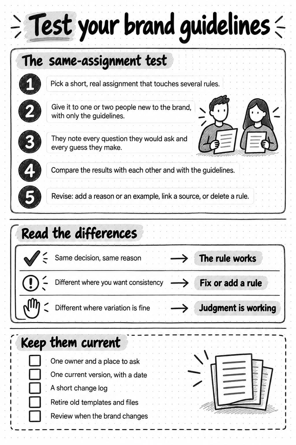
Keep one current version at one link, and show its date or version number on the first page. Keep a short change log that says what changed and why, so people who learned the old rule notice the new one. Red Hat numbers each release of its brand standards and lists what each one added or changed; version 6.6 was published on June 30, 2026. The GOV.UK style guide keeps a dated list of new and revised entries, and its advice on writing change notes applies to brand guidelines as well: a note that says only "Guidance updated" does not tell anyone what changed.
Review the guidelines when something prompts it: a change of positioning or audience, a new product or channel, a refresh of the visual identity, the same question asked several times, or the same exception requested repeatedly. A periodic check, once or twice a year, catches smaller drift. When a rule changes, retire the templates, files, and examples that follow the old rule. Otherwise they keep teaching it.
Access has to match the audience. Partners and press may need a public page with logo files and usage rules. Freelancers, agencies, and new employees need the full guidelines and the linked sources. AI tools need the current version wherever the team keeps its reusable instructions or brand context. When the guidelines change, update every place that holds a copy, or link to one source so there are no copies to update.
None of this requires a governance program. A five-person company needs an owner, a date, a single link, and the habit of recording decisions. More structure becomes useful as the number of people and agencies producing work grows.
Test whether your guidelines are useful
The most direct test of brand guidelines is whether someone who has not worked on the brand can use them to produce work that fits. The exercise below tests exactly that.
- Choose a short, real assignment that touches several rules. For example: a LinkedIn image announcing a new feature, with one headline, one supporting line, and a product screenshot.
- Give it to one or two people who have not produced work for the brand. A new freelancer, or a colleague in sales or product, works well. Give them the guidelines and the linked sources, and nothing else. You can give the same assignment and materials to an AI tool as well.
- Ask each person to keep a list as they work. They should note every question they would have asked and every decision they had to guess. Do not answer questions during the task, because the answers are what you are testing.
- Compare the results with each other and with the guidelines. Where people made the same decision for the same reason, the rule works. Where they differed on something you wanted to be consistent, a rule is missing, unclear, or hard to find. Where they differed on something you are happy to leave open, the judgment you intended is working.
- Revise. Add the missing reason or example, move a fact into a linked source, mark an area as judgment, or delete a rule nobody needed.
When Wrenhold first ran this exercise, a colleague from sales asked whether a real customer's name could appear in the screenshot. The guidelines did not say. That question is where the Example Co line in the imagery rule comes from, along with a requirement for written permission, recorded in the proof library, before a real customer's name appears.
Everyday work supplies further evidence. Questions that keep appearing in the brand channel, the same comment in several reviews, the same correction made to different people's work, and requests for files that already exist all point to a rule that is missing, unclear, or hard to find. The touchpoint audit in our brand identity guide tests a related question: whether the finished work looks and sounds like one company. This exercise tests whether the guidelines can produce that result without you in the room.
View the test and maintenance reference at full size (opens in a new tab).
Keep the brand context your work depends on current
Brand guidelines are one part of the context that people and tools work from, alongside positioning, product facts, and examples of approved work. The four checks apply to all of it: the context has to be current, reachable, clearly worded, and relevant to the assignment, and the result still needs review.
Meet Ampere—your AI marketing agent. Ampere can study your website and public material and save editable reports to Brand memory, including your brand voice, positioning, brand colors, and visual identity. You can also add existing files, such as your brand guidelines, to a Project. Later work, such as social images, carousels, emails, and landing pages, can start from that saved context instead of a fresh description each time, and your team can review and correct what Ampere has saved. You can watch a replay of Ampere creating a brand voice report for Notion from public sources. Your team still decides what the brand is and approves what ships.
Sources and further reading
- NHS England: NHS identity guidelines, NHS logo
- Red Hat: Brand standards, including personality and voice, logo, and what's new
- Government Digital Service: How to use the GOV.UK style guide, What's new, and Write change notes
- Google: About the developer documentation style guide
- Monzo: Writing principles
- Intuit: Content design system, AI voice and tone
- W3C: Understanding contrast (minimum), WCAG 2.2
- Anthropic: Prompting best practices
- Anthropic: PDF support
- OpenAI Help Center: Creating and editing GPTs
- OpenAI: File inputs and File search
- Nelson F. Liu and colleagues: Lost in the middle, how language models use long contexts, Transactions of the Association for Computational Linguistics (2024)
- Yuxin Jiang and colleagues: FollowBench, a multi-level fine-grained constraints following benchmark for large language models, ACL (2024)
- Canva Help Center: Activate Brand Assist to ensure on-brand designs
All pages were read on October 6, 2026.
Frequently Asked Questions
What is typically included in brand guidelines?
Brand guidelines typically include rules for the logo, color, typography, imagery, layout, voice and tone, and terminology, along with a short summary of the company's positioning and core message. Useful guidelines also name an owner, show when they were last reviewed, and link to sources that change often, such as product facts and approved claims. Each rule works best with a reason, an example of correct use, and a counterexample where the boundary is easy to miss.
What are some good examples of brand guidelines?
Useful public examples of brand guidelines include Red Hat's brand standards, which show copy that falls short, fits, and goes too far for each voice trait, and the NHS identity guidelines, which give logo sizes for each format and the reasons behind their rules. The GOV.UK style guide shows how to handle proposed changes, and Monzo's writing principles adjust one voice for each channel. Copy their methods rather than their rules.
What is the difference between a brand kit and brand guidelines?
A brand kit is a set of ready-to-use files and values: logo files, color codes, fonts, and often templates. Brand guidelines explain how to use them: what each color is for, which logo version fits which space, what images should show, and how the company sounds. A brand kit tells people which file to use. Brand guidelines tell them how to decide when the kit does not settle the question.
Are brand guidelines the same as a brand style guide?
Often, yes. Many companies use "brand style guide" as another name for brand guidelines. Others use "style guide" more narrowly, for editorial rules such as spelling, punctuation, capitalization, numbers, and preferred terms, and some use it for visual rules only. Because the terms overlap, say what your own brand guidelines cover, and link any related documents from one place so people do not have to guess which one holds a rule.
What is the difference between brand guidelines and a design system?
Brand guidelines cover how a brand looks and sounds across all of its marketing, from slides and social posts to email and video. A design system is a library of reusable interface components, with code and usage guidance, used mainly to build a product or website. The two should agree on color, type, and voice. Many design systems include content guidance, but a design system tells people which component to use in the product, not how to build a slide or a social post.
What is the difference between brand identity and brand guidelines?
Brand identity is the set of recurring visual and verbal choices that make a company recognizable, such as its logo, colors, typography, imagery, and voice. Brand guidelines are the written record of those choices, with the reasons behind them, examples, and limits, so that other people can apply them. A company has a brand identity whether or not it writes brand guidelines. The guidelines make that identity easier to apply consistently.
Can brand guidelines be one page?
Brand guidelines can be one page, and a first version for a small team can fit on one or two. Length is not a measure of quality: a short document that settles the decisions people face beats a long brand book consulted only for logo files. Start with the rules people break most often and a rule for claims, then add detail when the same question or mistake keeps coming back, or when a new format, agency, or product raises decisions the page does not settle.
How do I create brand guidelines for a small business?
To create brand guidelines for a small business, start from the decisions you already make. Collect recent work you are happy with, note the choices it shares, and write each one as a rule with a reason and an example. Begin with the decisions people get wrong most often, and add a rule that sends anyone making a claim to your current product facts. Name an owner, add a date, and test the draft by giving a short assignment to someone new to the brand.
What are brand voice guidelines?
Brand voice guidelines describe how a company sounds in writing and speech, and how its tone adjusts to different situations, such as an announcement compared with an apology. Useful voice guidelines turn each trait into observable choices: what to do, what to avoid, and an example sentence for each. They usually include preferred and avoided words, and they sit alongside the terminology and messaging rules in the wider brand guidelines.
Can AI tools follow brand guidelines?
AI tools can apply brand guidelines when the relevant rules reach them in a form they can use. Rules written in words, with labeled examples and reasons, work better than design spreads or vague adjectives. Give the tool the rules that apply to the assignment, along with current product facts, and review the output against the guidelines as you would review a new freelancer's work. Uploading a file alone does not mean every rule will be applied.